

Capri by Fraser, Germany
In the heart of Berlin, Germany, Capri by Fraser brings its unique design-led style to this cultural and diverse city. Located on Museum Island, this brand new hotel residence is only a short walk to the famous museums in Berlin’s historic centre and guests can choose from 143 stylish serviced apartments, ranging from studios to one-bedroom units.
Designed around the ‘always on’ needs of today’s travellers, Capri by Fraser Berlin features carefully curated art pieces that make each property unique and offers floor-to-ceiling windows with stunning city views. Interior designers JOI-Design were appointed by Frasers Hospitality to design Capri by Fraser’s first German property in Frankfurt, which completed in August 2015. Its interiors were true to Capri by Frasers’ brand of fun, playful apartment hotels for plugged-in, globetrotting professionals that also have a strong sense of place.
When Frasers Hospitality acquired the site on Spree Island, they brought JOI-Design on board once again to develop interiors that were as vibrant and exciting as the previous Frankfurt project and which, as before, celebrated the hotel’s location. This time however, the location was extraordinary – atop an archeological site that showed structural traces of how the area has been used in centuries past.
Excavation works carried out between 2007-2009 revealed the island to be the birthplace of Berlin and as such, the designers were keen to showcase this heritage within the contemporary spaces. This fresh and modern long-stay apartment hotel encourages guests to learn about the site’s past in a fun and engaging manner.
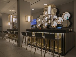
The lobby for example, affords guests a unique opportunity to interact with the site’s remarkable legacy. An eclectic array of vibrant furniture allows for flexible configuration atop a tempered glass floor, immersing guests in history as they peer into the archeological dig below. Overhead, a shimmering gold wall-to-wall installation features hexagonal mosaics and perforations that frame a black and white etching of the Spree River’s island and its ancient structures. Layered patterns recur throughout the hotel’s interiors, including the lobby seating groups where rugs are decorated with hexagon blocks and stencilled art employs superimposed circles to inject creative energy. Timber shelves strung onto colourful ropes suggest the notion of being suspended between time and space. Lighting within the hotel was of exceptional importance to the interior design and according to JOI-Design, offering different light moods in the public areas was particularly crucial as they allowed the spaces to be completely transformed from day to night.
“We chose decorative lighting that would emphasise our concept’s playful spirit and echo other elements within the design,” says Peter Joehnk, Co-Managing Director, JOI-Design. “Moolin floor lamps and pendants surround seating areas in the lobby and illuminate the bar. Their bamboo ribbon shades cast lined shadows across the walls, a repetition of the patterns created by multi-coloured strings hung from the doorways as an allusion to the graphic depiction of timelines. Hotellicht pendant lights suspended in a zigzag pattern also suggest the charting of time.
“Bespoke Hotellicht table lamps and pendants made from stacks of colourful globes emulate the lacquered spheres strung into the floor-to-ceiling shelving units. These shapes can also be seen in the quirky, contemporary artwork streamlining these elements within the design scheme.”
Working in close collaboration with lighting designer Raoul Hesse of Lichtvision, the teams talked at length about technical planning, site-specific information and installation to develop seamless mood lighting for all public areas.
“JOI-Design’s idea was to use decorative lighting fixtures designed in layers – an outer filigree layer or opaque material and an inner transluscent layer that hides the light source,” says Hesse. “For the different rooms with their different functions, other luminaire types were proposed – this was due to the fresh and young atmosphere that was the design intent. The decorative lighting elements work as part of the furniture – it integrates into the young and vivid feeling, using fixtures that are en vogue, such as cage luminaires.”
Guestrooms at the Capri by Fraser Berlin have been designed to feel modern and bright yet comfortably relaxed. Elegant oak detailing and floors enhance their cosiness, while stylish yet durable modern furnishings in muted orange and pink tones bring understated warmth and a sense of wellbeing for longer-stay residents. Once again, the heritage is an important reference point with laser-cut wall panels that reveal in orange and pink a map of ancient Petriplatz. The historical reference is also depicted in the abstract rug pattern.
Lichtvision was responsible for both architectural and decorative lighting elements throughout the hotel and as such the relationship between the two is based on a common concept, as Hesse explains: “Architectural lighting stands back in recessed ceilings and is as discreet as possible – while decorative elements do as they are supposed to – decorate the space.”
Good lighting is crucial for interior design to be successful, according to Joehnk. No matter the quality of materials used or the finesse of the concept, without the correct type and level of illumination, guests will not be able to fully appreciate them.
In terms of challenges, according to Hesse, the client set higher luminance levels than you would normally find on a project like this and as such, Hesse and his team proposed luminaires with the latest technology including LED. This of course had an influence on the budget: “Although the budget was defined in ‘pre-LED times’ the daily design process was based on LED-techniques,” Hesse says. “On one hand Fraser appreciated this but on the other, were not willing to change the budget as this was a main focus of the project. In the end we had to make the decision to specify discharge lamps.”
“It was a unique and humbling experience to work on such an important historic site,” concludes Joehnk. “We wanted to preserve and showcase the excavations, bringing Berlin’s origins into the design. However, we also needed to create a concept that reflected the values of the brand, which is young, fun and playful. This was a challenge, but one we truly relished.”