Educators4Excellence, US
New York-based interior design studio Kati Curtis Design, tapped into educational non-profit firm Educators4Excellence’s refreshing and motivated professional approach, to create a stimulating working environment with the Big Apple at its core.
Rapidly growing educational non-profit organisation Educators4Excellence reached out to Kati Curtis Design (KCD) to create a new office space that would accommodate their national and local headquarters in New York City. Principle designer Kati Curtis met Educators4Excellence’s CEO at a tradeshow in New York, which marked the beginning of a synergistic design relationship that grew into the space they now occupy in downtown Manhattan.
As an advocate organisation for teachers, the client’s mission was serious – crystal clear, modern and clean. The CEO wanted a budget-friendly space that would be a sanctuary for working, training and supporting teachers not only in New York, but throughout the country. Clean lines, raw concrete floors, good lighting and ergonomic furniture were of paramount importance.
Located in New York’s Wall Street area, the decision was made to gut the space down to the raw structure. Keeping the original concrete floors and exposed ceilings opened up the space to city views, allowing in an abundance of natural light. With such a clean slate to work from, Curtis chose to exploit the organisation’s gestural apple logo as the key recurring element throughout the office.
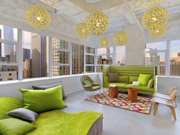
“I envisioned millions of apples surrounding you as you enter the space,” said Curtis. The New York designer used the apples in different ways to define areas by printing them along glass partition perimeters, while still allowing light into the interior. The café and lounge areas feature David Trubridge’s Floral pendants with a yellow interior hanging above oak tables and tree stump coffee tables. These spaces double as work/meeting spaces where the lighting creates an energising link with the furniture.
The decorative pendants here work to reinstate the company’s logo shape and foundations of its modern, clean aesthetics. The project proved a success with staff as a playful yet productive space that evokes the organisation’s mission of advocacy and unification.