

One Piccadilly, UK
Interior design studio SpaceInvader transforms the previously lifeless One Piccadilly office and retail building in the heart of Manchester, UK, into a vibrant and contemporary bustling hub. The team took inspiration from the city’s rich history in clay mining and piccadils to influence colour palettes and fixture choices.
Manchester-based interior design studio SpaceInvader has transformed one of the city’s well-known developments at One Piccadilly Gardens for LGIM Real Assets (Legal & General).
Originally designed by architects Allies and Morrison, and developed in 2003 by Argent, the building faces into the gardens with an impactful red-brick frontage.
Comprised of retail on the ground floor and office space above, the brief to SpaceInvader was to design new interiors for the six-storey Grade A office spaces, creating a more inviting, dynamic office that promoted a sense of welcome, wellbeing, flexibility, and collaboration, via a scheme that would match the building fabric in terms of character and presence.
“The transformation forms part of a bid to bring more life and love to this part of the city,” says SpaceInvader Founder John Williams. “Helping to ignite a more vibrant surrounding area with a café culture feel. Legal & General took the decision to invest in the building in order to make a mark and help elevate the overall Piccadilly area.”
Senior Interior Designer on the project is Regina Cheng who sits down with darc to discuss the project and SpaceInvader’s design intentions. “We were appointed by the client right at the outset, creating a feasibility study for the different areas, analysing how the spaces were being used and putting together test fits and concept ideas for how to improve them,” she explains. “We then worked closely with the project team through to completion.”
The original interior of One Piccadilly comprised an entrance to the office building located on a cut-through that sees a lot of through-traffic but offered no real sense of arrival. Existing views through to the interior gave off unwelcoming, dull and grey impressions. Once inside, an existing, huge-scale reception desk functioned more as a barrier than a welcoming element, discouraging people from doing anything but passing straight on through the speedgates, despite a few additional arrangements of loose furniture serving as waiting areas. The double height diagonal void through the ground and first floors of the building was also not utilised to its best advantage.
“There was a great opportunity here,” Williams reflects, “to turn the personality of the offer around, working with rather than against the building. A new interior that was properly integrated with the building’s stature, location and material palette was called for, to make the most of the great corner location and views out. This was evidently a well-established building with real potential for change.”
SpaceInvader was commissioned by Legal & General for the concept stage of the project and then novated across to commercial interior design, build and delivery specialist ADT Workplace for the construction delivery stage, and the scheme’s project managers were Paragon.
The full scope of works by SpaceInvader covered the entrance, reception and atrium areas, a new upper basement bike store with adjacent changing rooms and shower space, the building’s lift core and circulation areas and a refreshed design for the non-tenanted office spaces on the third and fourth floors, as well as the scheme’s wayfinding.
The concept formed by SpaceInvader was centred around the idea of creating a new community culture, featuring a series of attractive spaces for people to sit, relax, meet, and collaborate. Taking nods from the building’s rich history, the design also needed to be timeless with a non-exclusive appeal catering to a wide user and age-range demographic.
The site dates back to the 18th century when Piccadilly Gardens was a wasteland on the edge of the city and known as the “daub holes”; an area home to a wet pit and ponds from which clay was extracted and used for the construction of wattle and daub structures.
“We were inspired both by the terracotta colour of clay and the outer red building façade when it came to creating the design palette,” says Cheng. “Although, as it’s such a strong colour, the terracotta was to be used for highlights only. We also looked at the origins of the word Piccadilly, which comes from a 17th century frilled curved collar known as a piccadill. Roger Baker, a tailor who became rich making piccadills, lived in the area. The origin of the word is thought to be the Spanish “picadillo”, meaning pierced or punctured. Subtle references to this in the form of curves and punctures, especially using light, also formed part of our design language.”
Lighting formed a central part of the brief, with various needs demanding unique attention, from task lighting and decorative ambience to wayfinding. “We didn’t use a lighting designer but worked with Hydrock (M&E consultant) in the early stages to ensure we had the right general lighting lux levels to supplement and support the feature lighting,” explains Cheng. “Once on site, ADT – who delivered the project – brought on Lorne Stewart (M&E Contractor), who worked with Glamox Luxonic to develop the scheme for the general lighting. For the more bespoke areas, such as the external entrance and the atrium, we worked with lighting specialists Studiotech, whose expertise and experience were invaluable to advise on and deliver our vision for the layering of the suspended hooped lighting and the entrance overhead planter with integrated lighting.”
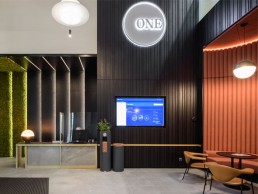
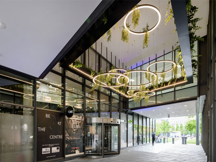
The entrance to the building posed one of the greatest design challenges for the team, as a statement needed to be made without changing the external façade. “We re-thought the entrance as a ‘puncture’ within the passageway, changing its hidden nature and making it stand out by the creation of a new, hanging biophilic and light installation above the entrance, set within a rectilinear LED light, which extends the full breadth of the passageway and is clearly visible from either direction of approach,” says Cheng. “We then added a new round ‘bus stop’ signage, using the development’s existing ONE logo, where all branding previously had related only to neighbouring retail and hospitality offers. We also increased the presence of the glass-front manifestation. Clear views through now ensure a new era of transparency for the interior, celebrating rather than concealing its existence.”
The new reception area was completely rearranged, with a new, smaller bespoke desk featuring a portable Lee Broom table lamp, linking to other feature pendant lights in the space. Here, highlights of terracotta feature in various furnishings and finishes, as well as a play on ideas of light and dark referencing the concept inspiration of piercing and puncturing.
The first seating area close to the reception presents a striking curved nook that houses chestnut leather Gubi Masculo chairs alongside terracotta accents that create a warm and inviting area. A Lee Broom Lens Flair pendant hands over the space with two further identical pendants in the seating area adjacent. The main reception area features four large-scale Flamingo pendants from Vibia.
“The feature lighting choices all stemmed from what we thought complemented our concept and the overall look and feel of the scheme,” explains Cheng. “We chose the Lee Broom Lens Flare pendant and table lamp, for example, for its contrast of two halves (the dark solid against the soft deflected light through a transparent cross-cut lens), reinforcing the concept of light and dark.
“The Vibia Flamingo lights offered the soft light, curves and layering that complimented the double height space and the curves within the design.”
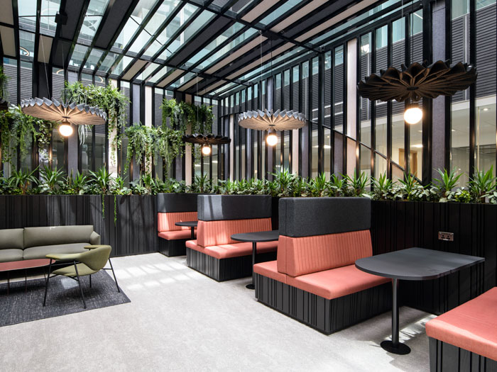
Moving into the atrium, architectural lighting is used in balustrades for wayfinding. A centrally-located box garden pavilion is a focal point in the space, providing a breathing space and a private meeting space for first floor tenants. “This was a key area for our new scheme,” comments Williams. “We saw the potential here to turn the focus inwards and create a real statement space that would serve all the building’s inhabitants, not just the company whose offices were located directly adjacent.”
A heavy use of planting along the back wall as well as generous hanging plants creates a feeling of outdoor space as well as added privacy. The integration of biophilia allows the atrium to be an area of retreat, aiding user’s physical and mental wellbeing, as well as acting as providing natural acoustic properties. Fan-shaped circular Buzzispace acoustic lamps are also featured, representing the lace collar reference. Above the pavilion, simple hoops by Studiotech hang at different levels, tying in with the entrance area lighting.
“The BuzziPleat [by Buzzispace] allowed for a functional decorative light, with the acoustic felt finish adding further softness in a hard-surfaced atrium space, whilst also referencing the ‘piccadil’ lace collar that also formed part of our concept. The feature rings [from Studiotech] reinforced the circular element and concept of community, whilst the layering helped highlight the verticality of the atrium.
“Acoustic lights are great for creating intimate spaces set in more open/transient/busy areas, such as the atrium at One Piccadilly Gardens, so location is a main consideration,” explains Cheng. “For the atrium, there were a lot of hard surfaces in a very high, open environment. Although the pavilion structure incorporated acoustic panels and soft furnishings, suspending the Buzzipleat lights at a lower level added extra intimacy by reducing any sound bouncing between the hard surfaces.
“The science behind acoustics needs to be considered to inform the size and shape of the acoustic light if it’s a noise-sensitive space,” she continues. “It again ties back to location and how that space is being used, e.g., if it is a focused working area within an office space, there would be more need for acoustic treatment to help with work productivity, whereas an open flexible space that can be used for informal meetings or breakout may not need to be as acoustic-heavy. The light output from the fitting needs to match as well so that it’s fit for purpose; there needs to be a balance between the two features of acoustics and light.”
Elsewhere, for main office lighting, the team selected linear lights from Luxonic, either suspended or integrated into the suspended rafts. “[These] gave a good general spread of light for an office floorplate, and provided a simple and elegant aesthetic,” says Cheng. “Simple downlights were coupled with the feature Tricell ceiling in the core areas where reception and breakout areas are likely to be located by new end-user tenants.”
When approaching the lighting of an office space, there are various factors that need to be considered in the design stages. Cheng elaborates further: “We first look at the overall space and how it is likely going to be used. We can then start dividing the space into areas that may need to be made into more of a feature zone, and others where it may need to be a question of more generic lighting, e.g., reception and lounge vs. circulation routes and open office spaces.
“We also think about what type of ceiling treatment would work best for the space and the types of light fittings that would work together with that. It’s important to get the right levels of light according to the end use of the space e.g., lighting in the office area needs to provide sufficient, even lux levels and good overall comfort suitable for working, compared to a reception or lounge/breakout area, where it’s more a question of setting the right mood and where a design choice can be more tailored. This ties in with where feature lighting is best located, and if there is need for more control by the end user, e.g., for floor lamps or table lamps.”
Reflecting on the project’s success, Rob Codling, Fund Manager at LGIM Real Assets, comments: “Through long-term investment, we remain proactive in delivering the optimum environment for our occupiers. LGIM Real Assets has made a significant investment in One Piccadilly Gardens (OPG) – in which SpaceInvader has played a pivotal role. The transformation of the property will not only improve our occupiers’ experience, but, more widely, assist in our drive to be landlord of choice. Aligning with Legal & General’s ongoing ESG agenda, all works undertaken at OPG have the highest ESG credentials, ensuring the building remains fit for the future.”