Yeo Valley Cafe, UK
Phoenix Wharf and Yeo Valley have joined forces to bring a little piece of Somerset to West London, with its first outlet comprising of a two-story café, shop and workspace.
As a brand, Yeo Valley is keen to stress the quality of its products and ethical approach to its farms, where its Friesian herd are digitally monitored and provided with organic feed and their own mattresses to sleep on. The business has developed over two generations, starting with the acquisition of Blagdon farm in 1961 to becoming Britain’s leading organic dairy brand, gaining a new farm, beef cattle and sheep along the way.
The desire was to bring some of this rustic ethos of Somerset to London, and to create an engaging, inviting showcase for Yeo Valley in order to establish an increased presence in the capital.
Working together with Phoenix Whard, it was important that the concept maintained and expressed the brand’s nature-inspired ethos and friendly, fun and unpretentious feel.
In order to honour the origins of Yeo Valley and establish a sense of synchronicity between places, scattered throughout are visual links to the Blagdon HQ, another Phoenix Wharf project. These include a mural by Natasha Clutterbuck, a long-time Yeo Valley collaborator.
“One of the main challenges was the shape and footprint of the site,” explains Emma Gullick, Associate Creative Director at Phoenix Wharf. “The long, narrow shape of the building means lighting was frequently used to create an illusion of depth and size. The rear of the store, for example, appears to have vintage style Crittal windows with illuminated panels, to give the impression of space beyond.
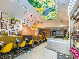
A slatted and angled roof feature pays homage to the brand’s agricultural roots, and places emphasis on a bright, stained glass window embedded into the ceiling. Being long and narrow, we wanted to capture the feeling of the open space present in Blagdon HQ and make sure the design didn’t feel too enclosed.”
The other challenge was to make sure the project did not fall into the clichéd territory of an ‘organic artisanal look’. Gullick and the team tackled this through treating each individual space as a mini project, using pattern and colour in abundance to create a visual flow between them. This feeds into a binary balance that is expressed throughout the project, where warm and cold LED lighting are used to separate cosy and clinical spaces.
One half of the cafe is intended to represent the cool light of a dairy farm, using marble and white LED strip lighting alongside retail chillers and yoghurt pots. Gullick adds: “This feels clean and also adds a directorial cue, leading visitors along the counter.”
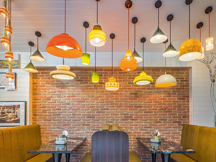
Meanwhile, the booth space on the opposite side is all warm lighting, with coloured glass shades and pendant fittings that create a ‘more is more’ decorative feature, as well as a distinction in space and tone. Furthermore, this lighting clutch of pendant lamps embodies the brand’s sustainability drive. “It was inspired by a pendant originally created for the Blagdon HQ, and contains eighteen different upcycled light fittings sourced via eBay and vintage fairs,” says Gullick.
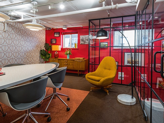
They inspire a retro and colourful atmosphere in the space, whilst the re-use of old fittings fits into the company values and progressive attitudes towards the environment. Upstairs, the meeting rooms and office space have very low ceilings and exposed pipework running in a maze across most of the surface. “
The desire to create an open, bright and comfortable working space meant careful design considerations to ensure nothing made the space feel smaller,” continues Gullick. “By adding three new windows and using full height glazed walls for the meeting rooms we were able to achieve a feeling of bright openness.”
Further vintage light fittings are used upstairs – combined with Anglepoise task lamps and a 1960’s Arc floor lamp. “We specifically used wall-level and floor lights to accommodate for the low-level ceiling,” says Gullick. “Much like the booth lighting feature, these vintage fittings are reminiscent of the domestic feel within Blagdon HQ, creating further overlap and connection between the two outposts.”
In terms of the balance between decorative and architectural lighting, the latter remains very much functional and subtle. Spotlights and high-level tracklights are designed for additional illumination but do not detract from any decorative lighting feature. Meanwhile, bespoke neon lettering and an illuminated diner sign downstairs were designed by Phoenix Wharf and manufactured by Bristol-based Artworks-Solutions. The intention is to attract attention from the outside, delivering playful messages and potential current offers, whilst also doubling as a bright feature at mid-level from the interior.
In addition, the stained glass effect ceiling panel makes for the other key decorative lighting feature. This is a five-by-two-metre mounted ceiling lightbox with a fabric printed graphic that alludes to Blagdon, also bespoke designed by Phoenix Wharf. This hand-drawn design has also been worked into the ground floor toilet, which has been designed to look like its own underground station, complete with arched corners, authentic tiling throughout and two illuminated, bespoke ‘Blagdon Station’ tube signs. This is considered the standout feature of the space and acts as a playful link between Yeo Valley’s London and Somerset sites.
Ultimately, the project was not about creating something entirely new but an evolution of a well-known space, the marriage of a familiar household name in a new and urban location. Gullick summarises aptly: “Upon entry, the customer is met with a feast of colour, pattern and character.” Phoenix Wharf has created a warm and playful brand experience, one that underlines Yeo Valley’s countryside origins and that emphasises its dedication to the fun, the friendly and the unpretentious.