

Lita - LucePlan
Lita by David Dolcini is an extremely versatile family of decorative lamps, the result of a delicate design process that mixes imagery, signs, geometric textures and natural materials. The result is a collection with its own elegant simplicity, including table, floor, suspension and wall/ceiling solutions.
Blossi - Nuura
Designed by award-winning Danish designer, Sofie Refer, Blossi is a lamp collection created from rounded surfaces that are continued in glass and metal and combined with state-of-the-art technology. Danish design coupled with elegant light makes Blossi an organic and stylish light that complements any space.
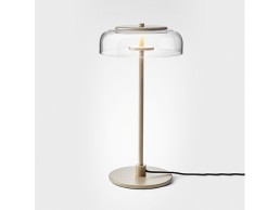
Manhattan - Bsweden
Manhattan lamp clear from Bsweden was designed by Gunnel Svensson in 1997 and is a modern classic. The lamp has the same shape as a drinking glass and has got its name after the traditional drink Manhattan. It has a stylish look in clear glass with decorative details in stainless steel and aluminum.
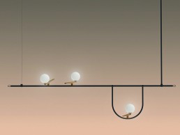
nh1217 - Artemide
nh1217 is a simple, versatile, practical appliance that can be laid or suspended. A white blown glass sphere slides along a brushed brass ring, which allows it to take different positions and to freely adjust and direct the diffuser. The frame becomes a support, a hook to hang the appliance to the wall, or a handle.
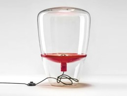
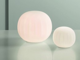
Balloon - Brokis
A simple yet timeless light based on a transparent, nearly invisible balloon with a hovering reflector to serve as an elegant and stately source of light in any setting. The natural beauty of the handblown glass is underlined by the clean appearance of the transparent balloons. A small table light and two free-standing models are available.
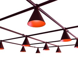
Grid - Blond
Blond launched Grid at this year's Stockholm Furniture Fair. Designed by Bornstein Lyckefors architects who previously designed the Bend, Grid is a tasteful, modular lighting system with the adaptability of a three-phase rail where a node is placed in each node. A stylish addition to any space.
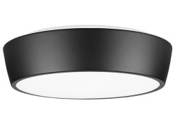
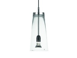
Riff - ateljé Lyktan
A dimmable downlight combined with a tuned direct light creates a soft aura against the ceiling and wall, providing a pleasant, balanced light.
With its timeless designs and latest LED technology, Riff is developed for offices, learning institutions, hospitals and other public spaces.
Principal Hotel Charlotte Square, UK
Interior designers Goddard Littlefair worked with Susan Lake Lighting Design to create the perfect mix of vintage travel references and modern-day amenities at the new Principal Hotel, Charlotte Square, Edinburgh.
Interior design studio Goddard Littlefair has just completed a £25m, top-to-toe transformation of the Principal Edinburgh Charlotte Square, formerly The Roxburgh Hotel. The new hotel joins the Principal family of standout, city-centre hotels, each with its own unique treatment and personality, entirely appropriate to its historic building envelope and location.
As the second Principal hotel to be established in Edinburgh, following the opening of Principal Edinburgh, George Street, the remit for the Grade-II listed Charlotte Square covered a complete revamp of all the hotel’s public spaces, including the reception, lounge areas, ballroom and meeting rooms, plus the stunning central ‘Garden’ all-day dining area. All of the hotel’s 181 rooms and 18 suites, plus linking lobbies and corridors, were also completely redesigned.
The scheme also included the creation of a new bar and restaurant offer – BABA, a new destination hotspot for Edinburgh, masterminded by the culinary team behind Glasgow restaurant Ox and Finch, featuring a Levantine-inspired design feel and menu.
Jo Littlefair, Goddard Littlefair Director and Co-founder, commented on the overall design approach: “Like a cosmopolitan clubhouse, the scheme for Charlotte Square is eclectic, intriguing and full of references to travel – from set-dressing with vintage suitcases, hats and canes to The Map Room, where walls are lined with historic maps from around the world. The interior feel is plush and elegant, with interesting and varied furniture and tactile, high-quality fabrics, such as richly coloured velvets and leathers, all set within a series of stand out individual spaces.”
“Charlotte Square had to differentiate from the newly-opened and already successful sister hotel at George Street, while at the same time, adhering to the key brand principals.” adds Goddard Littlefair’s Creative Director, Richard McCready-Hughes. “The new Charlotte Square project was therefore given its own aesthetic language to appeal to a slightly different market. We adopted a slightly ‘hipper’ more masculine ‘town house’ vibe and even developed a fictional owner – a well travelled, slightly eccentric Scottish gentleman with a taste for the finer things in life – who informed many design decisions along the way. He became a much-loved mascot for the design, construction and project management teams by the end of the project. It was a fun way of working!”
Guests enter the hotel via a classic original arched entranceway, refurbished with a smart, black-painted door set into a white-painted glazed arch. The sense of being welcomed into a grand old Georgian townhouse prevails. Once inside, a spacious, glazed vestibule provides an area to wait or lounge in. Over to the left, an original fireplace, floor lamps, small tables and Ercol chairs upholstered in rich mustard velvet, along with a sisal carpet runner, provide a sense of warmth.
The vestibule space is freshened and contemporised by white marble, herringbone mosaic flooring, which cedes to an ebony timber parquet floor, as guests move into the reception area through a second set of glazed timber and bronze doors. Immediately beyond, hangs an opulent 1.1m-diameter, bespoke pendant light, designed by Goddard Littlefair and produced by A Shade Above in pale, coffee-coloured silk with elaborate black trimming.
The walls here are painted a soft milk-chocolate colour, creating an immediate feeling of warmth and intimacy. The space is further softened via the use of full-length deep green velvet curtains, which cleverly subdivide the space and provide a sense of privacy and exclusivity.
“The hotel is made up of several Georgian townhouses that have been knocked together,” continues McCready-Hughes. “As such, there was a wealth of existing architectural features and eccentricities, which provided us with a very characterful canvas on which to work. The decorative lighting has been used to highlight and in some cases, contrast with the building’s character and reinforces the sense of elements acquired organically over a period of time. We hope they also appear to be a manifestation of someone’s personal style and taste, rather than being part of a uniform and ultra co-ordinated approach so often found in hotels.
“In the public areas the decorative pieces remain eclectic and have been used for more dramatic effect. For example, the bespoke silk pendant fitting already mentioned manages to reflect and be entirely in keeping with the Georgian architecture, but hints at the well-travelled, experienced and exotic.”
The brief for the lighting was to create a considered scheme that was subtle yet emphasised the richness and vibrancy of the interior finishes, allowing the decorative lighting to take centre stage. For lighting designer Susan Lake (SLLD), working within a Grade II listed building, in a UNESCO world heritage site, gave her team a lot to think about when it came to the internal lighting, using the constraints of the building to their advantage.
“As with the interior design, we designed a scheme that complemented and emphasised the existing historical architecture,” she tells darc. “The Georgian architecture was a wonderful base to work with; it's both dramatic and elegant when lit well. The building has sensational Georgian ceiling plaster moldings in the Salon, Map Room and Library and wonderfully tall windows looking onto leafy Charlotte Square from the front of the Library.
“The decorative lighting works harder than it seems to at first. We wanted it to look like curated items, as if the furniture had been collected by someone over time.”
Moving over to ‘The Garden’, the hotel’s courtyard, a canopy of assorted light fittings, hang beneath the glazed ceiling and provide a sense of warmth and magic, not unlike candle light. The new garden space is immediately visible from the moment you enter the hotel. Located in a space previously used for pre-function drinks or as a breakout area, The Garden serves as a destination all-day food and beverage space, creating an oasis for local Edinburgh residents, as well as hosting breakfast service for hotel guests.
Originally open to the elements, the central courtyard space has now been reclaimed as part of the hotel’s interior space with the addition of a new glazed roof. With open views of the sky, the space provides the hotel with a much-needed heart and allows comfortable all-year round use. The design for The Garden was inspired by the great hothouses, orangeries and nurseries of grand historic country estates and the space has been sub-divided to provide guests with a sense of privacy and intimacy, using reclaimed glazed doors, fretwork screens and metal gates sourced from architectural salvage yards.
In the evening, the space takes on a magical feel, thanks to the ambient lighting scheme, which includes periphery wall lights with an intimate candle-lit feel, while the extensive use of wicker shades reinforces the sense of being in an indoor-outdoor space and casts playful patterns across the walls and floor.
Pretty glass-jar lights with metal floral fittings, multiple-string ‘festoon’ lighting and antiqued metal chandeliers all add to a garden-party vibe. A particularly notable element are the eight, over-scaled drum lampshades around the edges of the space, dressed in a black and white palm tree fabric from Tissues d’Helene.
“We cast the net wide when it came to searching for the right accessories to dress the space with and add personality,” says McCready-Hughes. “Extensive trips to antiques markets and dealer fairs provided one-off planters, jardinières, benches, cabinets and garden tools, all of which add to the fashionably eclectic feel of the space.
“Hanging the lighting beneath the glazed roof of The Garden was quite challenging because often there wasn’t a structural support available where we wanted it. It’s an informal space intended to evoke the sense of conservatory and potting shed and so we managed to get around this by hanging ladders transversely between the cross beams and wrapping flexes and chains around these. This enabled us to get the decorative fittings exactly where they are needed to be for maximum effect.”
Lake adds to this telling darc: “We worked around the challenges of the glazed ceiling in The Garden by incorporating mini downlights into the pendants designed by Goddard Littlefair, this compensated for the lack of light in the centre of the room.”
Directly behind the bar area of The Garden, is the pre-function space, which shares some of the same glazed roof and benefits from a soft glow of light, created by mid-century-inspired table lamps, sitting on the bar counter, while glass and metal lanterns continue the outdoor feel. This space can be sealed off for functions as it leads directly into The Gallery, where grey-toned woodwork acts as a backdrop for gallery-feel art displays featuring local artists.
Moving on to the new restaurant and cocktail bar – BABA, Goddard Littlefair was asked to provide a step change in terms of the look and feel of the space and this change in approach is immediately apparent. With its own street entrance, signalling the unique identity of the space within, a specially-commissioned mural of the ‘host’ Mr Baba, based on a vintage photograph, provides the backdrop to the bar counter. The bar itself has been refurbished with a re-finished, dark-stained, timber bar front and re-used zinc bar top, replete with the signs of aging character from its previous life. The bar ceiling is painted in a rich teal tone, with multiple antique framed mirrors attached to it, reflecting the activity beneath. In terms of lighting, four wall lights with timber-panelled shades from Graypants add further interest by casting shadows and playing with the light; two further examples are also used in the restaurant.
Guests move from the bar to the restaurant via a glazed platform, which allows views over the space before stepping down into it. At the base of the steps is the restaurant’s show kitchen and dining counter, which is the first in a series of dining spaces that also includes The Map Room, The Salon and The Library, each with a different emphasis.
In the main restaurant space, striking feature lighting includes five sets of bespoke, hand-forged lights with metal chandelier casings from Made by the Forge, along with 20 pendant lights made up of fret strings along the inner and window sides of the restaurant - these continue into the bar area. All designed by Danish designer Alexandra Raben, there are three more of her designs along the restaurant’s back section and one super-sized light in burnt orange over the ‘snug’ seating area.
The Map dining room is characterised by an artwork collection of framed map and vintage travel posters. This is a colourful room, building on the peacock blue anchor colour with oranges and a burst of dark red. A lighting feature by Janie Knitted Textiles features in the space and is made up of a cluster of twelve lights in three different shapes, with dip-dyed wool shades in blue, orange and grey. The room is ‘clubby’ in feel, but the dining tables are at proper dining height so that the room is also very appropriate for dining.
Moving upstairs to the guest rooms and suites – no two rooms are the same, with bedrooms spread across three locations, the old block, new wing and the ‘wee hoose’. The design treatment for all, centres on comfort, colour and character, with fun and eclectic 'salon hang' artwork in each room.
“Our primary concerns in lighting the guest rooms was to ensure the lighting was both practical and restful and that this could be simply and intuitively controlled,” says McCready-Hughes. “We had quite a varied style of rooms to deal with and many had very high ceilings, so decorative pieces were specifically developed to provide scale and interest – particularly in the older parts of the building.”
The old block guestrooms make the most of period details, such as refurbished listed detailing and cornicing. The overall design treatment is a balance between tradition and a more youthful, contemporary feel. The new wing guestrooms are more uniform in layout and considerable effort was made by Goddard Littlefair to ensure they had the same sense of character and uniqueness present in the more historic areas of the building.
The ‘wee hoose’ is like a mini hotel-within-a-hotel and is spread over four storeys. It has bedrooms with a similar feel, but with a unique bathroom treatment featuring roll-top baths, marble washstands and tiles. There are two central staircases in this section of the hotel, which both feature a bold wall covering by Timorous Beasties, with a light well at the top.
Looking back at the redesign of Charlotte Square, for McCready-Hughes the decorative lighting elements, “add to the sense of character and individuality of the property. We also hope that some of the them are memorable and create a talking point among guests,” he says. “There was huge pressure to demonstrate the financial viability of this project initially and that meant working in a very collaborative manner with our client to maximise the value of the design as a whole, without compromising the guest experience in any way.
“We’ve always embraced individualism and a sense of eclecticism in our work, but with this project we also had the opportunity to inject some quirkiness and humour too. We love the end result and I feel it perfectly demonstrates our ability as a practice to interpret our client’s brief on an individual basis and deliver a range of aesthetic styles in a fresh and unique manner.”
Lake adds to this, saying: “The decorative lighting is integral to the atmosphere we created throughout. Different layers of light add to the opulence and richness of the interior finishes and furniture; overall, we’ve achieved a subtle, considered scheme that delicately balances the decorative and architectural lighting aspects.
“The architectural lighting adds soft washes of light in places, bringing the vibrant finishes to life as well as focused and dramatic lighting to architectural features in others. The decorative lighting adds warmth and striking focal points in the spaces, adding charm and personality to the interior.”
Marcello Ventisei, General Manager at the Principal Edinburgh Charlotte Square, commented on the process: “It’s been an incredible journey for the entire team here at the hotel, but we’re incredibly proud to be able to reveal the results of our refurbishment. The new space focuses on bringing one of the city’s most impressive buildings back to life, offering guests the perfect blend of heritage and modernity. The refurbishment allows us to continue to push for excellence in the design and service we provide in one of Edinburgh’s most desirable locations.”
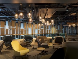
One Twenty, UK
UK-based architecture and design company, KSS was recently armed with the task of creating an exclusive members club experience within Club Wembley at England’s national football stadium, delivering a new benchmark in football hospitality.
With just 120 members One Twenty is the most prestigious club in Wembley’s history. A new hallmark in football hospitality where members can expect service and experiences like no other. Whether members choose to relax in the luxury of the lounge, grab a drink in the bar or enjoy a memorable meal in the restaurant. These stylish, contemporary spaces are there to be indulged in.
Curating the complete guest experience – right down to the menus – ensured a ‘one of a kind’ experience. The ‘club within a club’ is the first hospitality upgrade at Wembley in ten years and was delivered while the stadium remained fully operational throughout construction.
From the beginning, KSS engaged in extensive consultation with Club Wembley to design a space that takes the traditional hospitality experience to a new level. From the rich tone of colours used throughout the lounge, the scale and presence of the bar area and the small, intimate dining rooms in the restaurant, One Twenty is truly an exploration of the visual senses.
In terms of the lighting throughout the space, having previously worked with KSS on a number of hospitality projects, including the successful lighting design for Liverpool FC at the new Main Stand concourse areas, Enigma Lighting was brought on board to produce a scheme that provided general and decorative lighting within specific areas of the members club.
“After spending time to fully understand the design vision of KSS and the inclusion of bespoke and decorative lighting, our task was to produce a lighting design that met the challenges of this prestigious project,” says Enigma’s Paul Shoosmith. “Working closely with KSS, we agreed there needed to be a good balance of general and decorative lighting and good communication enabled effective installation of the right products, with key choices of individual fittings made by KSS.”
Along with bespoke lighting pieces from Enigma Lighting, decorative lighting products specified for the members club included the Lute pendants from Ebb & Flow and Marble collection from &tradition - supplied by Holloways of Ludlow; as well as Mami wall and table lights from Penta Lighting; and the Long John pendants from Rubn, which were all supplied by Chaplins & Latitude.
Belgium-based lighting company Dark.be supplied their Coolfin suspended fittings and a Big Gary floor lamp from Porada features in the lounge space.
“We were delighted with the overall final impression. The balance of the two lighting elements worked superbly well in creating a stunning environment. While it involved many people in the decision process, it was a positive experience as everyone was working towards delivering an exceptional project.”
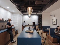
Airbnb Beijing, China
Airbnb’s lead interior designer Rebecca Ruggles transformed an old office space for a new community of Airbnb staff and clients.
American company Airbnb host's an online marketplace and hospitality service for travellers looking to rent short term accommodation. Having successfully expanded its operation to China, the company was looking to expand again, this time into a larger office.
Rebecca Ruggles, lead interior designer at Airbnb was tasked with transforming the new space for a global audience. “We secured the lease in January and moved in at the end of July,” Ruggles tells darc. “It was a very fast process. The initial brief was to create a larger office, the existing team had been divided between two separate buildings, some employees were transferring from other Airbnb offices and a great deal of new employees were being hired.”
The brief was clear in that the new design needed to bring people together, connect them to the company mission as well as building culture and a sense of community in an authentic way. The office also needed to serve as a space to host guests and explain to them who Airbnb is and what their goals are, to achieve this the office merges key elements of Chinese culture with modern architectural practices.
The office is divided into four ‘neighbourhoods,’ each with adjustable desks, a communal table, a project room, phone rooms, and a lounge area, the multi-layered office has a variety of workspaces and configurations, giving the employees a choice of places to work.
Taking inspiration from traditional Chinese philosophy, the Beijing office plan represents the five elements of wood, earth, water, fire and metal. Certain functions were specifically located in parts of the building according to the ideal element for that cardinal direction, for example, the tea station, ‘Chaguan’ is located in the North where water is the corresponding element. Additionally, each part of the office uses materials and colours that best represent that specific element. For the pendants above the island at the Chaguan tea station, the designers opted for Niche Modern’s Stamen Collection. “The traditional Chinese element for this area is water, which is one of the reasons we chose to locate our tea station here. The blue coloured glass pendants help emphasise that theme,” says Ruggles.
The reception area and café forms the primary gathering point of the office. Coined ‘The Greenhouse’, it uses elements of wood, combined with its corresponding primary colour, green. Wood represents family, creating a genuine sense of unity and home as a communal space that helps employees stay connected. “The pendants above the reception desk from More or Less are a more modern take on traditional Chinese lanterns,” Ruggles explains. “They set the tone for the space and draw your eye as you walk in the front door. They bring a sense of warmth, and also utilise wood as the primary material which is the traditional element that we wanted to highlight in this area according to the cardinal school of Feng Shui.”
The pendants above the cafe counter from Bentu TU are made from recycled concrete terrazzo that complements the outdoor/ garden vibe of the café and adds great texture and interest to the space.
Working with local employees, the team wanted to incorporate several Chinese traditions within the office culture – one being the ritual of taking a nap after lunchtime, and the other being the idea of removing ones’ shoes and wearing slippers instead. In response to this, the Environments Team created a dark, quiet, contemplative space for employees to relax in, as well as providing storage for footwear as part of the personal storage solution in the open office - these features are part of the custom office design. The office also houses alternate workspaces, such as a wellness area for yoga and other such classes, in order to harness a flexible and creative work environment. Light cage pendants from Zaozuo are located in the alternative work area which features designed inspired by the rice terraces in Yunnan province. Fishing is a big focus in the area and the mesh material around the pendant reminded the designers of the fishing nets you see being cast in the rivers in Yunnan.
Airbnb’s ethos supports local firms and businesses to ensure the concept and components of the space were as authentic as possible. The furniture within the office was sourced from Chinese practices like Fnji, More or Less, and Zaozuo that produce high quality traditional pieces and designs with a more modern look. Sourcing inspiration for the design concept by local brands helped to achieve the mix of ‘old meets new’.
The office is located in a corporate office tower with low ceilings and a typical dropped acoustic ceiling, the space didn't fit with the homey aesthetic of Airbnb offices, so Ruggles had to strategise creative ways to use decorative lighting to mitigate that corporate feel. Ceilings were removed in certain areas and cove lights were added to wash the walls. “We added decorative drop pendants above the desks for more focused task lighting and each meeting room has their own unique decorative pendants that reflect the style of the Airbnb listing they were inspired by. They really help transform the space," says Ruggles.
The designer’s biggest challenge was delivering a unique, high quality space on such a tight deadline. To do so required hands on approach, as she explained: “We took many trips to the project site in China as well as keeping constant communication through apps like WeChat. We have a unique situation since we work as in-house designers, working internally allows us to have an intimate familiarity with the company’s goal and operations, we can also work in the spaces we design and gather direct feedback for how to make future projects even better.”
Any major changes to the brief would have jeopardised the schedule, so the team had to settle quickly on a brief and stick to it. There were however, design details that continued to develop up until the last minute – in particular the screens that separate the open office and the meeting rooms had many different forms before the team decided on using real bamboo as planters. According to Ruggles it was critical that the open office authentically represent the local Beijing culture, which can be a real challenge for a remote design team, she says: “We leaned heavily on our local Airbnb team to share important aspects of Beijing culture that we should include. We also reached out to our larger network of designers and vendors to help get connections in Beijing and find new and exciting materials and furniture to use on the project.”
Sourcing a wide variety of furniture and material styles for the meeting rooms was a challenge for the team. Each room had to represent the breadth of design visible in Airbnb’s around the world.
“Each room is like a separate design project. We sourced as much as possible from Beijing and supplemented that with items purchased in Hong Kong where there’s a larger diversity of global style options.”
Furthering Airbnb’s global narrative the Environments Team engaged with local employees in an Employee Design Experience (EDX) programme to help add the finishing touches to each meeting room, features of the programme includes a wall decorated with artwork painted by the employees that replicates a listing in Provincia di Limon, Costa Rica and sketches from guest around the world to mirror the listing in Burlingame, USA.
“Beijing has many layers. You have to dig a little deeper, you have to ask people, you have explore and quickly discover its rich culture, incredible people and drive to change the world. Hutong’s in particular are synonymous with Beijing and they have that same-layered effect. The word literally translates to the path between and they have become a symbol of community and new discoveries hidden around every corner into our office. The Hutong inspired spaces become a gathering point within the neighbourhoods of the office, China has a rich past that dates back thousands of years and it is now entering a new, modern era. We wanted to pay homage to that incredible history, while still celebrating the ground-breaking ideas of a new generation.”
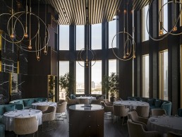
Ritz-Carlton Astana, Kazakhstan
Based in the exclusive Talan Towers, a high-end, mixed-use development in the capital of Kazakhstan, Nulty recently completed work on Selfie and MOKKI, two restaurants located in the Ritz-Carlton Hotel, Astana.
Situated on the left bank of Astana, in the heart of the business district, forming the background of the main square, the Talan Towers have become an iconic landmark for the city, setting a new hospitality benchmark and providing a world-class destination for business and leisure. Working alongside UK-based design studio Blacksheep, lighting design practice Nulty has created two individual lighting design concepts: one for the all-day dining destination, Mokki and the other for the exclusive sky bar, Selfie.
“We worked on this project for three, almost four years,” Nulty’s Associate Lighting Designer, Anna Sandgren, tells darc. “Our clients were the property developers and were very much involved. With the brief being quite strict; Ritz Carlton know what they want and what defines their brand so it was very much tailored to them, hospitality areas use light in a very different way. We created a bright and welcoming space within MOKKI, highlighting surfaces and playing with textures and finishes, whereas the Selfie bar and restaurant needed a scheme that created mood and drama adding to the exclusivity of the space.” The final result is a warm, luxurious, high-end restaurant and sky bar boasting stunning views of the Astana skyline.
All-day restaurant MOKKI is located on the third floor of the luxury development and features a large open space encompassing different zones such as a bakery, deli and grill. The bakery space is adorned with gold Italian marble with brass inlay details and a bronze mirror front façade perfectly complementing the theatrical charcoal-burning grill visible from the hotel’s entrance. The elevated main dining area at the heart of MOKKI is characterised by a curved timber dropped ceiling in millennial pink illuminated by track-mounted spotlights, positioned within the soffit above, which allows the light to graze through the timber fins creating movement and intrigue whilst highlighting key areas of the restaurant and providing a striking focal point. A feature wall wraps the perimeter of the space with carefully positioned LED lights integrated behind, washing light up to create a subtle perimeter horizon. Low-level lighting has been added to the shelves within the bakery and deli, with integrated LED’s in the joinery to illuminate the produce. Complementing the clean architecture of the various spaces, a brass through trough is incorporated into the ceiling to form a grid system, allowing a consistent design aesthetic to flow throughout. Surface mounted spotlights are nestled within the trough to provide general illumination, whilst suspended brass rails allow beams of soft light to graze the marble counters below.
The exclusive Selfie bar and restaurant is located on the 18th floor of the tower, where the space boasts spectacular panoramic views of the city’s skyline, framed by floor-to-ceiling windows. The extraordinary ambience is created through a rich palette of jet-black marble, mahogany wood, velvet and copper, which continues throughout the space. The dark interior design is lifted by high ceilings that feature deep recessed downlights to provide an intriguing dining space. The lighting is purposely refined throughout to encourage intimacy and emphasise the breath-taking views.
The back of the restaurant features a slate marble wall installation trimmed with copper edges and illuminated by integrated LED’s to pick up the texture in the interior and provide additional depth to the space. Mahogany wood columns punctuate the external wall of the restaurant and have been washed with light from above to highlight the rich material palette while decorative copper pendants are suspended throughout the dining space to create additional drama and contrast, while exuding a warm intimate glow for guest sitting below. The bar has been backlit by illuminated light sheets to create a stunning backdrop that picks up the glint in the wine bottles and provides a visually exciting display.
The result of this thoughtful and measured design is two distinct spaces with two different personalities, Mokki serves the daytime guests and the casual evening diner while Selfie with its exclusive, members only feel and stunning backdrop, draws in the night crowd.
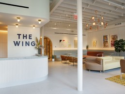
The Wing Brooklyn, US
The Wing was born out of the belief that women need and deserve a multi-purpose space designed to make their lives easier, and that magic is created when women gather together. darc spoke with interior designer Chiara de Rege about her involvement in this very special project.
Founded in 2016 and built upon the Women’s Club movement of the 19th Century, The Wing’s mission is to create a space for women to advance their pursuits and build a community together.
Interior designer Chiara de Rege has been involved since the beginning of the project and with a new location just opened in Brooklyn and one set for Washington later this year, darc spoke with de Rege about her work on the SoHo, New York location.
Originally built in 1890 as a manufacturing warehouse, the SoHo location allows for even more women to join The Wing community in a space three times the size of the original Flatiron location. The Wing SoHo offers the same flexible working environment that the brand is known for: open layouts, private nooks and a light-filled atmosphere and is infused with bolder jewelled-tone colours throughout, designed by an all-female team as a tribute to the fierce feminine powers that will fill the space. Alongside de Rege, the women who led the project include architect Alda Ly and a team of graphic designers led by Emily Oberman at Pentagram.
“When I met the guys at The Wing I loved their vision and we really connected,” de Rege tells darc. “At the first location – Flatiron – it felt more like I was curating different creative directions they both had, while at the second location in SoHo I was out on my own more and I drew inspiration from things I had seen during Milan Design Week. The architecture of the space in SoHo also really informed the design, I was lucky that the founders trusted me to just get on with it.”
The space at The Wing SoHo combines many elements and with conference rooms named after favourite fictional female characters such as Ramona Quimby and The Golden Girls’ Blanche Devereaux, the 10,000sqft space also offers half-a-dozen phone booths and private offices, which are all available to rent. Designed with women’s needs in mind, the amenities include showers, lockers, a nap room and a beauty room, featuring custom wallpaper by illustrator Joana Avillez and Flat Vernacular’s Payton Turner - both founding members of The Wing.
Elsewhere in the space, The Wing has partnered with the founders of Strand Bookstore to curate an all-female lending library with over 2,000 titles, ranging from feminist theory to contemporary women’s fiction, and includes a collection of new works from The Feminist Press, one of The Wing’s literary and programming partners. There is also a gallery of works by prominent female artists curated by Wing member and collaborator Lolita Cros. Artists include Alba Hodsoll, Alice Lancaster, Angelica Hicks, Carly Burnell, Devra Freelander, Esther Sibiude, Kim McCarthy, Lana Barkin, Leanne Shapton, Linnéa Gad, Louise Parker, Marilyn Minter, Pamela Hanson, Rebecca Dayan, Sophia Narrett, Taryn Simon and Tschabalala Self.
The Perch is the in-house café at SoHo, offering an extended seasonal menu featuring food, wine and cocktails made by female chefs, sommeliers and mixologists.
“When you enter Wing Soho it is flooded with light and I relied heavily on the lighting to define the different areas – what was a work space and what was a more elevated glamorous living room,” says de Rege. “So we used lots of layers of lighting just in the first room…not only defining commercial and residential spaces but formal to informal.
“The decorative lighting elements at The Wing are pretty fun because, true to the vision of SoHo, there’s a lot of workspace with lounge like living space and so obviously, we wanted to be certain there was accurate lighting for all the big tasks people would be working on. We worked with Bold Lighting who helped us figure out all the task lighting and the recessed architectural lighting, which creates a really pretty wash of light up against the wall.”
Decorative lighting pieces used throughout the space come from the likes of Atelier de Troupe, Tom Dixon, Lindsey Adelman, Roll & Hill, Ladies & Gentlemen Studio, Cedar & Moss and Schoolhouse Electric.
“Lighting can really create such an important ambience,” continues de Rege. “And the decorative lighting elements were really fun to work with because we were trying to create this elegant residential feel to certain areas in the space. The decorative elements were all really important to warm the spaces up and make it more home like and less commercial.
“The Wing is such a fun project! The clients are two very strong interesting women with a great aesthetic and I was very inspired by the project and enjoyed the process immensely – it was very different to residential or hospitality projects that I’m used to working on.
“The architecture at SoHo was so special and really stood out to me, it made the project what it was. It has these massive skylights and loft windows that just let the light pour in.
“What’s been so much fun about this project so far is that although it’s the same women’s club, with the same ethos and there’s a common thread – each location has it’s own identity with lots of layers and lighting has been a very significant aspect for each of the locations.”