Deadline approaches for 2025 [d]arc awards
(Global) - The countdown is on for the 2025 [d]arc awards! Take this as a final reminder that the 11 December deadline is approaching for all, including the interior design, decorative lighting, and artistic installation sectors.
This year’s programme features three key categories for decorative lighting and design community to enter:
Best Interior Lighting Scheme – Low / High Budget
Open to any indoor lighting scheme, spanning commercial, retail, residential, and hospitality projects, this category welcomes both decorative and architectural luminaires.
- Low Budget: luminaires valued under £30,000
- High Budget: luminaires valued over £30,000
Kit – Decorative
A category tailored to product designers and manufacturers, recognising outstanding decorative lighting products for both interior and exterior use. Previous winners include notable names such as Flos, Vibia, and Jonathan Coles.
Art – Bespoke
Celebrating sculptural lighting installations, this category is open to both permanent and temporary works with no budget restrictions. Entries are judged on creativity, innovation, and craftsmanship.
Once entries close, an international jury will be announced, who will shortlist the entries before the global design community votes for their winners. The champions will then be honoured at the legendary [d]arc awards night in London, equipped with a free bar, food vendors, and a late-night party.
The awards provide designers and studios with a valuable platform for increased visibility, industry recognition, and new professional opportunities. Plus, everyone is a winner when entering the [d]arc awards, with every entry featured on the awards’ website, and short listers have a lifetime complimentary entry in the [d]arc awards directory.
Enter now via www.darcawards.com/enter
Preciosa - Driftfing Lights
(Czech Republic) - Preciosa Lighting has announced Drifting Lights, a new addition to its Signature Designs portfolio. The Czech lighting manufacturer, known for its contemporary interpretations of Bohemian glassmaking, will debut the design at Downtown Dubai Design 2025.
Drifting Lights centres on fused glass panels that incorporate naturally formed air bubbles created during the glass fusion process. These pockets influence the passage of light through each panel, producing subtle visual effects. The panels are framed in stainless steel and can be illuminated with static or dynamic lighting.
Ten panel sizes are available, with the option to install them horizontally or vertically to create varied compositions. Additional artistic treatments can be specified, including the Fused Veil pattern - offered in Vortex or Diagonal variations—or a pigment technique applied between fused layers to introduce colour within the glass.
Lighting is delivered via concealed LED strips that inject illumination into the edges of each panel. According to Preciosa, the integration of RGBW technology and 3D spatial mapping enables designers to programme dynamic lighting scenes across installations.
Drifting Lights joins Preciosa’s Signature Designs collection, a group of customisable lighting systems that can be adapted in scale, colour, materials and illumination methods to suit project requirements.
Design Mumbai marks successful second edition
(India) - Design Mumbai has concluded its second edition at Jio World Garden, 26-29 November 2025, reporting higher visitor numbers, strong exhibitor engagement and continued interest in its design features and talks programme. The 2026 edition has been confirmed for 25-28 November.
The Design Mumbai Exchange talks returned with 14 sessions curated by Caro Communications, featuring designers, architects and industry specialists. They explored material innovation and colour - such as Chris Lefteri’s discussion on alternative materials and a panel on colour theory featuring Juan Gerstl and Ajay Shah - drew significant interest from lighting and interiors professionals.
This year’s design features included Gerstl’s colourful entrance installation Journey Through India, Lucas Muñoz Muñoz’s Ex-Hotel for THE Park Hotels, and Materials! Do Touch! by Lefteri. The Object Edit, curated by Kamna Malik, showcased designers working with strong material narratives, including several focused-on lighting.
Two connected pavilions hosted the fair’s curated brand presentations, alongside food pop-ups from Soho House Mumbai, Solaire and Burma Burma. Exhibitors included global names such as Baccarat, Hästens, Poltrona Frau, String and Natuzzi, as well as Indian studios including Sarvatva, Phantom Hands, Fazo Project, Racconti and Emanate.
Commenting on Design Mumbai’s second edition, co-founder Ian Rudge says: “This year, we have solidified Design Mumbai as a mainstay of the international design events calendar. It has been a huge thrill to see yet more major international brands on board, as well as global friends of the show that we’re pleased to welcome back. The calibre of talent amongst the Indian exhibitors is breathtaking, and we are so pleased to hear of the many opportunities coming their way on the back of our show.”
Further information and exhibitor registration for 2026 are available at www.designmumbai.com
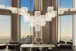
Corka by Zero Lighting
In an era where sustainability is no longer a design afterthought but a defining principle, Swedish lighting brand Zero continues to lead by example. Known for collaborating with forward-thinking designers, Zero champions innovation that balances form, function, and environmental responsibility. Their latest collaboration with British designer Samuel Wilkinson exemplifies this ethos perfectly.
When Zero Lighting approached Samuel Wilkinson to design a sustainable pendant, the brief was refreshingly ambitious: create a lighting novelty that could be “literally thrown into nature” and decompose naturally. From this directive, Corka was born – a compact conical pendant crafted entirely from cork.
Corka’s journey began in mid-2023 and was completed earlier this year, a remarkably swift turnaround for the design world. Having previously designed successful novelties for Zero Lighting, such as the Haze pendant and Thirty ceiling and wall lights, Wilkinson understood the company’s ethos and reputation for unique lighting fixtures with sustainability and high-quality at the forefront. Yet, bringing Corka to life demanded a deeply process-driven approach – one that involved extensive exploration of materials and manufacturing techniques before arriving at the final, refined form.
“We experimented with numerous materials before concluding to go ahead with cork. Learning about cork has been particularly interesting,” explains Wilkinson. “At first, we assumed turning cork on a lathe would be the most cost-effective approach. But some pieces oscillated during turning, making accuracy difficult. Switching to pressing methods produced more consistent forms with a finer surface finish.”
The buoyant, lightweight material is known for its unique impermeable qualities, making it an excellent thermal and acoustic insulator. This versatility allows it to be used in various applications, such as wine stoppers, building insulation, and now pendant lights.
Cork is a type of bark, specifically the outer bark of the cork oak tree, called Quercus suber. The material is harvested only every 12 to 14 years in the Montados, Mediterranean oak forests, due to being a vital player in supporting 325 animal and plant species, protecting from erosion, regulating the hydrological cycle, and absorbing carbon dioxide. This remarkable material is one of the most sustainable resources available due to its ability to naturally biodegrade without releasing any harmful toxins, as well as this, nearly all its byproducts can be utilised for products such as flooring, aggregates, or bioprocessed for cosmetics, pharmaceuticals, or water purification.

What sets Corka apart is not just its material but its method of production. While many sustainable lights rely on recycled composites or industrial processes, Corka reimagines a natural, centuries-old material through modern moulding techniques, achieving consistency without compromising the cork’s organic charm. The production of the pendant is deceptively simple yet deeply rooted in craftsmanship and material understanding. Each pendant begins with granulated cork – either natural cork, black cork, or a mix of the two – combined with a small amount of binder. This blend is carefully prepared to achieve the right balance between texture, density, and strength.
The mixture is then placed into two-part metal moulds made from Teflon-coated aluminium. The surface quality and pressure of these moulds are critical, initiating the natural binding reaction within the cork as it begins to set. Determining the precise treatment time is a matter of testing and refinement, as different cork combinations, particularly when mixing natural and black cork, react in subtly different ways.
 Once the mixture is sealed within the mould, it is left to cure for a carefully-timed period. During this stage, the cork reacts and binds, forming its distinctive, compact structure. When released from the mould, the Teflon coating leaves the surface with a soft sheen, a delicate contrast to the organic texture beneath. Each pendant is then lightly sanded by hand to reduce the gloss and reveal the raw, tactile quality of the cork. This gentle finishing exposes the material’s natural grain and variation, making every piece inherently unique. Though the process is efficient, it remains highly craft-based. As mentioned, no two pendants are identical; each reflects the subtle interplay of pressure, temperature, and time. “Once everything is added to the mould, the final result is out of our hands and left to the will of the cork,” says Wilkinson.
The creation of Corka occurred as a relatively streamlined development with few challenges and trials aside from the manufacturing process. Wilkinson had to work within the parameters of a strict budget set by Zero Lighting that ultimately heavily influenced the design process.
Wilkinson adds: “When machining from solid cork, the cost is directly affected by how many parts can be cut from a given sheet size, since the raw material is quite expensive. While tooling costs are much lower for machining, the outcome can be less consistent, so persuading Zero Lighting to invest in a moulding tool for the granular approach was important. The main criterion for the final shape was that it could be produced using a simple two-part male and female mould with sufficient draft angles to allow the part to release easily.”
Cork’s virtues extend beyond its renewability. It is extremely light – over 50% of its volume is air – and elastic, compressible without losing shape. It is impermeable to liquids and gases, thermally and acoustically insulating, fire-retardant, abrasion-resistant, hypoallergenic, and possesses a tactile natural texture that is warm to the touch. Its inherent qualities make it perfectly suited for a lighting object, softening the glow. 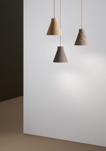
“The tone and texture of the cork are among the material’s greatest qualities. They help to soften the emitted light, creating a warm and gentle glow. During the day, the natural gradient that forms across the conical surface is particularly beautiful, enhanced by the cork’s subtle granular texture,” adds Wilkinson.
Available in three finishes – natural, mixed, and black cork – and can be paired with either black or natural linen cables, with the linen option offering a lower environmental impact, similar to cork, completing a pendant that is entirely process-conscious and materially honest. Beyond its sustainable credentials, Corka offers a quiet sculptural presence to any interior, whether it is residential or commercial. Whether suspended singularly or as a cluster, the Corka offers a subtle, unique edge to any space through its tactile materiality and a soft ambient illumination, which evokes a sense of calmness through its natural warmth.
The mission was clear: to create a light that could quite literally be thrown back into nature. Wilkinson not only rose to the challenge set by Zero but also continues to demonstrate the possibilities of how organic material from the natural world can coexist harmoniously with contemporary design. Corka is more than just a pendant – it is a statement of intent in a world overrun by synthetics and overproduction. Together, Wilkinson and Zero Lighting champion a more regenerative, material-conscious future for lighting design.
Images: SW Studio, Zero Lighting
CSI Europe Opens Registration Ahead of First Hamburg Edition
(Germany) - Cruise Ship Interiors Design Expo Europe (CSI Europe) has opened registration for its inaugural event in Hamburg, marking the trade fair’s move from its long-standing London base to one of Europe’s key centres for shipbuilding and river cruise design. The show will take place at Hamburg Messe & Congress on 3–4 December.
The relocation aligns the event more closely with the European cruise interiors market, at a time when shipyards across the region are operating at near-full capacity. According to organisers, the shift allows CSI Europe to address the specific challenges facing the sector, including design requirements for 295 refurbishment projects and 73 new-builds scheduled over the next two years.
This year’s conference, delivered in partnership with NEWH, will focus on efficiency in the shipbuilding process and the design considerations shaping guest experience on smaller river and ocean-going vessels. More than 300 exhibitors are expected to showcase products and solutions across the cruise interiors supply chain, from materials and finishes to outfitting services.
A dedicated hospitality zone, Hospitality@CSI, will examine the crossover between hotel operations and onboard experience. Programming will include a Lunch & Learn session featuring insights from a major hotel brand, followed by networking opportunities.
Over 120 companies will be exhibiting at CSI Europe for the first time, alongside regular participants such as Marine Interiors, The Deluxe Group and Accomar. Exhibitors range from amenities suppliers and outfitting specialists to surface and furnishing brands.
The event will conclude with the Cruise Ship Interiors Awards, the only awards programme focused solely on cruise ship interior design. The ceremony will feature updated categories and a new judging panel, reflecting the rapid activity in both new-build and refurbishment markets.
Registration for the two-day event is now open.
www.cruiseshipinteriors-europe.com
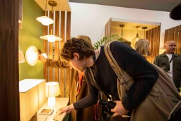
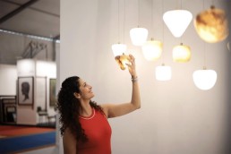
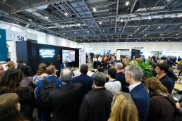
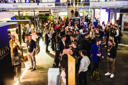
LiGHT Expo London marks its most design-driven edition
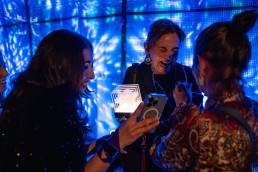
(UK) - The highly anticipated LiGHT Expo London returned for its fourth consecutive and increasingly successful year. As the UK’s only dedicated high-end lighting exhibition, LiGHT 25 once again welcomed thousands of visitors to the Business Design Centre in London. Over two days, the 19th and 20th November, the exhibition centre was transformed into a creative and collaborative hub.
A record number of more than 6,700 visitors braved the cold weather to attend this year’s show, demonstrating their unwavering support. LiGHT 25 brought together thousands of architects, interior designers, lighting designers, engineers, and specifiers, alongside hundreds of leading architectural and decorative lighting brands. Visitors attended inspiring talks and presentations from over 60 speakers, all while making new industry connections through creatively curated networking opportunities.
This year’s Decorative Zone proved one of the most talked-about elements, welcoming many new big-name brands to the zone, such as Italamp, Industville, Vibia and Lumen Loom. A special VIP Design Tour welcomed 23 leading interior design studios to participate in a whistle-stop guided tour of the show. The design professionals were treated to introductions to 10 leading lighting brands suited to the interiors market, before heading to the lounge for further networking opportunities. The tour received high-praise from both attendees and the participating brands for providing a concise yet informative platform to explore the show and make connections.
Always evolving in order to remain relevant to the wider industry, LiGHT 25 also introduced its new Technical Zone. While focused on brands in urban and commercial lighting, controls, components and emergency lighting, this addition sat alongside the decorative offering to ensure a well-rounded visitor experience.
Education and community were once again central to the event. Supported by Studio Due, the Associations Lounge once again acted as a shared base for leading industry bodies, including the DALI Alliance, The LIA, ILP, SLL and the IALD. Located on the Gallery Level, the lounge hosted networking events such as the in-person Silhouette Awards celebration, the LiGHT Lunch with Studio Due and speaker David Atkinson of DALD, and a dedicated two-day splinter talks programme.
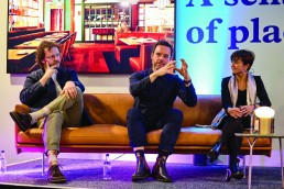
Central to the educational element of the show programme were the CPD-accredited [d]arc thoughts talks series in collaboration with Lutron. Curated and moderated by editors of arc and darc magazines alongside guest moderators, the two-day talks programme brought together global experts to address themes ranging from sustainability and circularity to wellness, health, and the business of design. Topics and highlights include Shaping Atmospheres with Judith Patiño, of Vibia, who discussed how light and space work in unison to craft memorable spaces. Plus, True Luxury is Handmade: Crafted for Connoisseurs of Light, with speaker Surbhi Jindal (Da Light Hub / Women in Lighting India Ambassador), exploring the creativity that brings bespoke lighting designs to life.
Also new for 2025, visitors were able to immerse themselves in an innovative light art installation by Speirs Major Light Architecture in partnership with formalighting. Re:Vision explored the theme of colour perception across species, using custom spectral profiles and reimagined Ishihara colour blindness test patterns to reveal the diversity of visual experience across the natural world.
Managing Director, Paul James comments: “We are once again blown away with the positive response and overwhelming attendance to the show. We are proud that the exhibition keeps getting bigger and better this year, cementing LiGHT as a must-visit event for anyone involved in lighting, architecture, interior design, engineering, and beyond. The show has a perfect mix to discover new ideas, strengthen professional relationships, and stay at the forefront of the lighting industry.”
Helen Ankers, [d]arc thoughts Programme Director adds: “We are so pleased with the feedback to this year’s show. The entire team had an amazing time exploring the zones, attending the range of inspiring talks from renowned speakers across the industry, and being in awe of the light art installation from Speirs Major. Thank you to all the media partners, event supporters and exhibitors for your valuable contributions this year. We hope that LiGHT will continue to be a success for years to come, and we are looking forward to sharing special plans for our milestone fifth year in 2026.”
LiGHT remains free to attend, with next year’s dates confirmed for 18–19 November 2026.
www.lightexpo.london/
Blink Design Group opens London studio
(UK) - Blink Design Group has opened a new studio in London, marking the next step in the practice’s ongoing international expansion. The interior design studio, founded by Clint Nagata, already operates in Bangkok, Singapore and Dubai, and the London launch aims to strengthen its presence in the UK and wider European markets.
The move follows the securing of three major European projects, which the firm says prompted the decision to establish a permanent base in the city. London’s role as a global centre for design, along with the firm’s ambition to deepen its work in the region, were cited as key factors.
As part of the launch, Blink has appointed William Evans as Director of Development. He will lead the studio’s business development efforts and act as a liaison with developers, investors and hospitality clients. In addition, Matt Nadilo joins as Associate Director of Interior Design. With more than two decades’ experience in luxury hospitality projects internationally, he will work closely with Nagata to guide the creative direction of the studio.
Blink’s European portfolio includes upcoming projects such as Six Senses Loire Valley Residences and a new retreat in Normandy, both of which draw on the firm’s interest in site-specific storytelling and cultural context.
Nagata’s approach to design is shaped by his background in Hawaii and Japanese heritage, with an emphasis on narrative and locality. This ethos underpins the studio’s global work and its internal initiatives, such as the S.W.A.P exchange programme, which enables collaboration between Blink’s international teams, and the Wish To Remember scholarship, which supports designers exploring craft and culture abroad.
The studio has delivered projects for hospitality brands across Asia, the Middle East and the Indian Ocean, and continues to work with operators including One&Only Resorts, Nobu, Banyan Tree, Park Hyatt, Orient Express, Mandarin Oriental, Waldorf Astoria and Alila.
The London opening aims to embed the practice further within the European design landscape and expand its collaborations in the region.

BDNY 2025 Highlights in Design and Hospitality
(USA) - Boutique Design New York (BDNY) returned to the Javits Centre this November, drawing more than 16,000 members of the global hospitality design community for two days of exhibitions, installations and industry programming.
Now in its 2025 edition, the show featured over 750 exhibitors and a conference schedule of more than 180 speakers. Organisers reported a 6% rise in qualified attendees compared with last year, with visitors representing more than 50 countries.
As in previous editions, BDNY placed significant emphasis on experiential spaces. The BD mainstage, designed by Saguez & Dash, created a woodland-inspired setting for keynote talks, while the nearby BD Hub hosted discussions on emerging technologies, sensory and emotional design, and the development of responsive environments.
Hospitality F&B design took centre stage in the expanded Dine & Design area. Its signature installation, The Alchemist café by Aria Group, operated as a fully functioning venue, showcasing how atmosphere, materials, lighting and service can be combined to shape guest experience.
Three additional “Designed Spaces” offered further creative interpretations of contemporary hospitality environments. They included Châlet Après, a modern take on an alpine retreat; The Splash Pad, which explored poolside culture through reflective surfaces and strong geometries; and Midnight Garden, a richly coloured, atmospheric installation centred on light, movement and mood.
BDNY also recognised achievements in booth and product design. The Best of BDNY Best Booth Competition named winners across Small, Medium and Large categories, with Cava Surfaces receiving Best in Show.
The Best of BDNY Product Design Competition awarded winners in 13 categories spanning architectural materials, lighting, textiles and outdoor products. The Best in Show accolade resulted in a tie between Juniper’s Multiverse System with Illuminated Ribbon, Weave, and Juniper Cylinder, and Fireclay’s Foundry Collection.
A range of networking events and celebrations took place throughout the week. The annual Women Leaders in Hospitality breakfast brought together senior figures for discussions on leadership and professional development.
The show week opened with the Platinum Circle Awards Gala, honouring long-standing contributions to the hospitality sector, and concluded with the Gold Key Awards at Cipriani 42nd Street. This year’s Gold Key ceremony recognised winners across 24 project categories and named Studio Paolo Ferrari as Design Firm of the Year.
The next edition of BDNY is scheduled for 8–9 November 2026, returning once again to the Javits Centre.
David Village Lighting becomes official UK distributor for Artemide
(UK) – David Village Lighting (DVL) has announced a new UK distribution partnership with Italian lighting manufacturer Artemide, covering its architectural lighting portfolio, including the Alphabet of Light collection.
The agreement marks the latest development in a relationship that spans nearly 50 years, during which DVL has collaborated with Artemide across both decorative and architectural product lines on a wide range of project types. The new distributor status is intended to enhance visibility of Artemide’s solutions-focused architectural offering in the UK, as well as strengthen local support for the architecture and design (A&D) community.
DVL’s recently expanded business-to-business team will assist in the specification process for the Artemide Architectural range, working in close coordination with Artemide’s head office in Milan.
Founded in 1981 and based in Sheffield, David Village Lighting has established itself as a specialist in architectural and decorative lighting within the UK market. The company supports projects from the initial design concept through to product specification, procurement and delivery, across commercial, hospitality, residential, education and healthcare sectors.
The Artemide Architectural range comprises a variety of solution-led luminaires designed for precision and flexibility, including directional spotlights and adaptable profiles. Products are available in a range of colour temperatures, dimming options, CRI values and UGR ratings to meet diverse project requirements.
www.davidvillagelighting.co.uk
&Tradition sets science-aligned carbon reduction targets
(Denmark) - &Tradition has outlined a new climate strategy centred on reducing emissions across its operations and supply chain, following the validation of its targets by the Science Based Targets initiative (SBTi). The plan aligns the Danish design brand with global efforts to limit warming to 1.5°C under the Paris Agreement.
The company says its approach responds to increasing environmental pressures, including climate-related disruptions and biodiversity loss affecting natural materials and the communities that produce them. Its new roadmap uses the Greenhouse Gas Protocol to assess emissions across Scope 1, 2 and 3 categories, from direct energy use to the wider supply chain.
Working with SBTi, &Tradition has set measurable goals for 2030. The brand aims to reduce its Scope 1 and 2 emissions, those generated directly through company operations and purchased energy, by 50% from its 2021 baseline. These emissions account for less than 1% of its total footprint but include areas such as company vehicles and energy use across offices, stores and warehouses.
The company’s largest impact lies within Scope 3 emissions, which cover production processes, materials, and activities across its supplier network. These represent more than 90% of &Tradition’s total footprint. Rather than setting an absolute reduction target, the company has chosen an intensity-based metric that reflects its growth rate, aiming to cut Scope 3 emissions by 55% per million DKK value added by 2030.
The roadmap identifies several key levers for reducing emissions. One priority is increasing the share of products manufactured using renewable energy. While some suppliers already operate with green energy, availability and cost remain limiting factors in certain regions. Supporting a transition to renewable sources will form a central part of the company’s strategy.
Material adjustments also feature prominently. &Tradition plans to integrate higher levels of post-consumer recycled content and explore lower-emission alternatives in upholstery foams and textiles. These efforts are part of a broader review of product lifecycles, with the company assessing opportunities to reduce the long-term carbon footprint of key collections.
According to the company, achieving the targets will require continued cooperation with designers, product developers and suppliers. The roadmap will evolve as new methods and technologies emerge, with further initiatives expected as part of the brand’s long-term sustainability work.
One week until LiGHT 25: Discover the show's new features
(UK) - The countdown is nearly over, with just one week to go before visitors and exhibitors gather for the 2025 edition — an expanded showcase of innovation, education, and networking opportunities. This year’s highlights include the launch of the brand-new Technical Zone, the much-anticipated return of the Associations Lounge, and an exciting new immersive light art installation.
Launched for the first time at LiGHT 25, the Technical Zone will provide a dedicated showcase for brands at the forefront of urban lighting, commercial lighting, control systems, components and OEM, lamps and gear, and emergency lighting. With advanced controls, emergency systems, and components playing an increasingly important role in sustainable and human-centric design, the Technical Zone offers both exhibitors and visitors a vital platform to exchange expertise and explore the latest developments.
Supported by Studio Due, the Associations Lounge will once again act as a shared hub for leading industry bodies, including the DALI Alliance, The LIA, ILP, SLL and the IALD. Located on the Gallery Level, the lounge will provide visitors and exhibitors with a comfortable environment away from the show floor, complete with complimentary refreshments, networking events such as the in-person Silhouette Awards celebration, the LiGHT Lunch with Studio Due and speaker David Atkinson, DALD, and a dedicated talks programme. It also offers the opportunity to learn more about association initiatives and membership.
Central to the educational element of the show programme is the CPD-accredited [d]arc thoughts talks series in collaboration with Lutron. Curated and moderated by editors of arc and darc magazines alongside guest moderators, the two-day talks programme will bring together global experts to address themes ranging from sustainability and circularity to wellness, health, and the business of design. Topics and highlights include Out of Our Lane: What Lighting Designers Must Learn from Medicine, with speaker Willie Duggan (Lighting Designer), which calls on lighting professionals to step beyond the silo of the industry. Plus, True Luxury is Handmade: Crafted for Connoisseurs of Light, with speaker Surbhi Jindal (Da Light Hub / Women in Lighting India Ambassador), exploring the creativity that brings bespoke lighting designs to life.
LiGHT 25 will also feature a new light art installation with Speirs Major Light Architecture, who have partnered with formalighting to present Re:Vision. Exploring the theme of colour perception across species, Re:Vision uses custom spectral profiles and reimagined Ishihara colour blindness test patterns to reveal the diversity of visual experience across the natural world. LiGHT isn’t just a trade show made up of rows of exhibitors. It’s a chance for designers, engineers, and architects to really immerse themselves in light, learn more about how light shapes the design industry, and make new connections through our varied features.
In addition to these new features, LiGHT 25 will bring together thousands of architects, interior designers, lighting designers, engineers, and specifiers, alongside hundreds of leading architectural and decorative lighting brands. Visitors can also take advantage of networking opportunities throughout the event, including a late-night drinks party, a networking lunch, and a dedicated co-working space.
LiGHT 25 is a must-visit event for anyone involved in lighting, architecture, interior design, engineering, and beyond. The show has a perfect mix to discover new ideas, strengthen professional relationships, and stay at the forefront of the lighting industry.
Visitor registration is free. To register and for more information, visit: https://www.lightexpo.london/
HIX LDN returns for 2025
(UK) – Europe’s leading hotel design event – returns to London’s Business Design Centre on 26–27 November for two days of talks, parties, installations, and a curated expo of over 150 leading interior labels.
Guided by the theme ‘Culture Clash’, this year’s programme is a platform for hospitality design without borders, celebrating the unique customs, traditions and perspectives that see hotels breaking down barriers and connecting guests worldwide.
Welcoming designers, architects, operators, suppliers, investors, developers, project managers, independent hoteliers, and anyone else involved in creating inspirational spaces, HIX LDN brings the hospitality design community together for a true celebration of the hotel interior experience.
The show floor features a curated edit of the best new products for next-generation hotel spaces. Featuring major brands from across the furnishing, bathroom, surface, fabric, technology and décor sectors, more than 150 exhibitors will showcase their latest collections along with some exclusive HIX-first releases.
With its own programme of exhibitor activations, breakout talks and partner content, HIX EXPO represents the cutting edge of hotel interior design, connecting the entire supply chain under one roof for a one-stop project shop.
Discover the latest launches from: GROHE, Panaz, Marset, Chelsom, Concept Contract, Robena, Laufen, Tuuci, Roca, Heathfield, Jung, Heals, Gessi, Hansgrohe, Porta Romana, Julian Chichester, Hypnos and more.
The HIX Talks programme features two days of panels, presentations and perspectives delivered by leading designers, operators and experts. From innovations in hotel wellness and the secrets of brand translation to emergent technologies and the shifting definitions of luxury, the 2025 agenda will put the industry’s hottest topics up for debate with some of its brightest minds.
Returning sessions include Studio Confidential with the Festival of Hospitality, going behind the scenes with international luxury hotel specialists G.A Group as they celebrate a landmark 40th anniversary, as well as a panel discussion with four esteemed AHEAD Europe judges as the leading awards programme for hospitality experience and design prepares to reveal the year’s best hotels. Meanwhile, a special HIX Keynote interview with hotel visionary Christoph Hoffmann will see the 25hours Founder explain what it takes to meaningfully challenge the status quo.
Guests will be able to explore a trio of distinct installation spaces inspired by the 2025 theme of ‘Culture Clash’. As part of the main installation space, MKV Design have teamed up with Luma Mirrors by Gemm London for a reflective kaleidoscope concept bringing a slice of Ibiza to the HIX show floor.
Elsewhere, Secto Design and Conran and Partners will be bringing The Essence of Finland – an immersive display and exhibition first debuted at Clerkenwell Design Week – to HIX, offering a visual journey into the country’s unique interplay of light nature and craftsmanship via a triptych of themes - Forest & Materiality, Lakes & Reflection, and Light & Contrast. While up in the Silent Gliss showroom, a future/retro guest room concept by Studio Moren will feature its own programme of content including breakout talks with the designers and a drinks reception.
The HIX opening night party will start on 26 Nov. 17:00–20:30 and kicks off the social strand with receptions, activations and networking opportunities across the show floor, soundtracked by a Balearic-inspired DJ set from Music Concierge and the return of the Gessi soundsystem.
HIX is free to attend, and welcomes designers, architects, operators, developers, investors, owners, project managers, suppliers, general managers and anyone else involved in bringing hotels to life.
Register for your free pass via the link.