

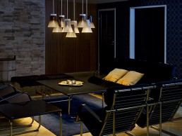
Eevert, Finland
Design Restaurant Eevert, located in the neighbourhood of Punavuori, Helsinki, has been created in a building designed in 1952 by architect Alvar Aalto.
The interior design of the restaurant reflects Aalto’s functionalism and modernism combined with fascinating contrasts of colours, materials and shapes. Eevert’s founder, Tarja Martiskainen, has an appreciation for Finnish design and has included signature pieces of Alvar Aalto, Seppo Koho, Harri Koskinen, Yrjö Kukkapuro and Lars Sonck in the interior design.

The lighting of the restaurant is eye-catching. The dining area is lit with handmade wooden lamps by the Finnish lighting company Secto Design. The black Octo pendants hold the key role in the lighting design of the restaurant bringing structure and playful drama into the space.
Another interesting lighting solution provided by Secto Design can be spotted in the lounge area where a cluster of Petite pendants create an impressive installation by the fireplace. The contemporary design and clear lines of the Secto Design lamps suit the restaurant’s interior perfectly.
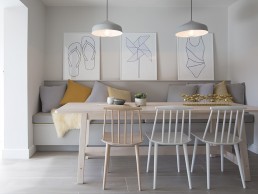
Private Residential, UK
When architect Leigh Bowen and wife Charlotte began the renovation of their 1960s bungalow in West Wittering, they worked with lighting designer Richard Fallows to choose modern, energy efficient light fittings which would complement the clean and contemporary interior scheme.
A bright, open plan kitchen and dining room was created to provide a fantastic social space for the family to spend time together. Astro’s Ginestra pendants, in a matt white finish, were chosen to hang directly above the large breakfast bar and family dining table to illuminate the space perfectly and add an element of interest against the contemporary scheme. An Atelier desk lamp was also chosen to provide efficient task illumination on the kitchen worktop, helping to keep the area well-lit for preparing and cooking meals.
Beaumont Kitchen, Canada
One of Oliver & Bonacini’s latest projects, the beautiful Beaumont Kitchen at Saks Fifth Avenue in Toronto, was designed by Moncur Design Associates in partnership with VISO lighting designers.
This fashionable all-day dining lounge was built around a central column which the design team decided to highlight due it being a load bearing structure that could not be removed. The chandelier attached to the column is composed of 53 brushed metal arms, each holding an LED Edison lamp by VISO casting a soft, warm ambiance throughout the restaurant. To attach it to the column, the VISO industrial design and production teams designed it with a metal cuff that is fastened to the column with LED strips, thereby lighting the top and bottom rim for an additional design detail to the chandelier.
All of VISO’s custom fixtures for this project were made of high-end materials such as smoke glass, hairline bronze plated metal, frosted glass domes, optical lenses, and high-end polycarbonate to finish the custom restaurant lighting. These materials were incorporated into the main chandelier as well as the other custom pendants designed for the establishment.
Tuscan Table, USA
Tuscan Table, located in South Portland, Maine, is the latest venture in a trio of restaurants including Tuscan Bistro in Freeport and Royal River Grill House in Yarmouth. As with the other restaurants, Tuscan Table’s interior design was created by Nicola’s Home, a design company dedicated to injecting warmth and comfort into every space they design. Tuscan Table fits this remit perfectly with its use of wood, lighting that illuminates but isn’t overpowering and seating conducive to conversation and relaxation. The restaurant serves classic, simple Italian food with a menu designed by executive chef, Lee Skawinski, using the restaurant’s two rustic wood ovens.
”The restaurant location was a little out of the way so space had to be a destination that attracted patrons. The light fixtures were design elements that reinforced and helped drive the business goal of attracting customers and enticing them to keep coming back,” said Nicola Manganello, Lead Designer at Nicola’s Home.
The Kōura family of fixtures by David Trubridge were used to light the new restaurant. Six different sizes of Koura lights, all hung at different heights, enable variety whilst maintaining a cohesive style. The fixtures are made from bamboo plywood resulting in lightweight fixtures that don’t require ceiling reinforcement or specialised hardware
Koura is part of the Seed System family, a design philosophy developed by David Trubridge, to minimise the effects of shipping on the environment. On average every Seed System kit set is 1/30th the size of a fully assembled light and are easy to construct by following printed instructions included with the kit set and an online video.
“There is a fantastic notion at play in this project; Kōura is the Māori word for New Zealand’s’ native freshwater crayfish which are found in rivers and streams. Kōura was a nourishing food source for early Māori people, even the traps used to catch them were woven and looked very similar to our lights. So it’s great to see them used like this in a restaurant,” said David Trubridge, Lead Designer at David Trubridge Design.
SLS Lux, USA
LS Hotels is the brainchild of Sam Nazarian, founder and CEO of global lifestyle hospitality company sbe. A new paradigm in the luxury hotel experience that speaks to a global, sophisticated audience, and presents an alternative concept of luxury that revels in an unabashedly cheeky, modern spirit, SLS dares to dream a modern day playground – a place of enchantment, delight and elegance founded on the principles of incredible service, world class cuisine and design.
SLS Lux Brickell, situated in the heart of one of Miami’s most vibrant business and cultural community offers guests an all-suite and residential experience with heightened amenities and an array of bespoke and personalised VIP services.
Designed by Yabu Pushelberg, SLS Lux features world-class art, tennis and fitness centre, a roof top pool, as well as two ground floor dining experiences, Katsuya and S Bar.
George Yabu and Glenn Pushelberg talk darc through the project: “We have a long-term relationship with Jorge M. Perez and were glad to hear SLS Lux were looking for a new adventure. Our intent with the interiors of the Lux was to embrace the cultural heritage of the city and present a new interpretation of luxury to downtown Miami. Tailored Latin American influences infused the choice of colour, materials, scale and form – a counterpoint to the beachy-white modernist influence that’s so prevelant in Miami.
“We were particularly inspired by the glamour and grace of Havana and created an imagined design narrative of a Cuban-born entrepreneur who builds a clubhouse as a tribute to the fortune they have made in Miami, the decorative lighting throughout the hotel enhances this narrative.
“Good lighting is integral to what we do – it informs how the space feels and sets the tone for the overall guest experience. We play with varying textures and depths of light to inform the intention of each space and to create a visual hierarchy. If the lighting isn’t done well, everything else can falter. We strongly believe in the power of good lighting and have a growing team of internal lighting designers to help bring our vision to life.”
Through the SLS Lux project, Yabu Pushelberg has had the opportunity to debut the first installation from their lighting collection, Cipher, which is situated in the SLS Lux lobby and has been designed for Czech crystal manufacturer Lasvit.
“The collection is comprised of a series of delicate hand-blown crystal cylindrical pieces that have been cut with clean, clear lines,” the duo tells darc. “The cylinders are joined together by champagne-gold finished connections that are the hidden sources of light, creating a soft overall effect. The cylinders themselves can be reconfigured into countless different horizontal and vertical combinations making the pendant fit just as appropriately in a hotel lobby as it does in a residential home.
“This feature allowed us to alter the natural form of the pendant to create a multi-dimensional starburst chandelier in the SLS Lux lobby, spanning 15.5ft in length.
“We aimed to create a hotel that mirrors the liveliness of Cuba and its cultural roots. Exploring our imagined narrative, we balanced expressive pattern with rich jewel tones and residential furnishing to artfully layer the spaces. There is a particularly playful nature to the decorative lighting used in the hotel, infused with spirit and purpose. Whether it be a rain chandelier in the S Bar from Blackbody to bespoke XO wall sconces carried throughout the hotel, the lighting has been carefully considered to reflect the design narrative.
“Over time, more and more of our lighting has become custom. We have a growing internal team of lighting designers that are involved from the beginning stages of the design brief to lighting installation. We are focusing our efforts on creating bespoke pieces with our internal team and as our project scope is limitless it becomes more and more essential to have an internal team that understands and contributes to creative direction for lighting.”
“Miami has placed itself on the cultural map and we believe SLS contributes to the city’s expanding cultural landscape. The project allowed us to explore the rich cultural heritage of the local vernacular, approaching design in an authentic way that resonates both locally and regionally.”
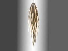
Flax Seed - Jeremy Cole
An ode to nature and and craftsmanship, the Flax seed is the newest addition to Jeremy Cole's ever-growing collection. Sleek in form, the cascading light captures the glowing light elegantly. The light comes in two colours natural (pictured) and white.
Mana, UK
British design studio, James Roberts Design, has completed the interior for Mana, a restaurant experience like no other in the heart of Ancoats, Manchester.
The Chester-based design studio is known for taking on challenging and interesting briefs and this project was no different. The wide open space of the restaurant, with its high ceilings and open kitchen located in the centre, is arguably reminiscent of a place of worship, with an altar of food at its core.
Using strictly British produce and with a constantly changing menu, allowing the chefs to create interesting and ever-evolving dishes, Mana has caused quite a stir in the run up to its opening with dishes including fried reindeer moss!
Brainchild of Chef Simon Martin, an alumni of Copenhagen’s famous Noma restaurant, Mana is a celebration of British food with the principles of Noma.
James Roberts, lead designer on the project, spoke to darc about how the project got started: “We had just finished working on an independent restaurant here in Chester which Simon Martin had also been working on. After seeing some of our work, he asked us to get on board.
“Simon had a clear vision for the project and had identified a location in Ancoats, but needed direction to translate his vision. He needed a creative team involved to drive it.
“He had the brand name ‘Mana’ with the definition: ‘The power of the elemental forces of nature embodied in an object or person,’ and he wanted to celebrate British food.
“So we had a definition of Mana but as with a lot of projects, we had to think about where to go with it. Using the background of Noma and Simon’s pictures and renderings of the building, we were able to pick up and run with an aesthetic we felt ticked the boxes.”
One of the biggest challenges the team faced was the building itself – a huge manmade box of glass, steel and concrete, located in the middle of Ancoats, an area of Manchester that historically became a cradle of the Industrial Revolution and as such, is still quite industrial. This needed to be transformed into a space where people could feel in touch with the elemental forces of nature.
“The restaurant building, the buildings around it, and the apartments above, smacked of new build and we contemplated how we were going to create Simon’s vision in this setting,” Roberts continued. “It’s an impressive eight-storeys high and the red brick reminds you that you are in Ancoats. It has its own character, its own identity and we weren’t trying to address that, we were looking to focus on the definition of Mana, on the food, and create an almost international setting.”
In order to create a space that transcends its location the design team had to find a way to shield the diners’ eyes from the outside world. Initially, this proved difficult to achieve due to enormous windows that curved along the exterior of the room.
“There was this huge glass window that left the build very exposed and worked against our vision of creating something natural and hidden away. We wanted diners to walk into an intimate space, an oasis, away from it’s urban setting. Almost like stepping into a wardrobe and finding Narnia.
“From an early stage we wanted to put curtains in place to make the glass wall translucent enough that you could tell something was going on inside but you couldn’t really capture what it was. You had to go inside to experience it. You weren’t shut off but it was certainly enough to tease and create privacy once inside.”
Installation of the curtains created a private restaurant in a bustling Manchester setting while allowing natural light to pour into the space. This helped strike a balance between nature and architecture, something Martin was keen for the team to incorporate.
“Simon made it clear early on that the word ‘cavernous’ was something to think about – implying nature and architecture,” says Roberts. “This was something we really focused on, but, at the same time, wanted to pay homage to people, and the word ‘cathedral’ came to mind. By creating this cathedral, this worship of food, we were blurring the line between nature and architecture. The lighting was a huge part of that.
Inspired by a friend’s work, Roberts had the idea to create a dramatic ball of energy that could help represent Mana and become a huge feature in the room that created ambient light and drama.
“Unfortunately (and fortunately in the end) budget and time forced us to look for an off-the-shelf design. While going around various lighting shows and design festivals I remember seeing the Puro-Single Brokis lights and thinking that I could do something sculptural with them. We decided to hang a large quantity of them in the space and have them cascading down creating shafts of light, almost like laser beams.”
The Puro-Single Brokis light is a boldly minimalistic variation on atmospheric pendant lights. The collection comprises of a vertical or horizontal light tube where the vertical tube has a single bell light suspended from it and the horizontal has dual bells suspended from it. The diffused glow of the tubes combines with that of the bells to elicit a dynamic ambience, while the alternating gloss and matte finishes provide a degree of provocation.
“We created the ambient light with the pendants; we used them to create the task lighting for the tables, and we created the aesthetic and feeling that we wanted, all from the same pendants. As a result, we were able to minimise the supportive architectural lighting.”
As such, a simple, clip-in, roof adaptable XAL lighting system has been installed over the kitchen space, which ties in with the plank flooring and furniture.
“Outside of that, we’ve got some spots at the high level, around the perimeter where the curtain is, to shine down on them and give them a bit of drama. But, largely speaking, at front of house, Brokis is the only light source.
“The drama of it all is key. The air conditioning creates a bit of air flow in the restaurant, which moves the lights and the curtain a small amount and reminds you that they are there. That dynamic is the definition of Mana. As you walk around the space, you also notice how all the horizontal lights cross the vertical spaces and create this place of worship, cathedral feel with the light installation gives the illusion of religious cross.”
When asked if there was anything he would change about the space, Roberts told darc: “We definitely had to sway in places but we hit everything that we wanted to. I’m really happy with what we’ve pulled together and done. Coming from a product design background, the importance of getting things right the first time is key. We convince the client that if they give us the time to plan everything out in the beginning, and consider all the ‘what ifs’, then we can negate any complications further down the project.”
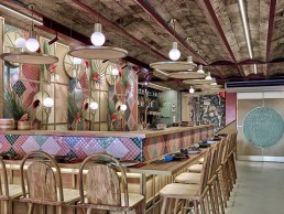
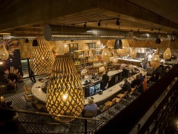
Kaikaya, Spain
Spain’s award winning creative consultancy, Masquespacio, has designed Kaikaya, the first tropical sushi restaurant in Valencia.
Inspired by the owner’s personal experiences living in Brazil and Portugal, the restaurant strikes the perfect balance between Japanese and Brazilian culture.
At the beginning of the twentieth century the first Japanese migrants arrived in Brazil to work in the coffee plantations and it was clear that the two cultures diets were vastly different.
Seeking their own flavours, the Japanese migrants combined the food of both cultures to create the Nikkei Nipo-Brazilian style. This style of cooking reached international fame and is still celebrated a century later.
This fusion of Japanese and Brazilian culture was an important part of the client’s brief. They wanted the design of the space to match the fusion of food between the two cultures.
Masquespacio’s Ana Hernandez told darc: “We connected with the client from the beginning and so it was easy to create the unique design she was looking for. The biggest challenge we faced was in finding suppliers who could produce the custom-made design we needed at a reasonable price.”
Masquespacio rose to this challenge and in terms of the lighting, managed to produce all the custom-designed pieces locally.
The first thing you notice when you enter the restaurant is the raffia circle lights that represent the hats used during Japanese rice collection. These are merged in an explosive way with colourful mosaic tiles and tropical plants.
“Decorative lighting was one of the key elements of the project,” says Hernandez. “From one side, we have the hanging lamps inspired by Japanese fans and on the other side we have Brazil-inspired parrot lamps. Both show a clear mix between the two countries.
“Almost all the lights were designed by our studio for this specific project and produced by local carpenter, Joalpa. The only other lights used were functional spots and LED strips by Onok Lighting.”
Once you reach the bar you encounter the mix of Japanese and Brazilian culture with a Japanese pattern on the bar itself and coloured patterns inspired by 70s Brazil.
The decorative lighting fit the client’s brief of mixing Japanese and Brazilian designs.
Japanese inspired lights surround the bar, while Brazil-inspired parrot lamps light up the counter bar, and the upper floor of the restaurant has a mixture of Japanese and Brazil-inspired decorative light designs.
These fixtures were teamed with architectural lighting so that the space could be illuminated to the exact levels required.
“The few interventions with the architectural lighting are mainly in place to add more light for cleaning but it also fits the idea we had from the beginning to create a space with dimmed light to create a warm atmosphere,” continues Hernandez.
The installation of the fixtures wasn’t plain sailing though, as the team were briefed by the client to maintain the original ceilings, beams and brickwork of the building as Hernandez explains.
“As we didn’t touch the original ceiling and beams it was not always possible to hang the lamps exactly where we wanted. We needed to have this in mind before starting to draw the layout of tables and seating options.”
Reflecting on the project, she continues: “We like the mix of lamps that represent Japan and Brazil but maybe we would have made the ones around the seating areas more authentic.
“It was one of our most custom-made, and maybe colourful, projects we have designed this year as the client was looking for something explosive and overwhelming.
“We managed to mix Japanese minimalism with Brazilian tropicalism, create custom-made features, use strong splashes and contrasts of colour, maintain the interior architecture and use plants to represent a jungle in the entrance and upper sections of the restaurant.”
Edelman, Dubai
The new headquarters of PR agency Edelman in Dubai has been decked out by interior design company Roar (formerly Pallavi Dean).
The Dubai office, a 1,000sqm-space located in the prestigious DMCC ONE JLT building, is the hub for Edelman’s creative and commercial teams; and builds on the success of Edelman’s Abu Dhabi office, which Roar designed and delivered in 2016.
“One of the big design challenges with Edelman Dubai was to create a link to their Abu Dhabi office, and yet give it a distinct character,” says Pallavi Dean, founder and creative director of Roar.
“They loved the ‘Cultural Villages’ concept we developed for Abu Dhabi: the idea of creating separate cities-within-a-city, such as Soho, Wall Street and Harlem in New York. But we couldn’t just repeat it. So, we took it to the next level in Dubai, adding layers of colour, texture and furniture to give each village more personality.”
‘Civic Square’ – the main reception zone – has a rich hospitality look and feel while the main work zone, where most staff sit, is more playful, rich with a vibrant ombre colour scheme. The ‘Urban Park’ is different again. This is a public space with an amphitheatre and cafe-style seating.
“The brief was to create a story for the office,” Dean tells darc. “They wanted a place clients could visit. A space that could showcase Edelman as a brand, while a point of attraction for employees. They wanted people to walk in and be wowed, something they could really own and be proud of.”
Edelman straddles two worlds, working to attract young, millennial creatives while appealing to its high-paying clients who are senior managers in banks, large companies and the government. Roar managed to bridge these two demographics with its ‘City Lofts’ space. This is the most mature, sophisticated space in what is otherwise a quite playful project. It’s a flexible hybrid of a meeting room, co-working space and a private office.
The client also wanted the office to have a feeling of Dubai, which the team achieved by commissioning various pieces of Emirati art. “It’s not very literal, and we didn’t put many patterns on there, but in the reception we commissioned an Emirati artist whose main installation is made out of the headgear that Emirati men wear, in the Edelman brand colours,” continues Dean. “Throughout the space we also commissioned other Emirati artists who used satellite images of the UAE downtown Dubai area to form amazing graphic artwork within the space. In the ‘Urban Park’ area we have this wallpaper made of palm leaf and you have to squint really hard to find the connection as it isn’t literal. The joinery features arches, as do many other forms in the space, and this is a subtle nod to Islamic architecture.”
The success of this project was no fluke, rather the result of a rigorous planning process.
“Whenever we start a project, we use a unique process called UXD, ‘User Experience Design’, and we feel that if we invest a lot of time doing the proper research and needs-based analysis for the client we wont have that many changes through the course of the design. Before we even hit pen to paper, we spend two weeks in different focus groups, middle management, employees, and even other stakeholders in the business, to really understand how they work and what they want the space to do for them,” said Dean.
This same planning technique was used by Roar on Edelman’s Abu Dhabi office. This time, however, the design team worked with Herman Miller’s workplace psychology team, using their ‘Living Office’ process. The result was a deep understanding of the needs of senior and junior staff, and a thorough, research-based set of guidelines to frame their design decisions. The psychology was based primarily on the use of colour after a study conducted by the University of Texas showed how colour impacts mood and wellbeing.
“We used a lot of colour in the space, which was very considered and responded to the creative team’s requests, such as a space where they could rest, and looked at how yellow can support productivity and creativity.
“For the finance team we used baby pink, if you look at all the research that’s coming out on colour psychology, it says pink calms people down. Therefore, if you are looking at big bills for the end of the month it helps that you’re in a baby pink space,” continues Dean.
Blue is the dominant colour in the entrance, reflecting Edelman’s branding, and green and pink are used in the Urban Park area. In between the two, gradient colour transition takes place, which serves as a wayfinding device and gives each department an identity.
Despite the extensive planning, as with all projects, there were still issues the team had to overcome in order to complete the project as Dean explains: “I think one of the biggest constraints, which I would actually say turned out to be a great opportunity, was the budget. If you have an unlimited piece of string, you can weave an amazing story and you can do limitless things with it, but we had to really consider our design decisions.
“We didn’t compromise on the ergonomic furniture, we got the latest and best chairs and Herman Miller desks. For the breakout spaces we found a really cool Danish brand that was very economical and cost-effective. We had a lot of the joinery custom-made here in the UAE, which was another saving point.
“We were very clever about how we used the lighting as well within the space. We had decorative feature lighting from Petite Friture and we found a really economical brand, Aromas del Campo, which makes beautiful lighting pieces.
“I think this is where we came in as designers. We didn’t compromise on the aesthetic of the project but we were clever about how we sourced and procured things.”
The lighting of the space, which includes pieces from Flos, Estiluz, Studio Italia, Aromas del Campo, DCW Editions, Seletti, Excloosiva, Petite Friture, Vibia, Zerolighting, Axo Light, and Mathieu Challieres, was as rigorously planned as the rest of the project. The Roar team knew exactly how to combine the artificial lighting with the office’s natural light.
“All the studies we looked at talk about how important the role of artificial lighting that supports natural lighting is to worker productivity. We worked very closely with a lighting consultant and before we even started with the decorative fittings we worked out all the lighting levels and that there should be a bare minimum between 300 and 500 lumens at any point in the workspace depending on where you are.
“We did the overall lighting strategy first and placed the lighting a good distance away from the windows in order to light the areas untouched by natural light. Then we looked at decorative fixtures that would support the overall lighting strategy. They looked stunning but weren’t going to provide enough light for an office space so we went with a track system throughout. We then added decorative lighting features purely for that reason, decoration.
“The lighting was also integrated in some of the art. We had made use of some fish wallpaper in one of the individual workspace rooms and in the eye of the fish we put a light. It’s not just thinking of lighting and how it can fit in the space, it’s how we can incorporate it with the design of the artwork.
“There’s another space which features monkey wallpaper from House of Hackney and we used a monkey light to give a strong connection between the two. In the urban park area we used umbrella style pink and green lights – the whole room is pink and green in fact, to give it an outdoorsy, beach feel. We also have palm leaves in that space and the lighting compliments that.”
In the ‘City Lofts’ area, a more sophisticated use of lighting was implemented, to counter-balance the more playful areas and to entertain their high-paying clients. “None of the upper management wanted their own offices so we created a dedicated office space upstairs that they can use as and when they need to. We ordered some beautiful Studio Italia Nano fittings for the reception area but then we commissioned an artist who needed a completely different lighting system. He wanted spots to drop over the reception, so we re-used the fittings and created a chandelier.
“We also have a lot floor lamps and spotlights that are positioned over some of the work stations. People work differently, some people might like the generic overview lighting and some people like task lighting. We took this into account and it affected the variety of fittings we used on the project.”
The finished product was a space clearly situated in Dubai and the perfect place for the PR agency to entertain clients and attract potential employees.
“We’ve had really, really positive feedback,” continues Dean. “I looked at my Instagram page recently and the CFO had written a comment saying: “Thank you so much, you made all our dreams come true,” and I thought “wow, I can do that?” All they asked me to do was make sure that clients can come for meetings and now their clients bring their own clients into the office space. For a PR agency, what more could you ask for?
“I think traditionally, with my own design aesthetic, I’m usually cautious about using colour. I like minimal palettes but we went all out with colour on this particular project. The carpet is colour co-ordinated with the furniture. We were way out of my personal comfort zone and I really enjoyed it and learned a lot about how colour can really impact how people feel. It’s not done in a kitsch kind of way, the transition of colour was interesting.”
The variety of lighting used for this project is vast and the placement concise. From spots and task lighting to decorative pieces selected to match the feel and design of each section, Roar have created a uniquely lit space for Edelman to be proud of.
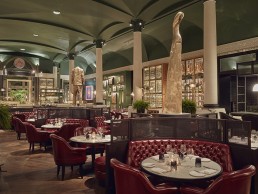
Kerridge's Bar & Grill, UK
Beginning his ventures with a Michelin Star rated traditional British pub in Marlow, Tom Kerridge has earned the respect of the hospitality industry through the opening of his fourth culinary space in the heart of capital at the Corinthia Hotel London.
Originally the site for the Massimo Restaurant and Grill designed by David Collins Studio, the Studio’s team returned seven years later to give the grand space a face lift for the new Kerridge’s Bar & Grill.
Along with David Collins Studio, dpa lighting consultants were brought in to complete the lighting design. Having previously worked with Corinthia Hotel London on different projects, the team were asked back to create a design that met the needs of the hotel’s overall aesthetic, budget, timeframe and ease of use.
The original design for the Massimo Restaurant and Grill was pastel toned with a central line of giant glass bauble chandeliers in the centre of the vast room. Kerridge had a clear vision to create a much more personal, intimate and romantic environment for his diners. Aware that the weight of bearing a Michelin status can put some potential customers off from visiting, Kerridge felt it was key to draw inspiration from his pub in Marlow that welcomes all into it’s comfortable dining experience.
Upon entering the Corinthia Hotel London restaurant, customers are welcomed by large barrels of real ale that present a sense of familiarity through scent and sight that immediately sets the tone for the dining space.
Simon Rawlings of David Collins Studio described their aim to “de-emphasise the structure of the room by pairing back columns, painting the ceiling very dark and creating an engulfing layout so you feel cosy everywhere you sit in the space.”
Taking historical inspiration from the Victorian aesthetics, the interior design team decided to paint the vaulted ceiling a deep green, which draws the high ceilings down to a more comfortable human level. It is also in keeping with the architecture of the Corinthia Hotel London, which is believed to be from the Victorian era.
In order to gather the vision Kerridge was proposing to the design teams, Rawlingss visited the Hand and Flower pub in Marlow to get a sense of the interior and lighting design in situ. Creating a similar mood evoking “heart and soul” was very important to Kerridge in the new location, as well as making a strong link with food and its preparation.
Rawlings explained: “The brief was to create a very welcoming space; a room that reflected Tom’s personality and food, with a nod to the Hand and Flowers in Marlow. The restaurant needed touches of nostalgia but still needed to reflect the building’s grandeur, and feel very British.”
Throughout the cosy and rich interior, chunky dark furniture compliments the dark green ceiling, creating an intimate dining experience. Sunken wine fridges are spot lit alongside open rotisseries and red meats hang in contained display cabinets.
Alongside, pieces of artwork that are personal to Kerridge are illuminated as points of interest, including the work of Kerridge’s wife, Beth Cullen Kerridge.
Shayne Grist of dpa lighting consultants explained to darc their involvement at the beginning of the project: “We needed to liaise closely with David Collins Studio to ensure that we were complimenting the vision they had, which was developed with Kerridge and his team. The key aim for the refurbishment was to bring the scale of the space down to a more human level; with a ceiling height of almost eight metres, the intention was to create a more personal dining experience and the lighting design therefore needed to support this concept.
“Our design work started at the end of April, the existing restaurant closed on 9th June and the new restaurant officially opened on 10th September, so an exceptionally short timeframe,”
“The changes to the decorative lighting from the existing restaurant to the new played a very important role in achieving the concept of bringing the scale down to a lower level,” explained Grist.
“The previous lighting scheme included four oversized globe chandeliers, which helped express the large volume above the dining and bar area. These were removed in the new design and replaced with ceiling apertures for discreet narrow beam spotlighting. Several existing decorative luminaires were retained in the new scheme, which utilise tungsten filament lamps producing a very romantic warm light.” Retaining this warmth in the lighting was felt very important to both David Collins Studio and lighting consultants dpa, in creating the intimate atmosphere.
“New gantry style structures were introduced at the bar counter and also for the new rotisserie counter, which were both functional and decorative,” continues Grist.
“Both structures feature globe tungsten filament lamps hanging behind reeded glass. At the bar, miniature recessed downlights in the underside of the structure illuminate hanging glasses, which create a sparkle as though they are purely intended to be lit. New floor lamps located on plinths and table lamps to booth seating were introduced into the dining and bar areas to further enhance the atmosphere at low level.”
Each area of the restaurant space was carefully identified and allocated a specific lighting fixture to suit its needs. Ceiling spots were integrated into large openings to allow each table to be individually lit, ensuring the food and service look good at all times. The architectural spotlighting was provided with narrow beam lamps and existing spotlights were re-lamped to narrow beams to allow for easing focus on dining, artwork and counter tops at low levels. Tungsten halogen lamp picture lights illuminate artworks in the bar area and sculptures in niches have miniature LED warm white spot uplights.
“I created a colonnade of torches through the room, which really, I believe, give the overall lighting scheme grounding, and add a very unique aesthetic to the room,” adds Rawlings.
Working within an old building did bring some architectural constraints for the project, as you would expect. A structural engineer was brought in to advise the design team with issues such as providing power from the lower level to the new floor lamps. This complicated process required the installation of new cabling to be placed in advised locations avoiding structural columns. Grist explained the installation of the new ceiling fixtures: “It was not possible to confirm if the new ceiling apertures, introduced in place of existing chandeliers, could be realised until the chandeliers were removed. Once this had happened, we discovered that there was an existing structure holding the vaulted ceiling in place, which clashed with our proposed depth requirements to ensure the spotlights were concealed. We were able to work with the contractor to create the necessary space around the structure, keeping these luminaries as discreet as possible.”
Each component is separately controlled and dimmed to create the ideal visual balance throughout the restaurant during both day and night. “As with many of our projects candles are as important, if not more important, that all the other lighting elements providing that soft dancing light across the tables and brushing people’s faces with a warm glow. The whole space has a beautiful softness and warmth both during the day and at night,” commented Nick Hoggett, dpa lighting consultants partner.
The overall British style that heavily influenced the Marlow pub was successfully carried through to Kerridge’s new location and was vamped into a sophisticated dining experience in this central London Hotel. The rich colours, fabric textures and lighting all reflect the decadent yet hearty food Kerridge’s team serve up.
“The success of the lighting is a direct result of the rich colour palette of the interiors, vibrant new art and dramatic sculptural pieces,” regarded Grist.
Manouche, Malta
Designed by DeMicoli & Associates, Manouche in Malta, is a craft bakery and bistro that pays homage to the traditional bakeries and bistro restaurants of Paris.
The client’s brief was for a design that re-created the ambience of a classic French bistro, with an element of finesse that echoed their creative menu. The brand’s ethos is to have hand-crafted food made from the highest quality ingredients that use a mastery of both French and European techniques.
“We, and our sister fabrication DFAB, were equipped to take on the client’s unique brief for a bespoke and hand-crafted design,” said Rebecca DeGiorgio, lighting designer for DeMicoli & Associates. “However, achieving the client’s expectations for a high-level design, with several detailed and bespoke elements, was challenging given the tight timeframe and budget.”
In order to achieve the concept of a bakery and bistro in one space, the design team had to create a subtle divide between the two.
“The bistro and bakery kitchens are divided via a central service pass which allows for ease of operations. The restaurant and bakery seating areas, however, are divided by the fixed banquette seating. The primary lighting in each area can be set and dimmed to delineate between their varied operational hours,” DeGiorgio explained.
Decorative lighting not only played a role in the division of space, it was integral to the Parisian bistro vibe the client was looking for.
“The role of decorative lighting was to create the mood of the classic French bistro and enhance the brand identity. The brief required a careful balance of warm, ambient lighting, in order to create a welcoming and relaxed environment for clientele. Introducing attractive focus lighting accentuated the food and handcrafted architectural details.
“The fittings also needed to encapsulate the combination of traditional and modern, and the main colour temperature was based on the palette of finishes and materials.
A reduction in budget halfway through the design meant that the team had to prioritise which lighting was integral and which fixtures could be let go. Once this was done the team managed to achieve the lighting they desired and the build went forward as planned.
“The Faro Marlin pendant light struck an aesthetic balance between the traditional and modern bistro, whilst its shallow shade gave us the opportunity to choose a decorative filament lamp,” DeGiorgio continued. “We tested a selection of lamps to find an appropriate model and settled on an incandescent filament lamp that was aesthetically pleasing yet comfortable on the eye of diners.
“In the bakery area, the Vistosi Futura pendant fitting was chosen and placed over the bar area. A seemingly unusual choice over a bar counter, the Vistosi Futura was chosen for its handblown aesthetics, which compliments the uniqueness of the food on display. These decorative fittings were teamed with Delta Light’s subtle rotational spotlights, Boxy RB, to provide focus lighting on displays and menu boards. Smaller Vistosi Futura pendants were added over the tables to further enhance the subtle division of space between the bistro and bakery.
“The main entrance was designed to juxtapose its surroundings, with wood cornices and paneling that pay homage to the traditional bistros and bakeries of Paris. The lighting choice of the Mullan Dyra Swan Neck IP65 wall light further compliments this theme. The material finish of brass was chosen, not only to compliment the palette of materials inside, but as it was well suited to an outside environment, where over time its beauty would increase as it weathers.
“Due to the restricted width and height of the terrace, ultra-small luminaires from Bel Lighting Sami were chosen to fit perfectly within the planters providing soft focus lighting on the table. The fixtures’ metal finish complimented the material palette of the restaurant.”
Architectural lighting at Manouche played a supportive role in highlighting architectural features, as DeGiorgio explained:
“Lighting also played an important role in highlighting bespoke, handcrafted architectural details that echoed the client’s menu and brand. One example would be the solid milled walnut wall, reminiscent of melted chocolate, working as a backdrop to the entrance and window display. The fall of light over these undulations creates an exquisite play of shimmering edges and deep, soft shadows that invite spectators to dip their fingers in. The fitting used was Luce & Light Snack 1.2 with a colour temperature of 3000k and a narrow beam of ten degrees. On location the fitting was tested for placement to achieve the optimum result. A soft spotlight was then added to accentuate the display. We opted for the versatile Neko Fusion and subtly integrated it into the joinery of the front facade.
“The main ceiling treatment in the restaurant featured a system of treated walnut panels and acoustic tempering. This called for a subtle and integrated lighting system that would keep the ceiling uncluttered. Due to the limited headroom, a shallow fitting, with a good UGR rating to ensure visual comfort for diners, was chosen. The Mars CV Hydra LD10 IP20 fitting was the perfect solution to this problem. A warm colour temperature of 2700k, together with a 60 degree beam, ensured that a soft glow was cast over the dining area. The black finish of these fixtures blended them into the soffit design.
“Nestled spaces were created in-between columns, forming a series of fixed banquettes. The feature walls in these areas were accented with linear LED strip lighting, embedded in the furniture, to enhance the vertical walls within the bistro. The limited headroom below the bulkheads complimented the banquette seating and provided an intimate feeling for gathering and eating. This provided the opportunity for decorative focus lights on tables using pendant lighting.”
Reflecting on how the design process went, DeGiorgio put much of the success down to the collaboration between the involved parties.
“What made this project so unique was the collaboration between the architects and lighting designers from DeMicoli & Associates, the sister fabrication studio, DFAB, and the talented owners and chefs of Manouche on their first restaurant venture. A close working relationship between the team and the client established a dynamic design process that allowed us to assist not only in the design of the restaurant but in establishing their brand identity.”
Throughout the space, the design, furniture, lighting and materials echo not only the classic French Bistro, but the hand-crafted, creative and innovative work of the talented chefs. Manouche blurs the boundaries between food and art and so to the design has strived to take their food as a material for artistic production.
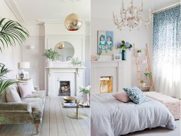
Private Residential, UK
Interior designers Russell Whitehead and Jordan Cluroe – better known as 2LG – are renowned for their residential design services – offering simplicity, elegance, functionality and their signature use of colour.
One of their most recent (and on going) projects, Perry Rise, is a Victorian detached house in south-east London and just happens to be the couple’s live / work space. The challenge for the pair was to sensitively renovate the home while creating bespoke spaces that allow the couple to express themselves and showcase their design perspective.
darc spoke with the design duo about the process: “I guess you could say it all started when we bought our first flat years ago – this was our first move into the design world,” Whitehead and Cluroe say. “We did a renovation project and turned it around really quickly – it was amazing and exciting but also the most stressful 18 months of lives and we always said to ourselves, next time let’s spend time on the house – let’s have a romantic experience and enjoy the journey.
“So really, this house was righting the wrongs of the first one – we wanted to express ourselves slowly. We have now owned the property for four years and we’ve really been luxuriating and spending time on the process. Some of the classic historical interior designers made their name out of working on their own homes, which then became their calling card. We wanted to have that opportunity as well – the house was a business move as much as it was going to be our home.
“The day we moved in we sat down with an A4 sheet of paper and planned out our dream version of the house, allowing our initial ideas to be explored on paper… A lot of things have changed since then, but a lot of those initial thoughts have remained. The house itself was very instrumental in the design process because it already had a very strong look. Its previous owners clearly had a passion for interiors as the house had pink walls throughout, deep green carpets and William Morris wallpaper in the dining room. In the loft we also found a stash of old interior magazines from the 50’s and 60’s as well as remnants of fabrics.
“Those colour palates really informed the new design – we wanted to hold on to the first impact the house had on us, after all it’s what made us fall in love with the property. As such, the house took us in a much more decorative direction than we’ve ever been before in terms of wallpaper and patterns, decorative panelling in the living rooms and chandeliers. It was a very different move for us, but we felt the house was taking us in that direction so we went with it.
“The downstairs toilet was bizarrely the first thing we worked on – probably because it was the smallest and felt like a chunk that we could handle while we were doing the roof and all the windows. We unearthed decorative wallpaper under several layers and it was a bit of a love / hate moment… it was the ugliest thing we had ever seen, but at the same time we thought to ourselves ‘we love this house, so how do we make that us?’ it was a ditsy floral paper from the 50s… this led to our collaboration with Custhom – we would have never chosen to do a decorative floral if we hadn’t bought this house.”
For Whitehead and Cluroe, using the space as both a home and business premises required a fine balance in terms of design, making sure they had various spaces within the house that were very much ‘theirs’. The bedroom and bathroom for example, are considered their sanctuary – meaning whatever photo shoots or events might be happening downstairs, or whatever rooms they might be prepping, they have always got that space. “We worked on those rooms first so we could shut the doors on the rest of the house,” they say. “Because the house has been chaos for the past four years, we needed a space to retreat to. It’s a very hard working house and we have a lot of clients through the doors, so having those break away areas is really important.”
While the house does takes inspiration from its previous owners and its Victorian roots, as you head towards the back of the house the designers have injected contemporary features and an open plan layout to the kitchen that doubles up as a working space day-to-day.
“We have kept the front sitting room enclosed because again, it’s our sanctuary and where we spend time in the evenings and then we opened up the back of the house so that we can spread out and in terms of working life, it feels really nice to be able to use the kitchen throughout the day.”
This deliberate shift in design style also informed the lighting specified throughout the house with a mix of reclaimed, vintage inspired and contemporary fixtures. When you first enter the house, CTO Lighting pendants feature in the hallway and Tom Dixon pendants can be found in the living room, while an original vintage lighting piece hangs in the downstairs toilet.
“The CTO fixtures feature a simple brass rod and globe design and sit very happily within a period setting and provide a new twist on an old classic. For the living room we brought Tom Dixon copper round pendants from our previous property, as we loved them so much. The fixture has become such a design classic that we’ve only just switched it up – we’ve upgraded to an electric blue version, which is really striking in the space.”
Moving through to the back of the house – this is where the contemporary really kicks in, featuring 2LG’s lighting collaboration with Cameron Design House – the Capsule collection. “The guys at CDH have a different aesthetic to us, which was quite nice and makes it interesting for collaborating… they typically have a more lux, high-end style and we brought them an idea that was a bit more ‘pop’, which they then put their twist on and elevated for the final version of the collection.
“The Capsule collection is the most disruptive element in the house, which was the plan from the beginning. Stanley Kubrick was one of the major influences for the live / work space in the initial story for the house and with this lighting range, it gives the space a really modern and sexy interpretation of the strip light.”
Moving upstairs, a refurbished twelve-arm porcelain chandelier is the centrepiece of the master bedroom while the bathroom saw 2LG work on another lighting collaboration with Sarah Colson and William Martin.
“Our initial inspiration for the bathroom was Superman’s cave of solitude… I’m sure Sarah and William just thought we were crazy comic book geeks but the thread was really stalactites and the idea of us having our own cave of solitude… a retreat. We wanted to play with the way glass shards can hang or stand and we designed three different versions of the bathroom lights – a wall light, table light and a double ended version with shards coming out of either end. It’s really beautiful and offers a soft, gentle decorative light when you’re in the bath.”
In terms of architectural lighting support throughout the house, despite having used it quite heavily in other projects they’ve worked on, 2LG reveal it’s not something they have really implemented at Perry Rise.
“It’s a funny one,” they say. “We did a project in Blackheath at the same time as doing our own home and there was quite a lot of architectural lighting in that and we got really excited about it… but in this house we’ve just not gone there and it hasn’t really been a conscious decision. We do have some recessed spotlights in the office and kitchen that highlight specific points, but other than that, it’s all decorative – wall lights, pendants, table lights. We allowed the house to take us in a more retro direction and it worked.
“Our approach to lighting is very instinctive and we’ve used our project experience from the past five years to make informed decisions in this house. The kitchen and lounge are good examples of how lighting can create different ambiences… generally when we’re not working we prefer a much more diffused light. It’s very atmospheric and relaxed in the lounge compared to the kitchen where we spend a lot of our time working.
“I think looking back on the work we’ve done so far, one thing people always say to us is ‘wow it’s all happened so quickly’ – people don’t realise the amount of planning and hours that have gone into making it ‘look quick’. Its all been about making sure all the bits fit at the right time and giving ourselves enough time to plan it and be happy in it.”