

Empatia
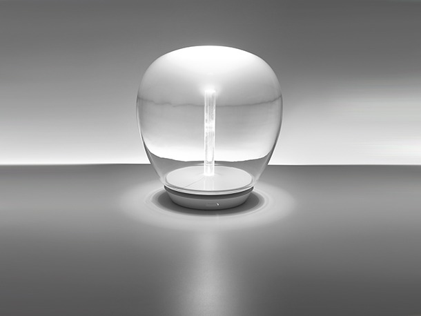
Designed by Carlotta de Bevilacqua and Paola di Arianello, Empatia elegantly combines the great traditions of Italian glass-blowing and the latest LED technologies. Artemide worked closely with Venetian master glass blowers to create a unique craft object whilst not compromising on light efficiency. The resulting Empatia combines a high performance LED light contained in a smooth glass dome – fading from clear to opaque - that will reflect light without glare. The Empatia is available in 3 different power levels and sizes: Empatia diameter 360mm x H382mmm /28W; diameter 260mm x H289mm /21W; 160mm diameter x H191mm /14W.
Glam
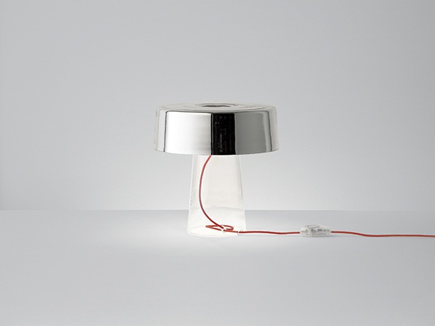
Designed by Luc Ramael in 2005, Glam table lamp remains one of Prandina’s most iconic pieces. A reinterpretation of the typical table lamp, it comprises two blown glass elements: a cylindrical diffuser with a flattened closed top and a truncated cone base that supports it and holds the hidden bulb support. The opal white, red, black or mirror finishes of the diffuser can be combined with an opal white or transparent crystal base. The character of the lamp - the formality of its appearance - and the quality of light it provides is dependant of the glass combination chosen.
Hollywood Icicle
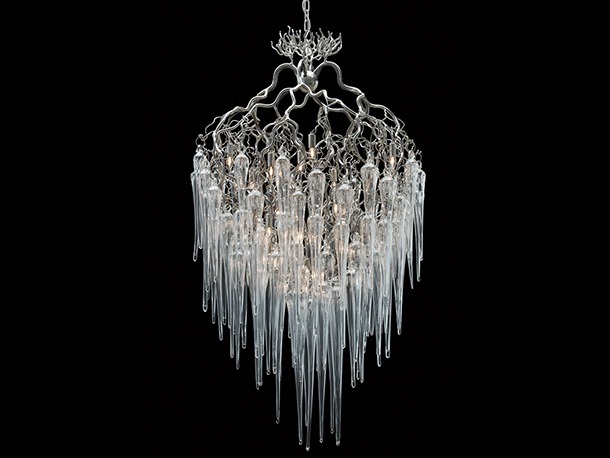
In the creation of the Hollywood collection, Annet van Egmond and William Brand took inspiration from the diversity of tree forms they encountered over their years of travelling the world. For this special edition of the series, the slender, nickel plated branches are hung with glistening hand blown glass icicles.
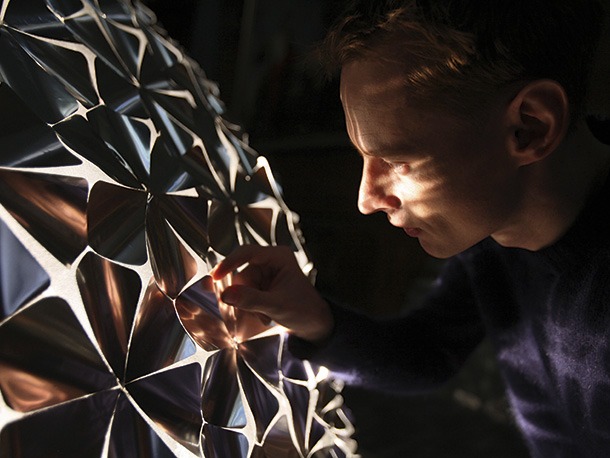
Petrona
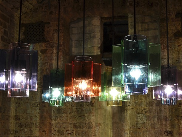
Inspired by children’s educational toys, two basic shapes in primary and secondary colours are combined around a light source to form a complex shape of hand-blown glass and gunmetal-patina brass. Looking through both glass elements, a tertiary colour is created.
Pia
Modern in style and original in design, the Pia collection was created for Lucis by Daria Podboj. It comprises a series of shades made from Czech hand-blown triplex opal glass, their shape inspired by popular fruit sweets. The range includes suspension, ceiling and wall lamp versions.
The Pia collection exhibits the precise craftsmanship that went into its creation.
Neverending Glory
Designed for Lasvit by Jan Plechac & Henry Wielgus, the Neverending Glory collection reinterprets the opulence of traditional candle chandeliers as single-piece glass pendants. The iconic chandelier shapes are taken from five of the world’s most eminent concert halls and theatres; La Scala in Milan, Palais Garnier in Paris, the Metropolitan Opera in New York, the Bolshoi Theatre in Moscow and, of course, the Czech Republic’s Estates Theatre in Prague.
Shoal
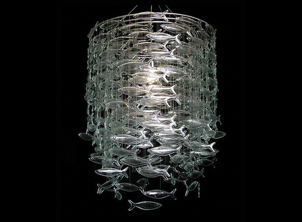
In contrast to the warmth that emanates from the translucent bodies of Scabetti’s English fine bone china sculptures, their foray into hand-slumped glass brings a new aesthetic to Shoal, the Bromley’s iconic luminaire. The depth of shadow created by refracted light on the glass evokes visions of shimmering waters.
Utrem Lux
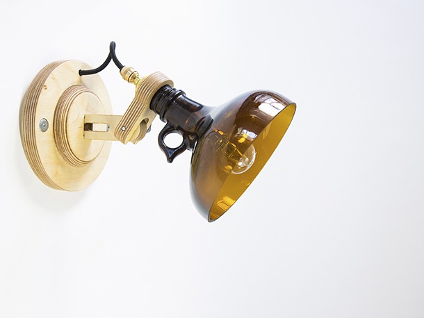
DeGross Design & Innovation is a multidisciplinary design studio based in West London. In line with their ethos of sustainable, environmentally sound solutions, they created the Utrem Lux series. Made from reused glass bottles that had been discarded behind the DeGross studio and, wood offcuts from their next-door neighbours, each piece is made individually, by hand. Following the huge rise in demand, the team now source bottles from Labwaste Ltd.
Pieces are available as pendant, desk and wall light versions.
Great Northern Hotel
The Great Northern Hotel has a place at the heart of British railway history. Originally opened in 1854, a textbook example of early Victorian Italianate architecture, it marked the arrival of a new wave of London railway hotels. By the time of its closure twelve years ago, those glory days were long gone. Now, following a £40 million renovation, the building is welcoming guests once again.
Positioned at the entrance to King’s Cross station, its clean-cut elegance stands in striking contrast to the gothic grandeur of its neighbours, the George Gilbert Scott designed St Pancras Station and Renaissance Hotel.
Given the success of the finished project, it is startling to discover that this Grade II listed building was close to being demolished as part of a wider redevelopment of the area. Long dilapidated and unloved, its reprieve came when master-planners decided to incorporate the hotel into the sweeping glass and white steel canopy that now forms the new entrance to King’s Cross station. Indeed the Great Northern’s curved structure is now part of the new concourse roof’s outer spine, its ground floor housing ‘Kiosk’, the hotel’s high quality coffee and hot-sandwich shop, and the GNH bar, which links in to the hotel itself.
It was Jeremy Robson of RAM who, as the hotel’s new owner-operator, took on the challenge of bringing the building back to life. “The restoration and re-opening of the Great Northern Hotel has been a dream of mine for many years,” he says. “ I saw the quality in the original architecture and realised what a careful renovation could contribute to the major regeneration being undertaken at King’s Cross. The hotel has an enchanting beauty and enjoys the most spectacular of locations in one of London’s most exciting neighbourhoods. I wanted to recreate something of real and lasting value; a London landmark that would serve visitors and Londoners alike.”
Inside, the Great Northern has been sensitively refurbished to preserve the building’s historic character, while also introducing a high-end, modern feel. David Archer and Julie Humphryes of Archer Humphreys Architects were tasked with creating the interior concept, adapting Lewis Cubitt’s original architecture to create a classical yet contemporary look. Naturally, lighting is an essential part of their design and, while the architectural illumination by Firefly Lighting Design plays a key role, it is the inclusion of artisan decorative pieces that provide the distinctive finishing touches to each space.
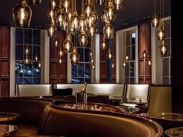
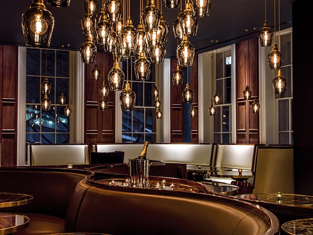
The majority of the ground floor is given over to the GNH Bar. Red velvet curtains, black and white tiling and a 25 metre pewter bar combine to form a glamorous setting that echoes a golden age of international train travel.
“The idea of having a very elaborate and quite decadent bar on a station platform is something that’s more common to Paris or New York than to the traditional British Rail waiting room,” notes David Archer. He points to Le Train Bleu at Gare du Lyon and the Oyster Bar at Grand Central station as a point of reference for the team as they forged the bar’s romantic interior.
The room is completed by two hand-made chandeliers from Bohemian glass manufacturer Preciosa, following a 19th Century design once popular with Europe’s aristocracy. A deep coffered, engraved mirrored ceiling allows the pieces to be seen from all angles, exaggerating the room’s already significant height and duplicating its rich interior.
In contrast to the bar, the hotel reception occupies a discrete corner of the ground floor. Its polite, 1930s aesthetic is complemented by three Estadio chandeliers from Santa & Cole. These circular pieces comprise metal frames tightly suspended from the ceiling and crowned with solid glass blocks that introduce a sparkle to the space.
The hotel’s restaurant, Plum + Spilt Milk, takes its name from the traditional cream and purple livery of the London and North Western Railway’s carriages. Located on the first floor, the space is surrounded by full height sash windows that provide a series of impressive views, be it the new King’s Cross Piazza, the modern glowing glass concourse canopy or George Gilbert Scott’s iconic clock tower. Over 150 bespoke smoked-glass pendants hang at different heights across the room. Hand-blown to create a subtly nuanced collection of individual pieces, each illuminated by a traditional ‘squirrel cage’ filament bulb.
The pendants were created by UK-based glass studio Rothschild & Bickers in dialogue with Archer Humphryes.
“The concept in Plum + Spilt Milk was to make something that was a little like Whistler’s ‘Nocturne’, where you have the deep hues and colours of the blue ceiling and walnut panelling alongside this twinkling gold cascade of light,” says Archer. “The lighting was laid out very carefully, aligning it with the seating, which was developed to fit the space, the clientele and the dining concept, so it’s all integral to generating a complete environment.”
www.archerhumphryes.com
www.gnhlondon.com
Christopher's London
When the Monte Carlo Casino opened in 1856, gambling was considered to be something of a dubious pastime often found in seedy pubs and other dens of iniquity, yet the newly plush and gilded gaming halls of Monaco began to alter this perception, after all the Monte Carlo casino was bankrolled by a cardinal, and not just any cardinal, a cardinal who went on to become Pope.
When news of gaming and its newfound Mediterranean glamour reached England, the Victorian gentlemen of London, always eager to be on the front foot in matters of fashion, flooded to London’s first licensed casino. The great city’s answer to Monte Carlo was to be found amid the fruit and veg of Covent Garden (and why not, it worked for an opera house) in a former paper mache factory with an ornate façade added on to create the required sense of style. The building still stands today and is home to that stalwart of the Covent Garden dining scene, Christopher’s.
After twenty years and more of culinary service, during which time the restaurant became a favourite lunching spot for media moguls and West End impresarios, Christopher’s has recently reopened after receiving a thorough re-fit.
The building’s opulent new interior, designed by De Matos Ryan and created in close collaboration with Christopher’s owners, eschews the current climate of austerity and financial abstinence that has been a mark of recent times. The new sumptuous interiors hark back to a bygone era of glamour and revelry, which celebrate the ornate and exceptional character of the existing building, summoning up the atmosphere of heady decadence the building has embodied since Victorian times.
In creating sumptuous interiors De Matos Ryan has evoked the real and imagined history of the building. The new Christopher’s comprises three distinct areas for drinking and dining; a ground floor Martini Bar offering cocktails and informal dining, an elegant dining room on the first floor and a club room for private events on the lower ground. Each of these spaces has been characterised whilst establishing a clear tonal and material palette continuity throughout. The entrance hall sets the tone with its charcoal grey walls, restored marble floor and domed ceiling highlighted with warm silver ornament.
The Martini Bar is conceived as a theatrical and atmospheric drinking parlour, with a palette of materials expressing the rich patina and alchemy of cocktail mixology. The double height space is dramatised by a 6.6 metre long onyx sharing table leading up to the main focal point of the room, a gold mirrored and brass-clad bar. Bottles are displayed against a faceted smoked gold mirror backdrop cut with the repeat abstracted motif of a martini glass. Light levels are kept deliberately low with a dynamic installation of suspended Delightfull Coltrane tube pendants, sculptural lights hung at varying lengths from adjustable magnetic cable, animating the gold mirror backdrop. Coltrane Wall Lights by Delightfull have also been used to excellent effect, mirroring the sleek pendants while adding a sense of modern creativity.
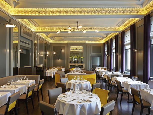
The dining room is located on the first floor and comprises two interconnecting rooms. Diners arrive via a grand spiral staircase, dramatically lit by three large glowing faceted pendants by Serge Mouille. In contrast to the Martini Bar this is a much brighter space with expansive windows overlooking London’s Theatreland. The classic contemporary two-tone grey panelled walls are framed by a theatrically lit silver gilded ceiling cornice. The cornice is reflected in antique mercury mirrored panels and accented by flashes of warm gold velvet in the predominantly grey leather upholstery, a look designed to maximize magnificent views across Waterloo Bridge from the smaller dining space. Slender black metal wall and ceiling lights, again by Serge Mouille, a company well known for angular, insect like fixtures that often feature several arms, punctuate the two dining rooms and complement the dark tones of the painted timber floor, allowing the original architectural features and the food itself to take centre stage.
The Club Room for private events is concealed within the basement and is accessed by a discreetly lit reconditioned former service staircase. The stairwell space is impressive, the winding stone stair and wooden banister meshing well with the original tiling in the lower hall. The Foscarini Plass feature pendant, which rests perfectly in the open space between ceiling and stair, adds a touch of modernity.
The dining space is classic and restrained with mid-century inspired pendant and floor lamps. Mirror lined walls give the illusion of greater space in this more intimate setting and a ‘gold nugget’ polished brass bar adds drama. Delightfull Sinatra pendants and a floor lamp with bespoke shades are also featured. The sculpted Sinatra floor lamp, fittingly named and placed in the former casino, a setting in which the fixture’s namesake felt most at home, is a sculptural brass creation with three dark red aluminium shades on three movable arms, adding a versatility, which allows the lamp to be easily integrated into any natty space.
The new Christopher’s achieves a sensitive balance that is difficult to accomplish, the interior offers a thoroughly modern look whilst summoning the glamorous memories of the building’s past.
Café Rouge
In the classic Parisian film Hotel du Nord, the actress, Arletty, famously replies to her partner after he announces he is desperate for a change of scene, ‘Atmosphere, atmosphere, do I look like an atmosphere kind of girl.’ It may have meant nothing to Arletty, but atmosphere is a crucial factor in the creation of a successful restaurant and when the owners of Café Rouge turned to AfroditiKrassa to redesign the chain’s look, the design agency in turn looked to the Hotel du Nord for inspiration.
The real Hotel du Nord, made famous by the film, still stands on the banks of the Canal St Martin, now much gentrified in comparison with the docker’s hostel it used to be. Once an industrial heartland, the area now flourishes with urban, bohemian Parisian bistros, all prefect fuel to Afroditi and her design team.
The Tragus Group approached AfroditiKrassa in the Spring of 2012 with the task of revolutionising the iconic restaurant. The studio approached the project with sensitivity to the established Café Rouge brand, yet with a real zest to inject creativity and innovation.
The brief was largely focused on introducing Café Rouge to a new, younger audience in an increasingly competitive market place, and
with this in mind AfroditiKrassa created a new brand world and design concept based on heritage, authenticity, quirkiness and humour. Four pilot sites were launched just before Christmas of 2012, in order to gauge the response of the Café Rouge customer base and beyond. The results were impressive with large sales increases recorded.
A mix of lighting was used in the roll out of the new design nationwide, with Firefly Lighting Design providing the architectural lighting scheme and AfroditiKrassa the decorative design. Lamps from Holloways of Ludlow are a new standard in the guidelines of the brand and can be seen in restaurants across the country. A polished brass external wheelhouse wall light from Holloways as well as a wheelhouse lobby pendant light, also in polished brass, have been used to fine effect on the restaurant’s exterior. The lamps from Holloways are complimented by white LED garlands from Power Road Studios in Chiswick, which suit the large French windows and wood panels, hallmarks of the exterior design.
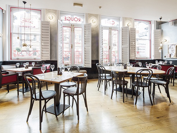
The interior of the bistro is fresh and airy, with multi-coloured tiles, red leather booths and rustic furniture working well together. Little trinkets of French culture have also been scattered around the interior, Laurent Voulzy record sleeves lean against iconic Jacques Tati film posters, accompanied by an obligatory Eiffel Tower or two.
Clusters of Lee Broom crystal bulbs play an important role in the interior design. The brass and crystal pendants each feature a G9 LED lamp and hover over the dining tables from gold coloured twisted flex, creating an almost supernatural effect.
Lighting from another British designer, Tom Dixon, also features in the interior of many of the new restaurants. Round sconce wall lights by the designer jut out from the bistro’s sides helping to illuminate many of the French ornaments on display, the pressed glass bowl wall light features a silver crown incandescent bulb. Tom Dixon has also provided a brass pendent void light with a hidden bulb that hangs down from the restaurant’s periphery, creating a warm and welcoming light.
A number of different chandelier options were considered by AfroditiKrassa to form the lighting centrepiece of the dining room. For the Hampstead arm of the restaurant chain a chandelier formed with red cable was chosen. The Red Connection Ball Pendant light from Shoreditch Lighting makes for a creative eye-catcher that blends seamlessly into the decor. Other chandelier’s from CB2, Litecraft, JSPR, Light in the Box and Foundry Light and Design were considered and feature in other Cafe Rougé interiors around the UK.
The new interior creates an atmosphere you want to be a part of, the first step towards the required alchemy that always makes for a memorable meal.

Profile: Daan Roosegaarde
“In terms of the economy, in terms of energy, the whole system is crashing and a new world needs to be discovered, somehow,” says the Dutch designer, architect and artist, Daan Roosegaarde. The trick is in finding the ‘somehow’ and in today’s tangled world, trapped in-between massive technological advancement and economic despair, with the principles of society getting lost somewhere amid the fray, we should be grateful Roosegaarde is willing to take on the task.
The key to getting out of trouble has always been society, people coming together to improve circumstances, but today real social interaction is being challenged by social networking, an impersonal experience dressed up in shimmery clothes. “I don’t believe in computer screens,” says Roosegaarde, they are one of the nightmares of our age, we call it social networking but all I see are people looking at screens.”
This increasingly digitalised world spurs Roosegaarde into action, his work in part is about reuniting people with people, tearing them away from their laptops, phones and tablets. “There are separate worlds developing,” Roosegaarde says, “there is the analogue world, Europe standing still, stalled building projects and a credit crisis, and faced with this we are connecting our dreams, our emotions, to a virtual cloud via Facebook and Twitter, there is a growing separation, a missing link and I’ve always felt the urge to join these things up.”
He attempts to do this by making our environment, the spaces people use, more human. A continuing project called Dune has won Roosegaarde praise since its first incarnation was staged in a suburban pedestrian tunnel in Rotterdam in 2007. The project is a ‘nature hybrid’, lengths of fiber optic cables creating a swaying riverbank of glowing reeds, kitted out with sensors that react to the sounds of people when they walk past. Utilising just 60 watts the project revitalized a grim tunnel by bringing people and architecture together. It prompted conversation in a space usually reserved for shuffling through with your head down, people even had their wedding photographs taken with Dune in the background.
Dune is one of many interactive projects that Studio Roosegaarde has developed in public spaces, projects that have included Marbles a set of large coloured moulded shapes that interact with people via sound, light and colour in a public square in Almere and Sensor Valley, Europe’s largest interactive sensor artwork, which interacts with human motion and touch in the Dutch city of Assen.
A more recent project, Crystal, is comprised of illuminated rocks, ‘Lego from Mars’ as Roosegaarde terms them, little pieces of glowing crystal, containing a single LED, that can be picked up and used to write and build with. “There were two agendas with Crystal,” says Roosegaarde, “one was public lighting, instead of saying here’s a streetlight, a pillar with a lamp high above you, Crystal is personal, it’s like a candle in the Middle Ages, you had the light with you then, it was hand held, you walked with the light, you can do that with Crystal.”
“The second agenda concerns communication, you can write with the crystals, you can leave messages behind, you can share them, you can steal them, they only work within an certain area, they need a small rubber power mat to charge, but with the open sourced way we made the crystals, it is possible to make your own, so you can make one for your girlfriend, then you can go to the exhibition and suddenly the crystal will burst into light like a wish fountain.” Crystal will be placed around Eindhoven during the upcoming Dutch Design Week.
One of Roosegaarde’s most visually stunning projects is Lotus, a living dome made out of hundreds of smart flowers that fold and open in reaction to human behaviour. “Making architecture that comes alive,” Roosegaarde says, was the inspiration behind Lotus. “The project feels natural, it doesn’t copy nature but behaves like it, it feels very organic, but is completely industrialised, Lotus is very sensual,” the designer concludes, “and that is very important.”
Lotus has been placed in different locations, one of the most effective being the 17th-century Sainte Marie Madeleine Church in Lille with its beautiful Flemish Renaissance and Baroque interior, a whole host of painted Christs and Apostles coming to life when the dome is tripped into light by movement. “The church is a beautiful ornamental building,” says Roosegaarede, “but nobody went there, like a beautiful model at a party, she was lonely, because everyone was a bit scared to talk to her.”
The splendour of Catholic piety in all its seventeenth century glory doesn’t bring you closer to the Almighty, but instead overawes and leads, ironically, to a feeling of disconnection. “So we made the church dark” says Roosegaarde, “and when you walk by and the dome illuminates, you literally scan the whole building, you are rediscovering this ancient world, you are seeing what was already there in a different way.”
Lotus was also displayed in Jerusalem in Zedekiah’s Cave, a onetime quarry and the first Masonic lodge in the Holy Land. “The cave was more brutal,” says Roosegaarde, deep underneath the Holy City of Jerusalem, it was an administrative nightmare to get the piece set up, but when it was it turned visiting the cave into a very powerful, almost spiritual experience. I like updating places like that.”
Light tends to be an important part of Roosegaarde’s art. “My work is about behaviour and the type of interaction you create between people, between your body and landscape,” he says, “light is a really good medium for that. Most likely we are made of stardust anyway, so there is an intriguing relationship between light and us human beings, it is a very elementary component.”
As Roosegaarde hares off from one project to the next, he leaves behind him a set of reenergized public spaces, which fire the imaginations of the people who use them. “I’ve always wanted to make environments people can add things too,” Roosegaarde says, “that they can change, or be a part of, I think that is the kind of world that we are going to live in, one where technology becomes our second skin, our second language.”
As long as Roosegaarde continues to champion technology as something that can bring people together in the flesh, rather than through the phoney medium of a computer screen, he might be nearer to solving the mystery of that ‘somehow’ than you think.