
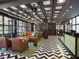
RoomMate Hotel, Global
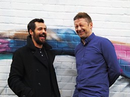
(Global) - Room Mate Hotel is growing from strength to strength with various openings over the past twelve months. darc looks at just four of it's latest offerings and how lighting works to create a friendly yet individual and luxurious, boutique atmosphere.
Bringing an innovative approach to the tourism industry, Room Mate Hotels, founded and chaired by Kike Sarasola, has expanded substantially in the past year, opening a number of new locations globally.
Working with various interior designers, each hotel has it’s own personality yet adheres to the brand’s philosophy – with design as an integral and distinguishing feature.
The creative process begins with the selection of a property: a city centre location plus a building with heritage that provides a story and personality to the project. Designers are invited to create bold, individual and welcoming spaces that, alongside a friendly service, impart a feeling of staying at a friend’s home.
In April last year, Room Mate Valeria, Malaga and Room Mate Giulia, Milan, were added to the hotel’s repertoire. RM Valeria features interior design by Victoria and Sylvia Melian Randolph and is located in the heart of Malaga, offering 61 rooms and a terrace with stunning roof top pool. The third RM hotel to frequent the city, Valeria’s rooms are inspired by its location and decorated in seafaring shades.
Working with lighting design practice Studio Ibu, Melian Randolph Interior Designs looked to incorporate decorative lighting elements that were a modern take on Andalusian classics. In the public areas there needed to be enough light for work, but that wasn’t overwhelming, while in the bedrooms there had to be a choice of lighting to keep clients content with more of a subtle ambience.
“Decorative lighting is of utmost importance,” commented the interior designers. “It can make or break any project; Studio Ibu chose elements that would achieve what we had in mind for the technical parts as they could offer us a wider variety of elements to choose from. The choices in lighting available are unlimited and a lighting designer can narrow it down to follow your specifications.”
In terms of challenges at Valeria, in some areas of the building the ceilings were very high and in some parts very low. It was important the lighting felt consistent throughout so the team worked to adapt the same lighting elements to the different heights.
“Lighting is essential to the interior design and can mask any flaws or technical issues that cannot be solved, while enhancing important features,” continued Melian Randolph. “It contributes immensely to the general atmosphere of a space and can change a mood entirely. In a hotel project you can never be too bright or to subtle… there has to be enough of each.
“We loved working in Andalucia, an area we know well and we were able to incoporate a traditional Andalusian courtyard into a more modern environment with black pebbled floors and a moorish fountain. As well as this, the glass coloured light sculpture - designed by Atelier Mel in the breakfast room is bold and fresh.”
The design for RM Giulia comes from award-winning architect Patricia Uriquiola, who lives and works in Milan and took a personal keen interest in the project. Referencing the city of Milan and taking inspiration from typical Italian domestic spaces, she added a vintage touch to create welcoming, familiar surroundings.
For the hotel lobby floor, Uriquiola selected the same pink marble as found in the Duomo of Milan. The predominance of this colour in her designs has become one of her trademarks, while throughout the hotel guests can admire works of different Milanese artists, photographers and illustrators. In terms of lighting for RM Giulia, Uriquiola made use of lighting fixtures from Flos, Fonderia Innocenti, Marset, OLuce and Servomuto.
For RM Anna in Barcelona and RM Grace New York, the interior design services of Lorenzo Castillo were called upon. Discussing the lighting for both, Castillo told darc: “The lighting is without doubt, the most important element of a project because if the lighting is amiss then everything else will be a disaster, regardless of how intelligent the concepts are. The lighting has to be adjustable, not excessively bright and comfortable for reading or working.
“I use a great deal of indirect light that is as warm as possible. I have always been a defender of incandescent lighting as opposed to LEDs but thankfully, LED lighting has evolved and now has warmth that is similar to that of traditional light alternatives.
“In general, my interior designer facet also extends to the light fixtures and I combine classic styles with a modern sense of lighting. For example, one of the most striking elements of the Grace hotel is the lobby, where more than 40 brass fixtures designed by myself, have been installed along the walls. They are reflected in the mirrored ceiling to create a fantasy world of lights and golden hues inspired by the night. They’re kind of 70s New York glam!
“We did something similar in the bar at Grace with a golden, plant-shaped wall lamp from Chelsom Lighting. The light and how it reflects in the mirror is extremely subtle and welcoming.”
For Castillo, while lobbies were once places for the sole purpose of welcoming guests and checking in and out, in today’s hotel environment, while they should remain functional there also has to be a surprise element to them. In the same way, hotel bars are increasingly integrated into the lobbies, so that the reception area becomes an experience.
“You have to feel welcomed yet feel the atmosphere of the hotel through its decoration and people,” says Castillo. “The lighting must be inviting and cozy and the decoration must have some kind of magic where guests and locals have the desire to chat and have a drink as if they were in a fashionable bar or pub.
“A couple of decades ago, hotel bars and restaurants fell from grace but that’s something which has completely changed thanks to the importance given to their decoration and lighting.”
Reflecting on RM Anna, Castillo tells darc that one of this hotel’s strengths lies in its lighting: “Take the brass and glass columns in the breakfast room for example, they create a classic Hollywood style.
“I also designed the shell-shaped wall lamps that look like they’re straight out of the film ‘The Little Mermaid’. It is very practical to work with professional lighting companies for projects such as this, which is why we turned to British company Chelsom for Grace and Dutch company Eicholtz for Anna.”
Having worked on previous RM hotels, Castillo reflected on some of the challenges faced with these two most recent projects. “Grace took much longer than expected due to certain issues with the construction company and countless permits that were needed in New York. Anna on the other hand was completed in less time than planned, although the design concept was underway for close to three years as the project was more complex. We had already renovated the Grace hotel eight years earlier and the aim was to move up to a higher category. In comparison, Anna was a completely new project that involved converting an office building into a hotel that was to become the company’s flagship establishment.
“In recent years there has been excessive use of neo-industrial styles with Nordic, Swedish and Danish influences, when designing Anna I wanted to veer away from this trend and return to Catalonian Mediterranean roots, Dali and classic Picasso, who searched for inspiration in Catalonia’s Grecian-Roman fountains in the 1930s.
“Grace was an extremely complicated project because it is housed in a tall, narrow building with a very cold, industrial feel and little natural light due to its location in the heart of Manhattan. This was addressed through the use of colours and prints, as well as carefully designed lighting.
“The building that houses Anna was much more straightforward thanks to its notable architecture, extensive facades and location on Barcelona’s Ensanche. The challenge was to define a different style unlike anything that was being created in Barcelona at the time.”
Thanks to considered and inventive design by all the teams involved, all four new hotels have their own personality while representing the Room Mate brand and ethos - taking the hotel chain to the next level in hospitality.
www.lorenzocastillo.org
www.melianrandolph.com
www.patriciaurquiola.com
www.talasur.com
www.studioibu.com
The Balancing Act
Studio Piet Boon creates bespoke contemporary architecture, interiors and product designs. Renowned worldwide for its exceptional craftsmanship, quality and vision, darc takes a closer look at the man behind the practice and discovers a philosophy based on the delicate balance between functionality, aesthetics and individuality.
ZAANSTREEK
Is a beautiful region very close to Amsterdam in The Netherlands. I was born and raised here and feel the rich cultural heritage and typical mentality of the region has influenced me greatly in life. Zaanstreek is known for its typical innovative spirit and ‘getting the job done’ mentality; it was here where painters, woodworkers, carpenter, masons and other master craftsmen turned smart entrepreneurs and tastemakers as early as the 15th Century.
SINCE I CAN REMEMBER
I have always been fascinated and interested in the world around me, different cultures, food, people, various materials, building techniques, crafts, architecture, you name it. I also really enjoyed working with my hands growing up and so I pursued my studies at the technical school. After I graduated I began my career as a carpenter and shortly after that I started my own building contracting company.
I FIND INSPIRATION
In people, cultures, architecture, fashion, nature, cinema, art… Everything actually. I find people such as Rick Owens, Frank Lloyd Wright and Wes Anderson, amongst others, very inspiring as well.
MY PHILOSOPHY
Of balancing functionality, aesthetics and individuality grew out of a frustration at designs by others. They were either ill-thought-out or aesthetically not in tune. I started designing myself, taking full ownership of the design concept and together with my business partner, Creative Director Interior & Styling Karin Meyn, I was able to develop the building contracting company into our multidisciplinary design firm; Studio Piet Boon.
OVER THE YEARS
The studio has grown into a global design company, delivering exterior, interior and product design solutions for both private and corporate clients. True to our roots, our headquarters are located in the Zaanstreek and our international versatile design team consists of interior and spatial designers, architects and stylists. We are recognised for our multi-disciplinary design services and our talent of balancing functionality, aesthetics and individuality into one of a kind design experiences. We put focus on the interior-exterior connection and make optimal use of space and natural light.
OUR WORK
Is recognisable for how we line spaces as well as our use and view on dimension and shapes. Initially we started out with designing private homes but over the course of 30 years we have broadened our scope of work from private homes to include corporate spaces, hospitality venues, residential developments, products and kitchens. One of my most memorable projects is the first penthouse we did in New York city - a 700sqm home. This was a long time ago and since then we’ve done many projects in New York, but you just never forget the ‘first’.
THE CORE INGREDIENTS
That define the Studio Piet Boon experience are based on a thorough analysis of how we create balance between functionality, aesthetics and individuality, making it suitable for every discipline and applicable to any industry. As I mentioned, our work is known and recognisable for how we line spaces, our use and view on dimension and shapes. Every element is very important to create the balance and harmony we aim to achieve in our work. One of the hallmarks of our style is that you, down to the minute detailing, experience the same atmosphere and signature throughout the entire design.
LIGHTING
Makes or breaks a space. Decorative lighting and lighting in general have a huge influence on how people experience an interior design, perceive a space and are directed within a design, not to mention the functional importance of light. By adding or subtracting lighting you can, amongst endless possibilities, create all kinds of moods, put focus on elements and play with colour, something we feel is very exciting. We always advise to invest in a good lighting scheme - it will be one of the best decisions you can make, along with comfortable furniture.
THE JANE IN ANTWERP
Saw us work closely with Beirut-based .PSLAB – a site-specific design house and manufactory that is invested in the production of sensory experiences. Our intent for the interior design at the Michelin-star restaurant was to invest in the artisanal feel of the existing historic chapel and propel it forward with a contemporary underground atmosphere.
We incorporate lighting and decorative lighting in all of our projects. The lighting elements designed by .PSLAB play a crucial role in how guests experience The Jane. We were given carte blanche by the client, Michelin-star chef Sergio Herman. The ‘piece de résistance’ in the centre of the restaurant is a gigantic chandelier of 12 by 9-metres radius with over 150 lights. Weighing 800Kg and suspended from one point in the ceiling, the chandelier dips to 2.75m above the ground and then disperses back up to fill the space above the dining area with tubular tentacles each ending with a glass bulb. The chandelier was created in such a way that it contributes to the intimate and ambient divinity of the chapel interior.
OUR HEAD OFFICE
Is another project where we worked with a lighting design studio, this time Studio Molen. The light object that hangs in our entrance is a true piece of art that fortifies our design. We always try to orchestrate elements in a way that allows them to complement each other and eventually enhance a design. Another example is the ‘Ginger blimp’, again by Studio Molen, that hangs in the entrance of our project Huys in New York.
REINVENTION
Is something we do constantly – drawing inspiration from everywhere, progressively applying new contexts and insights to our design values. We’re working on all kinds of exciting projects and while I can’t disclose too much, one in particular relates to a high-end hotel design in Amsterdam.
Pic: Richard Powers
WonderGlass rises to the top
(France) - WonderGlass presents 'Rise and Drift' by Tangent in Paris.
The installation 'Rise and Drift', designed by Hideki Yoshimoto, focuses on the organic shapes of water bubbles and the refraction of light. Tangent have also explored the complex way light transmits and reflects inside different materials.
This work captures a dynamic moment and is reminiscent of air rising through the water hinting life underneath, a presence that we cannot see but just imagine. The display captures natural bubbles that contrast inside solid, geometric shapes. When light is casted, it transmits and reflects in a complex way inside the material, resulting in a beautiful visual effect.
The different fixtures created by Tangent for the installation can be used as space dividers, lights, or chandeliers that cast beautiful shadows with light, including sunlight.
Putting the 'Deco' in decorative
(UK) - Bloomsbury Ballroom confirmed for darc awards / decorative awards party.
The very first darc awards / decorative will be held in the stunning Art Deco setting that is London's Bloomsbury Ballrom on 18th May, 2017.
The night itself will have a somewhat Prohibition-era feel to it and will celebrate the very best in decorative lighting, while turning the traditional awards ceremony concept on its head.
No more stuffy, boring sit down dinners, instead we throw a party with free food and free bar to celebrate the talents of the industry, which is why the winners are voted for by YOU, the design community... even better, every designer who votes is entitled to a free ticket to attend the awards party.
And don't forget to enter! This is your opportunity to shout about projects and products you've been involved with. Whether you're a product designer, lighting designer, architect, or interior designer - make sure you're involved in the only awards in the world dedicated to decorative lighting and enter your work now!
For more info and to enter a product or project into the awards (£100 per entry) visit the darc awards website below. If you are interested in finding out about sponsorship opportunities please contact Stephen Quiligotti on: s.quiligotti@mondiale.co.uk
Tick-tock, tick-tock...
(UK) British designer Ben Rousseau presents Tempus, his latest kinetic light art piece at Maison et Objet.
In an age when time has never been so precious Rousseau says he wanted to celebrate its importance by creating a more beautiful way of representing it. Tempus meaning time in Latin is the new collection of illuminated timepieces.
Each piece is primarily a kinetic artwork that doubles as a futuristic clock without the usual construction methods to represent the time. Tempus uses state-of-the-art digital LEDs that illuminate three different rings of segments in sequence to collectively represent a 12-hour time path. The central ring is the seconds units, once all 60 units illuminate then the first in the minutes ring illuminates. Once all 60 minutes segments illuminate the first hour segment will illuminate and the cycle continues.
Rousseau worked with Glaast at RVA, specialists in glass printing technology, to create a collection of unique antiqued glass clock faces. This striking surface can be teamed with a full spectrum of light colours, from subtle to vivid, to provide a choice of design to suit any interior scheme.
Launching the collection with a classic circular formation at 900mm diameter Tempus is offered as both a wall hung option and floor standing option in a broad range of luxury materials.
Double showcase for Martinelli Luce
(Italy) - Martinelli Luce presents new lighting concepts in both Colgone and Paris.
At this year's IMM show and Maison et Objet show, two new versions of Martinelli Luce's Pipistrello lamp were presented - Pipistrello-Med, a medium size and Minipipistrello, a cordless version table lamp version.
Retaining all of its original charisma while being restyled in a size perfect for lighting desks and work stations, the new offerings give diffused light and features including an adjustable height, with glazed stainless steel telescope.
Emiliana Martinelli explains: “We wanted to propose a new version of the Pipistrello table lamp with a diameter of 40cm and a height ranging from 50 to 62cm. This is a continuation of the tribute to Gae Aulenti, and also a way of showing how the design input behind this lamp is being constantly renewed without altering its authenticity.”
A Natural Remedy
Designers Mac Cox and Ben Rigby are possibly one of the lighting world’s best kept secrets. Working under the collective Haberdashery, Helen Fletcher discovers how their new venture will push the studio’s philosophy to the next level.
Lighting design agency Haberdashery might just be one of the industry’s best-kept secrets, with the studio’s prolific output of lighting sculptures having remained strictly behind (residential) closed doors for the past nine years. Co-founders Ben Rigby and Mac Cox are the driving force behind the 24-strong team that makes up the London-based studio and with their very different routes to market and design influences playing an important role in the company’s style and techniques, it’s easy to see how Haberdashery has grown into something quite extraordinary.
Having met on a film set in 2007, the duo’s creative story starts much earlier in life with Rigby growing up in Reading, UK and Cox in Mexico and Spain before heading to London at the age of ten.
“I was a quiet, introverted child fascinated by drawing and I fanatically compiled hand drawn guide books to birds of prey, the deep sea world, poisonous animals and the like, before getting swept up in the romanticism of exploration with further reams of sketches and illustrations about space, travel and lost worlds,” Rigby tells darc.
A steady passion for creativity saw Art and Design as Rigby’s main subject through school and he went on to study a Foundation Art course at Thames University, all the while teaching himself photography. “I went on to study editorial photography at the University of Brighton,” he continues, “but this was a course I didn’t finish as I embarked on several real world projects that took me away from day to day studying and has left me with fewer qualifications on paper than anyone I work with!
As a particularly insular subject, photography allowed Rigby to continue to look at the world through his own porthole and explore the narratives he could uncover through the medium of light. “It has given me a great eye for detail,” he says. “Along with an obsession for narrative, for the subtext and the hidden meaning behind things put in front of us”.
“My career in design was a strange evolution; through not earning enough money through photography I ended up working as an art director on film sets and advertising shoots and then moved into working as a self-taught director of photography where I eventually met my business partner Mac.”
For Cox, an education at Central St Martin’s College in London, doing a foundation and then degree in Product Design, saw him make the move straight into the film industry, working his way from Art Department Runner to Art Director within a few years.
“I mainly worked on Pop promos for people like Travis, Audio Bullies and 50 Cent to adverts for Persil, Walkers, Mini etc and was fortunate enough to work on the new Thunderbirds film and Tim Burton’s Charlie & The Chocolate Factory,” Cox tells darc. “I vowed never to enter the design world after university but seven years later we started Haberdashery. I decided I wanted a bit more creative freedom and to play with bigger budgets to feed my imagination… It was the perfect mistake!
“When we first started I felt overwhelmed with the range of things I liked, who influenced me and what direction to take our work. I was a sponge for everything; getting older, those influences have refined – I guess it’s the process of discovering what you like and what makes a design yours that makes this happen.”
With Cox drawing inspiration from the likes of Bridget Riley for her playful obsession with colour, simplicity and composition; Ai Weiwei for his political artistic rhetoric and dogmatic execration; and Mark Rothko to name just a few, Rigby is inspired by studios that work together to create something unique, telling darc: “In my twenties, studios such as Tomato (graphics) and Heatherwick were inspirational. These days I appreciate visionaries such as Olafur Elliason or James Turrell because they achieve such clear, timeless results.
“In terms of actual aesthetic, I look to the world around me – the textures, patterns and beauty found in the everyday. Things such as light falling through a curtain across a bedroom wall can have incredible subtlety and beauty to it, or texture found in nature that can be applied to a process we are using in a project…. Beauty can come from the most unexpected places.”
It is this inspiration found in nature that brings Haberdashery’s latest venture to life. Whilst publically known for their bone china Leaf range of lighting sculptures (covered in issue 15 of darc), contemporary lighting products have not come out of the Haberdashery stable until now, with all other works to date being 100% bespoke. Inspired by the memory of natural light, Evoke is a collection that calls on light manipulation in order to tell a simple story.
The first product in the Evoke range is the Canopy pendant, which launches at Top Drawer in London, January. Recreating the effect of dappled light falling through a forest canopy, a specially designed LED display creates a slowly animated pattern of light across a hand blown glass shade, with task lighting falling on the surface below.
“The pendant brings the memory of the forest into your space and is the first in a series of lighting products meant to inspire and stand out in a market that can sometimes seem a little one-dimensional,” says Rigby. “Our sculptural work causes the viewer to slow down and adopt their own time, leaving the busy outside world behind. Our new products will harness a little of this magic and Canopy is typical of our approach – it is a beautiful form, communicating subtle, narrative driven lighting generated by a rather clever piece of lighting IP. A custom designed LED display plays an animated GIF passing light through a special polycarbonate lens and chemically milled mask, elevating a decorative modern pendant into a real centrepiece to any space.”
“We want a viewer to have the same feeling we get when something magical happens in front of our eyes,” adds Cox. “The audience response is a highly rewarding one and is the best sales tool you can get. For this reason we are now working on far more public sculptural projects in order to showcase our ideas to the wider world, and hopefully through our new Evoke collection the public can also afford to buy into the mindset of Haberdashery.”
Seen by many in the industry as artists, designers or makers, Rigby and Cox would ideally prefer their work do the talking, but this has been challenging for a secretive (until now) entity such as Haberdashery. “The challenge we face as artists and designers is to communicate a consistent philosophy through our creative process,” says Rigby. “If we do this, we can approach a broader range of projects without losing a sense of what we stand for and the viewer can understand who we are and what matters to us.
“2016 has been a year of soul searching to uncover what this philosophy really is and how we can show the world,” adds Cox. “We want to ensure the DNA of our design thinking runs through all types of projects from a landmark public sculpture to a contemporary lighting product, even though budgets might be several zeros apart!”
With a philosophy based on play, you may wonder how this functions in the workplace… Well the design studio adopts a very flat company culture, resisting the temptation to become just another corporate structure. Instead, Rigby and Cox champion, ‘what if’ moments and encourage the designers to be ambitious wherever possible, always challenging the norm.
“A strong part of our culture is trust,” says Rigby. “We try to empower our designers and let them know that mistakes are part of the process. Without understanding our mistakes we do not improve and some of the most beautiful design journeys may never have started. From experimenting and being prepared to fail comes the ability to push on further each time.”
While the design duo might share the same work ethic and creative optimism, their very different ways of working is what makes them unique. “It’s good to be different as we can learn from each other,” says Rigby. “Mac and I share a feeling for when to take risks and when to hold back, it is essential to take big leaps of faith in design but to be calculated in when you take them. We are both along for the thrill of the ride as much as the end result.
“This can bring conflicts for sure, but these are a natural part of the process; if we are not challenging each other then we are selling our clients short. It is the idea that counts, not the ego. Mac and I have strong ideas but equally, work hard to draw the best out of every team we work with, as this leads to a greater chance of an exceptional design solution.”
“Because we experiment every day with materials, processes, form, narrative etc. we have to consistently adapt the way we work,” adds Cox. “Each and every project has its nuances and all of our clients are different. Putting that all into the mix means that our process inevitably changes, so adapting is in fact our process. We have many mediums for expressing an intent, whether that’s a five-second sketch, a physical model, a walk through render, a trip to a museum or laying out a full scale plan on the floor.”
Looking forward, Rigby and Cox have ambitious plans for the design studio… bigger, bolder statements of narrative led sculptural works that embody the micro and the macro; the ability to create wonderful, meaningful forms with exquisite detail; innovative customisable decorative systems such as their Leaf range, and now contemporary products that harness their creative energy such as the new Canopy pendant. As Haberdashery, the design duo have created a highly evolved philosophy that can be applied to any space or opportunity, as Cox explains: “Every lighting product has a different reason to be conceived, and that is normally dictated by the need for that particular space, but we always believe that regardless of the product’s task it should be beautiful, well-considered and evoke something in you. Whether it is task lighting, ambient, to simply light itself and be decorative, it must do any of those purposefully.”
“When we create a bespoke sculpture we are looking to create that ‘how on earth did they do that’ moment in the viewer, that slows down time and absorbs them in the moment,” says Rigby. “A good product should have a little sprinkling of this, combined with a clean, resolved simplicity that the design process can bring. It should be a beautiful object, a useful light and have real personality”.
“We want to stand out from the crowd but in an intelligent way. We’re not interested in responding to fashion but rather to an intelligent and innovative interpretation of the materials and technologies to hand, with a little Haberdashery magic mixed in for good measure.”
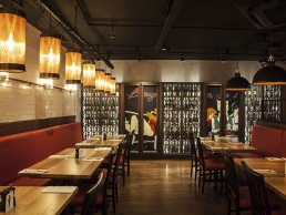
Burger & Lobster, UK
DesignLSM and The Light Corporation bring a warm, comfortable atmosphere to Burger & Lobster's laest London location.
Leicester Square, London, is one of the newest homes for restaurant chain Burger & Lobster. Featuring interior design by DesignLSM and bespoke lighting from The Light Corporation, it forms part of the brand’s current expansion along with the openings of London sites in West India Quay and Holborn.
The restaurant is housed beneath the five-star W hotel’s striking exterior, in an arresting double height space with a vast mezzanine upper floor, featuring an open kitchen and dining area. DesignLSM worked to retain some of the site’s original features including the grand brass bar front, central spiral staircase and timber flooring, carefully curating these existing elements into the brand’s unique design scheme.
Inside the restaurant, a dazzling hanging light chandelier takes centre stage, designed to be evocative of the luxury hotel’s external lighting facade. The signature features of lobster tanks and bold banquette seating create an instantly recognisable connection to the Burger & Lobster brand, accompanied by the addition of a refined and relaxed downstairs bar and lounge area.
“The idea behind the look and feel of the restaurant is that diners walk in and immediately know they’re in a Burger & Lobster location,” says Tim Henderson, Director at The Light Corporation. “Having worked on every restaurant since the first opening in Mayfair, we have key signature pieces that we use across all restaurants, which includes two styles of pendants and a ribbed glass wall light. We put these in every branch, along with illuminated lobster baskets so there’s a direct palate of information available - on top of that we’re given free reign when designing the rest of the lighting elements.
“We have worked very closely with DesignLSM on all the Burger & Lobster restaurants and this most recent location was no different,” continues Henderson. “The team at DesignLSM has got a very good feel of the brand and how it can move forward. When we’re working together, we’ll bounce ideas around and make sure that all the features we put in work well together.”
For Henderson, the key role of the decorative lighting at Burger & Lobster is to bring a warm, atmospheric feel to the space; with all of it bespoke fixtures made in-house by The Light Corporation. “We’ll always use warm colour temperature lamps at Burger & Lobster, while the lighting is heavily zoned and makes use of a dimming system that we designed and specified particularly for the project,” he tells darc. “It means the walkways can make use of different light levels to the tables, and then can be different again to the features and the wall lights etc. We’re able to create a lot of scenes for the restaurant to use throughout the day, so whether customers are dining at lunch, early evening or later on at the weekend – they’re able to set up different moods and atmospheres with the lighting.
“It’s a very warm and friendly lighting scheme with the central feature giving a really warm focus to the space. The central chandelier feature spans through two floors so you can see it from any level. It has a real interest to it because at first, it’s difficult to work out what it is… but then in certain angles you can see that it’s clearly a lobster.”
Working simultaneously on all three London projects was no mean feat, with just twelve weeks to transform initial designs into a finalised project and it took a lot of energy from the teams at DesignLSM and The Light Corporation to ensure they all came together as intended and finished on time.
Looking back on the project, DesignLSM’s Projects Director Andrew Harwood concludes: “It has been a pleasure to work with Burger & Lobster and assist them with their ambitious growth – we have relished the opportunity of developing the brand and interiors as they have expanded, creating a truly recognisable personality and engaging environment. We look forward to continuing this exciting and enjoyable journey with our client.”
Pic: James French Photography
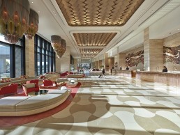
Sacred Circles
(Australia) - Design firm Bates Smart found what it was looking for in lighting design firm Willowlamp's work, with lighting sculptures that take their inspiration from the ancient Indian Mandala.
Drawing on the Mandala as an ancient Indian symbol of unity and circular wholeness, Australian-based Bates Smart turned to South-African lighting firm Willowlamp to create its most stunning art chandeliers to date at Crown Towers Perth.
Bates Smart’s Interior Design Director Jeff Copolov worked closely with Associate Director Kendra Pinkus, drawing on a wealth of experience designing luxury spaces, to create the highly refined lobby, cocktail bar, atrium and ballrooms.
Copolov commented: “TheCrown Towers brand is synonymous with the ultimate in luxury, so it’s important that the guests feel that in everything they see and touch.”
The scale of space at the Crown Towers Perth was vital to Bates Smart’s scheme, allowing guests to feel a sense of occasion and to celebrate the grandeur of the hotel while experiencing a strong connection to the wider resort landscape beyond. Copolov commissioned Willowlamp’s Creative Director and Founder Adam Hoets to design a bespoke series of four chandeliers to feature in the lobby of the hotel. These pieces, each weighing three tonnes, were unveiled for the first time in December 2016.
Hoets commented: “We were first contacted about the project in 2014. Bates Smart discovered a lighting design we made for an office building the UAE, which was a massive extruded geometric Mandala. The initial brief for Crown Towers was four giant-sized 6m diameter Mandalas. This would have been virtually impossible but we adapted the design and developed four clusters of three fused Mandalas.”
The Crown Towers chandeliers are a customised variation of the existing Willowlamp design, the Mandala No. 1, inspired by sacred geometric patterns. The Crown Towers variation was broken down into clusters, with each cluster encompassing approximately 40,000m of ball chain, lending each considerable weight. Illumination for these pieces comes from 150 LED G9 lamps per cluster, chosen to maintain a modern look and provide a spark only offered from small, intense lamps.
The design and installation of four clusters on a seven-metre high ceiling posed a new challenge to Hoets, with the pieces being the largest Willowlamp has ever created. “The main challenge was the sheer mass and scale of the installations,” he said. “Each drop cluster is 5.5m long and 3.5m wide, and weighs three tonnes. The installations had to be installed flat against a ceiling at 7m working height with no lifting platform able to reach that height.”
The design was extremely complex due to the constraints in the sheet size of the laser cut metal frames. The highly intricate geometric pattern had to be segmented into separate elements, which needed to be done in a way that allowed the three Mandalas to intersect one another.
“The hidden bit of genius is the system we developed to cut the chain to the required lengths,” continued Hoets. “When you consider that the geometric patterns made by the extruded chains curve into two planes, you can then imagine how difficult it was to develop a cutting schedule of chain lengths for each of these chains where the form is curved in two planes. In the end, we had the ingenious idea of turning a CAD drawing into a type of database – that was the hidden solution. But at the outset of the project, I had sleepless nights trying to imagine how it could be done.”
The next design challenge was the massive weight of the chains. “We couldn’t have all the chains going right to the ceiling, and it also would have been very difficult to cut such long lengths of chain accurately,” said Hoets. “Our solution was to have a hidden dropped tier within the mass of the light, which meant we could assemble the upper and lower tiers separately. This allowed us to work on separate parts simultaneously, thereby dramatically reducing assembly time.”
The installation itself was another extremely challenging aspect of this project. The design team, engineers and project managers came up with numerous ideas before arriving at a workable solution.
“We eventually decided to install each of the clusters’ three components individually. The first step was to attach structural fixing plates to the underside of the ceiling. A huge gantry with electronic pulleys and hoists with cables leading up into the ceiling would then lift each of the three modules into place, one at a time. This had to be designed and engineered for this one purpose and was an engineering challenge in itself.”
Throughout the process of working to create this challenging installation, the brief itself went through its own developments. It changed from being four 6m diameter single Mandalas to four 5.2m long, 3m wide and 3.5m drop cluster Mandalas. “The shape of the profiles also had to become more feminine and tiered. I transposed the profiles in the archways of the Taj Mahal as I was working on the design while on a trip to India, giving the tiered shapes a beautiful form.”
As a result of a painstaking and careful collaboration with a client who recognised that lighting is a fundamental design feature, Willowlamp was able to produce an awe-inspiring installation. At Crown Towers, light ties in with space seamlessly, not as an afterthought, but as an integral element to creating the ultimate guest experience.
www.batessmart.com
www.willowlamp.com
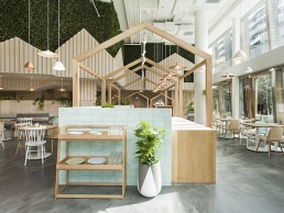
Kitty vs Burns
(Australia) - Biasol: Design Studio used Kitty against Burns to bring together two girls that inspired Melbourne's iconic Skipping Girl in a structured yet playful restaurant.
Nestled below Melbourne’s iconic Skipping Girl sign, restaurant group Pell Five’s Kitty Burns combines both the tranquillity of the Yarra River with the quirkiness that remains key to both Melbourne design and dining. Kitty Burns allowed Australian design firm Biasol: Design Studio to combine their experience in interior, product and branding design to create a unique space and character for the restaurant.
Inspired by the Skipping Girl story Kitty Burns’ interior design reflects the character of five-year-old Kitty Minogue whom the original figure was modelled off, and Alma Burns who was later also attributed to the sign. The contrasting elements of the Kitty Burns personality are creatively woven into every design element – Kitty’s fun loving, playful personality juxtaposed with Burns’ more serious and structured side.
Pell Five’s brief was fairly open from a conceptual point of view; their main objectives were to take advantage of the sites surroundings, respond to their business as an all day eatery and be highly functional in operation. Biasol: Design Studio wanted to establish Kitty Burns as a home away from home for the residents of the Haven apartment complex; a pitched roof design was incorporated into all elements of the project.
Biasol: Design Studio Principal Jean-Pierre Biasol tells darc: “We played with both scale and displacement of the roofs, forming a 3D effect that we utilised to create intimacy throughout the various dining spaces. The home concept was also carried through into the brand identity we created for Kitty Burns.”
These pitched roofs also played on the Kitty vs Burns theme, where Burns brings in the physical structure and clean lines, closer inspection reveals that each pitch is at a different height, paying homage to Kitty’s playful side. The lime washed timber bulkheads forming the house shape above the dining areas are lined with 3D cladding detail, allowing natural light to create a shadowing effect, changing the colour of the timber depending on how much light comes through.
Two main areas of the bar include the coffee bar and the elixir bar, individually housed within framework that ensures each area is distinctly identifiable, aiding on a practical level with ordering and service. The bar is lined with handmade pale turquoise tiles framed by a strong overhead structure constructed from Australian natural timbers. Kitty’s light-hearted theme is reflected in Biasol: Design Studio’s bespoke pendants that hang down through the bar’s timber frame, and are suspended all around the venue at varying heights above tables and elsewhere, creating a sense of unity between spaces. The coffee bar features a waiting area as well as a mobile coffee cart that echoes the design language of the main bar.
Each element of the design was considered in the context of the space, with the custom designed and manufactured pendant lights conveying both the playful and serious sides of the brand most effectively. Biasol commented: “The light fittings were created in copper and white tones, both sympathetic to the overall colour palette of the space. Each light was created in two parts allowing us to mix and match for a playful finish.” Throughout the overall outcome of Kitty Burns, the lighting design was carefully considered to create a strong atmosphere, whilst trying to maintain the balance between natural light that fills the space, giving it an open and airy feeling.
With tranquil surroundings and view of Melbourne’s iconic Yarra River, Biasol: Design Studio took advantage of that tranquillity to create comfort and a sense of serenity.
“We introduced a strong element of greenery inside to embrace the surroundings, making the dining spaces feel one with the environment. It was important for us that the space would never compete with its surroundings. When you look at the Kitty Burns interior, it really flows into the exterior, and vice versa.”
Fusing mischief with structure, frivolity with discipline, Kitty Burns embodies the iconic Skipping Girl woman in one light-filled space.
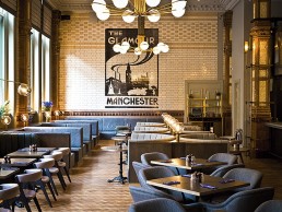
The Refuge, UK
The Refuge bar & restaurant at the newly renovated Principal hotel in Manchester, uses decorative lighting to introduce pockets of space and a cosy atmosphere into the previous vast business hall of the Refuge Assurance building.
The renovated Palace Hotel in Manchester, UK, is now the flagship hotel of Starwood Capital’s new luxury hotel group ‘Project 1898’. The grade II* listed building was originally constructed for the Refuge Assurance Group in the late 1800s, and subsequently extended twice in 1910 and 1932; the building was converted into a hotel in 1996.
With it’s striking red brick and terracotta cladding, and iconic clock tower, the hotel is a landmark building in Manchester, situated close to both Oxford Road train station and Deansgate tram interchange. Internally, three buildings each have their own character, but are linked with the use of timber panelling and extensive coloured tiling throughout. Newly named the Principle Hotel, this most recent renovation began in early 2015 and continued until September 2016 with the completion of the final rooms and the food and beverage areas.
Throughout the hotel, whether looking at the rooms, the F&B or the conferencing suites, the design has been driven by a desire to accentuate and celebrate the extraordinary building. With this as the brief, the designs are simple and luxurious. Architectural practice Michaelis Boyd has developed a scheme that highlights the rich heritage of the original building, accentuating the original tiling, with its varied and strong colours, and the beautifully carved timber panelling. Colours used respond to those of the tiling, and are muted so as not to draw attention from the existing fabric of the building. In addition, the furniture selected and designed makes use of simple raw materials, such as oak, brass and leather, which have their own personality but work well against this vibrant backdrop.
In the public areas this philosophy has been applied to a greater extent, sensitively dividing up the F&B spaces with low-level glazed screens to maintain the impressive scale of the Refuge Assurance Company’s old business hall. Everything has been designed to complement the uniqueness of the building itself in order to introduce new comfort and luxury into a space filled with history and idiosyncrasy.
Focussing in on The Refuge bar and restaurant area, which is run by Manchester-based Volta, this vast space is now the true centre of activity and interest at the hotel. The previous large business hall had been partitioned up and painted over, hiding the incredible scale and rich tiling. Michaelis Boyd’s design has sought to return the space to that glory, removing partitions and repairing original details throughout.
While a 10,000sqft double height space does not immediately lend itself to intimate dining or a cocktail bar, Michaelis Boyd has divided the space with large crittal screens that allow views through but provide a number of spaces within, that each have their own function and personality. The restaurant is lit with bespoke decorative light fittings designed by Michaelis Boyd in association with Northern Lights - from the large brass pendants hanging from the coved ceiling, to lower level pivoting lights that reach over from the banquettes to cast light on to the dinner tables.
In the bar the emphasis is on intimacy and comfort, with leather chesterfield sofas and upholstered wing chairs, and a long curved banquette seat that creates, with low level lighting hanging over from the wall, cosy areas for groups to sit within a much larger space. A long bespoke table has been made for people to sit and work during the day, and a large communal table sits in the centre of the space to allow smaller groups to socialise.
The bar itself is clad in a water-jet cut copper with lights set behind, giving a warm glow visible as you enter the space from either the hotel or the street. Behind it, bottles line shelves that back on to the crittal glazing, with views through to the Winter Garden. This sits under a large original roof light, and surrounded on all sides by crittal glazing has the feel of an atrium or conservatory. The tiled floor and metal framed furniture work alongside two large trees and large amounts of greenery and planting to accentuate the relaxed outdoor feeling.
Last but not least, The Refuge plays home to the Den. With a low level structure above supporting lighting, this is a more intimate space with higher seating, pool and foosball tables, and a custom designed dispense bar that folds away to look like an oversized roadie’s travel case.
“We put a lot of effort into creating something that had its own personality but complemented the building’s heritage,” Luke Rowett, Senior Architect at Michaelis Boyd tells darc. “The rest of the hotel is slightly more understated, whereas the bar and restaurant is the epicentre and has a lot of activity going on. It’s definitely got a bit of a schizophrenic personality!
“It’s a delicate balance between lots of different personalities for the restaurant, den, Winter Garden and bar. They’re all connected and there’s a common theme running throughout the design but they each have their own feel to them, as each space is used in a different way.”
For Rowett the decorative lighting elements played a key role in creating these different ‘personalities’, working to bridge the gap between the new and the old. “The decorative lighting created little pockets of space that hightlight elements and create areas. Some of this was down to the structural constraints we had to work around. We weren’t able to put fixtures everywhere we wanted as we couldn’t drill into the tiled columns, so we had to come up with interesting ways of using the lights to create a really nice localised space, so it feels like you’ve lit just that specific area you’re using at that time.
“In such a huge space, it works to bring everything very close and intimate and I think the decorative lighting really is what’s creating this. If we had lit everything by architectural lighting we would have ended up with a wash of lighting; the decorative lighting has helped us create a space you don’t feel lost in.”
Having enlisted the skills of lighting design practice LDI, which was principally responsible for the architectural lighting at The Refuge, the Michaelis Boyd team were able to exploit their experience to inform how architectural lighting was used alongside the decorative elements to add drama to the space. “Any project needs an element of both architectural and decorative,” Rowett tells darc. “If they’re thought of separately then there’s going to be clashes and issues, it’s really important to get an understanding of the design… how the space is going to be used, where you actually need light and where you can afford not to have it – that is the key.”
While a select few lighting pieces were specified, the vast majority of lighting featured throughout Principal and The Refuge has been bespoke designed by Michaelis Boyd in conjunction with the previously mentioned Northern Lights, featured throughout The Refuge; Chelsom in the Excalibur Rooms, Oak Rooms and Ballroom; and Heathfield Lighting in the guest room bathrooms.
“We like to create bespoke pieces as and where we can,” says Rowett, “and particularly for this project, it was hard to immediately think of ‘off the shelf’ products that would fit in with the space, so it was a really good opportunity to design something that worked in exactly the way we needed it to.
“Take the column lights in the restaurant for example. They are large, vast structures that are quite slender and have a light at the top of them. We weren’t allowed to fix the lights to the columns in any way and so they’re braced against the column using a rubber stopper – so they’re freestanding if you like. They’re really interesting pieces and highlight the heritage columns without ruining them.
“Our approach to every project is that if there is a constraint or structural issue, we should work with it, as it creates a richer design and in turn can become part of the brief. As it stands now, there’s nothing we would introduce from a lighting perspective on top of what’s already in place but we had to go down various routes before we got there.
“For me personally, it was a great experience working with the lighting companies on all the different elements featured at the hotel,” continues Rowett. “They were all incredible - for us to be able to come up with a design and then work through with them, how it would actually happen is a great thing to be able to do.”
As with most projects, the balance between lighting and the flow of natural light was another key consideration for this project and the end result creates a really nice change in the building throughout the day. This goes hand in hand with how the space is expected to be used as Rowett explains: “The large roof light in the Winter Garden has the hotel all around it - going up as far as four storeys, so the light you get through that is filtered – apart from midday when you get sunlight coming straight down. So the roof light is important because the sunlight comes through but there’s also a real necessity for additional lighting because while there’s lots of windows around the edge of the building, it’s not direct bright sunlight.
“During the morning when the restaurant is being used for breakfast, lighting isn’t such a big thing, because natural light is quite prevelant, as it is in the bar throughout the day while people sit and work… then as you move into the early evening the lighting elements become more of a feature and the venue turns into an intimate, fun space that you can eat, drink and play in… the lighting really does inform what’s happening at different points in the day.”
Brought back to life during a time when the food and beverage scene was changing quite dramatically in Manchester meant The Refuge design was continually pushed, progressing at every stage, however the end result is a space that is a welcome addition to the city centre. For Rowett, while the project experience was an intense one, when completion day came it felt as though something quite special had been achieved, telling darc: “It’s such an incredible space on its own and to be able to have a positive impact on that space is a really nice feeling. I was travelling up to Manchester every week for almost a year and it became a huge part of my life – for better or worse I became completely immersed in it. I’m from Yorkshire originally and spent a lot of my teens going over to Manchester and so I knew the building already – it is a pretty noticeable landmark and part of the city’s history. For it to have been what it once was and now is, particularly with everything else that’s going on in Manchester, it feels like we’ve had a part in the rebirth of the city following the recession… that’s a nice feeling.”
www.michaelisboyd.com
www.3dreid.com
www.lightingdesigninternational.com
Art of the Treasure Hunt
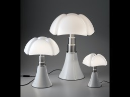
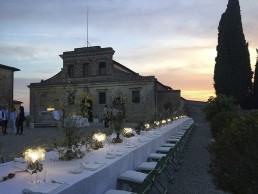
(Italy) - Slamp’s Clizia Table lamps set the mood for a suggestive outdoor dinner, held at the Felsina vineyard during summer 2016. The dinner was held in the vineyard’s garden as part of the ‘Art of the Treasure Hunt’ event, an exclusive experience organised for international art collectors to explore and purchase modern art while visiting vineyards throughout Chianti.
A portion of the benefits from the items’ sale go to Robert Wilson’s Watermill Center Foundation, an interdisciplinary laboratory focusing on the arts and human studies, giving young artists from around the world residence and study opportunities. This year’s treasure hunt was in honour of the foundation’s tenth anniversary. Slamp’s lamps were part of two on-going site-specific installations on the Felsina property, which were open to the public until the end of October.
Wilson’s own La Traviata light sculpture, designed in 2015, and Zaha Hadid’s Aria Gold, unveiled this past April during the 2016 Salone del Mobile, were hung in striking contrast to the aged barrels and stone walls of the wineries cellars. Slamp’s Clizia graced the dinner table during the Treasure Hunt’s dinner party. The Clizia Table lamp is part of lamp family that includes an array of functions, finishes and colours. Slamp’s patented Lentiflex and Cristalflex Fumé polymers diffuse light softly and evenly, and the lamps’ 230 manually folded elements create sensuous volume in each of the collection’s forms.
The table version has a base that connects magnetically to the diffuser, making cleaning and maintenance easy. As was the case for the Felsina dinner, the lamp is available in a battery-operated version, making it not only portable, but allowing varying lighting combinations and outdoor use. The soft, slightly opaque polymers refract the light, casting a play of shadow and form onto any surface, and the minimal base sturdily supports the lamp without appearing bulky or distracting from the lamp’s endless folds.
The “Art of the Treasure Hunt” dinner was a perfect example of Clizia Table Fumè’s versatility. In a rustic environment, the lamps’ modern silhouette, slightly inspired by the classic bedside table lamp of yesteryear, fit in perfectly. The illumination looked like contemporary candlelight, perfect for an al fresco Tuscan evening.