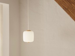
Carl Hansen & Son launches Opal by Esben Klint

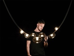
(Denmark) - Danish architect and cabinetmaker Esben Klint, son of world-renowned architect Kaare Klint, will be joining Carl Hansen & Son's prominent group of designers when the EK61 Opal pendant is added to the growing lamp collection.
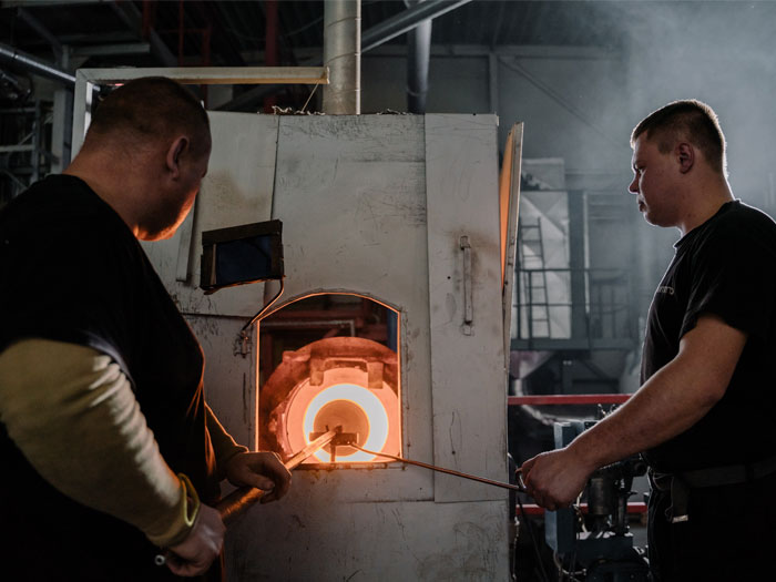
The classic lamp, which was designed in 1961 but has never been in production before, is now being launched in mouth-blown opal glass and solid oak.
Klint worked throughout his life as an architect and cabinetmaker, where he managed to create a distinctive line of furniture and large edifices, but now he is especially remembered for his lighting designs. Klint was enthusiastic about working with pleating, and in 1961 he created the Opal pendant in pleated plastic. At the time, however, the design was too complicated to produce, which is why it was stored in the family archives for 60 years - until now, as Carl Hansen & Son is putting it into production.
Knud Erik Hansen, CEO of Carl Hansen & Son, says of the launch: "When the Klint family introduced us to the Opal pendant, we were convinced that we wanted to give the design the life it deserves. The pendant is understated and elegant, and its soft, indirect light and classic materials give it a tactile expression that goes incredibly well with the rest of Carl Hansen & Son's design classics."
The Opal Pendant, which has a pleated, super-elliptical shape with distinctive top and bottom pieces, evokes traditional Chinese lanterns, while the lamp's materials - mouth-blown opal glass and oak - give it a classic, eternal look. The lamp's oak top and bottom pieces have been meticulously turned and honed by hand, and the pleated shape of the lamp also imposes great demands on the glassblower to achieve a smooth, distinctive shape.
Speaking about the launch of the Opal pendant, Esben Klint's widow, Marion Klint, said: "Of all the many drawings we've saved over the years, this lamp is one of those we would love to see produced, so it's with pride and joy that Esben's pendant is now being revealed. Although Esben originally created the lamp in pleated plastic, we're enormously pleased that the lamp is now being launched in glass and wood, as this has an ennobling effect on the design."
In recent years, Carl Hansen & Son has added several lamps to its collection, including the MO lamps by Mads Odgård and pendants by Bonderup and Thorup. About the thoughts behind the growing lamp collection, Knud Erik Hansen says: "When you come from Denmark, where it's dark six months a year, being interested in lighting and lamps comes naturally. In addition, we aim to provide the very best design-led products, and we're always looking for products that can enhance our existing portfolio. This is also why we see great potential in the Opal pendant, which elegantly complements our collection and blends in beautifully above the dining table, in the hall, in the living room or in the bedroom, and it's a lamp which can stand alone or be combined in clusters."
The EK61 Opal pendants come in three sizes and will be in stores from December 2021.
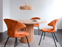
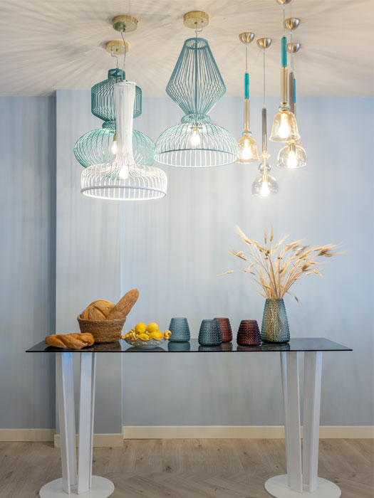
Innermost Plus launches Clava Dine Wood from Umage

(Denmark) - Innermost Plus adds Umage lighting collection to its portfolio.
Beautiful Danish design meets affordability, with this sculptural design piece from Umage (pronounced ooh-may), a Danish word meaning ‘making an effort’.
Clava Dine Wood creates a playful flash of light on the walls in the surrounding space. Craftmanship and precision create a beautiful pattern that can be admired from all angles, on the inside as well as on the outside of the lampshade.
Available in oak, dark oak and black, the wooden lamellae are made from laser cut ash and oak veneer with a solid oak top.
Innermost Plus co-founder Steve Jones comments: “The Umage brand combines aesthetics, simplicity and functionality with thoughtful craftmanship and environmental care. The result is exquisite designs with a sustainable edge. We’re really excited to be working with the team and introducing their beautiful products to our customers.”
Innermost Plus now stocks the full range of Umage products from its distribution centre and factory in Telford, ensuring fast delivery and local support for clients.
Brett Day, head of retail, Europe/Oceania/Middle East for Umage, says: “We want to ensure we have the best representation and support for Umage in the UK and Innermost Plus is the perfect partner for us. We are excited to be taking this new path together.”

TPL Lighting appoints Nawleen Kaur as Creative Lighting Specialist

Canada –TPL Lighting, an established, family-owned architectural lighting agency, welcomes Nawleen Kaur as the new Creative Lighting Specialist for The Adelaide Project.
The Adelaide Project, a revolutionary studio concept conceived, curated, and designed by TPL Lighting, was born out of the belief that, as partners to the architecture and design community, lighting plays a collaborative role in working to elevate the overall design aesthetic. Located in the intimate setting of an elegant heritage home in Toronto’s vibrant King West neighbourhood, The Adelaide Project seeks to create an intimate approach to experiencing and learning about today’s most innovative lighting solutions.
Continuing to evolve, The Adelaide Project’s architectural lighting offerings have now expanded to include a curated selection of decorative lighting. With an intimate understanding of contextual applications of thoughtfully controlled lighting solutions, Kaur and her team will provide clients with guidance in selecting the best lighting that matches the aesthetics of the space and elevates the human experience of its users.
“As we looked to reopen our doors to The Adelaide Project, we knew we had to surround ourselves with bright and brilliant minds from the Toronto design community,” says Dayna Bradley, President, TPL Lighting. “Since joining the team in January of this year, I have worked closely with co-owners Jennifer and Karolyn Pott to build a team of individuals that not only understand the commercial lighting industry but also possess the skill set to support our decorative lighting sector. As a registered interior designer, Nawleen’s understanding of the physical design world will help clients make informed design-centric lighting decisions.”
Nawleen brings with her 15 years of experience as an interior designer, most recently serving as a design firm’s workplace studio lead before taking on a role in consultative lighting sales. Since transitioning her focus to the lighting industry in 2020, she has proven to be a valuable resource for designers. Her sales and design background make her the perfect fit for serving as a client liaison at The Adelaide Project.
“Dayna and I have worked together since 2007, when she was in sales and I was working as an interior designer,” says Kaur. “Over the past decade and a half, we have supported each other through our career growth. Today, it has come full circle and the timing could not be more aligned. Working at a female run lighting studio has proven to be a supportive and trusted space for us to push the boundaries of what is expected in our industry.”
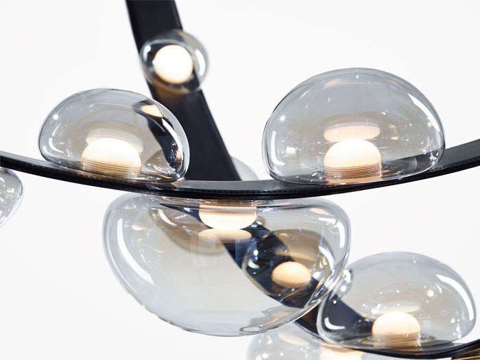
Vibia - Plusminus
Vibia is set to launch its latest collection, Plusminus, this year. Designed by Stefan Diez, the unique lighting system comes in various installation options and fixtures.
Beginning his design journey with Vibia in 2017 with the award-winning creation of Guise, Stefan Diez’s latest design for Vibia is the Plusminus collection, which is soon to be available in 2021.
Diez grew up in a household of fourth-generation carpenters, which provided him with an early bond to craftsmanship that profoundly shaped his development as an industrial designer. He studied under Richard Sapper at the State Academy of Fine Arts Stuttgart before opening Diez Office in 2002.
Plusminus is a lighting system that provides designers with the opportunity to customise light in their interior spaces. A bespoke collection that features a fabric belt and various light fittings to lend individual sensibility through contemporary technology, the specially developed belt provides support and electrical conductivity, while the light sources are attached using a clip-and-connect system.
Starting its design concept back in 2018, the inspiration for Plusminus originated in the simple luggage strap of a car roof rack or bicycle carrier. To achieve the successful technical resolution of the system, Diez worked with a Berlin-based institute in order to come up with a belt that would allow the conduit of an electrical current through its entire length. Starting from the properties of this conductive belt, Vibia and Diez explored different ways to attach the various light sources.
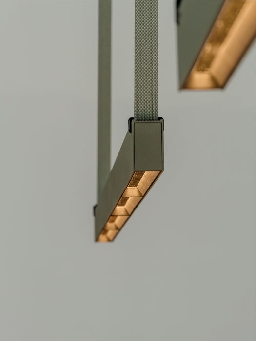
Each strap, which can be cut as needed, accommodates multiple luminaires and operates with simple plug-in technology for unparalleled ease of installation and connection. The belt offers adjustments in tension from taut to relaxed, as well as click-and-connect functionality that snaps into a buckle attached to each luminaire.
There are six different sources that give the lighting its specific characteristics when attached to the fabric belt: sphere, semisphere, cone, spotlight, linear diffuser, linear low UGR, curved metal shade, linear rectangular profile and hemispherical spot. A series of anchors and fixings maintain the desired configuration of the belt with the attached lights, which in themselves are an attractive addition to the overall installation.
The common thread of the Plusminus collection is the specially developed fabric belt that can be easily adapted to create all sorts of lighting installations. The belt is available in different tones and finishes within the Vibia colour palette.
-
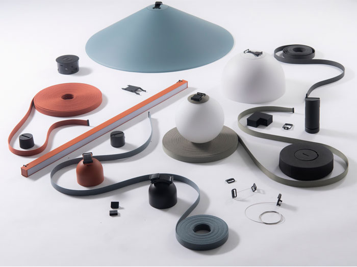
Image: Daniela Trost -
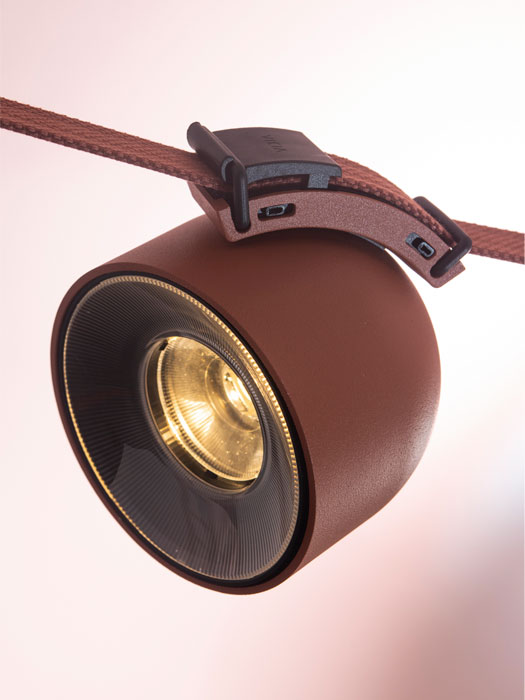
Image: Daniela Trost
Plusminus offers designers a powerful toolkit to create numerous possibilities for integrating light into their schemes, from intimate installations in residential settings to striking installs in commercial spaces. The various tensions of the belt can create elegant compositions, or an architectural presence when under more tension, creating a space divider or artistic installation in vertical configurations. Used horizontally, the system suggests a suspended ceiling with light sources delimiting the height. Adding a wire cable attachment allows any number of configurations to become possible.
The light sources are also configurable with intuitive software that allows designers to create pre-set lighting configurations from Vibia or design their own bespoke schemes. The light sources can also be added to or removed from the system depending on the evolving needs of the client.

Fanny Englund
As part of our Lobby Lighting feature, darc's Editor Sarah Cullen sits down with Fanny Englund, Lighting Designer at Light Bureau, to discover the key to successfully illuminating a beautiful lobby space.
Opening the discussion on lobby lighting, Englund went into the main considerations to undertake when approaching a new lobby lighting project. “A lobby for a business building needs to be representative of the company; what is the company image?” she explains. “The lighting design should contribute to that, of course in close collaboration with the architecture and the interior design. Generally, a lobby should be inviting and support social interactions. The light should help people orientate and to find their way further in the building. The lobby is often visible from the outside and therefore works like a display window for the building or company. The lighting and the space therefore must work well both during day and night,” she says.
When it comes to choosing which fixtures will be most suited to the space, Englund explains that the lobby needs to “stand out” in some way, whether that’s using decorative fixtures, dynamic installations or a higher level of materials and design. “Since you spend a limited amount of time in a lobby, it is often possible to work with higher contrast between light and dark, or with colours, to create an exciting place that attracts people.
“Lighting and the fixtures used always needs to support the design of the space and the company or building image. Sometimes the best way to light a lobby can be to use only hidden fixtures and let the light enhance materials and other design elements,” she tells darc.
Looking specifically at the benefits of using decorative pieces in the large space, Englund highlights that a lobby is the perfect location to experiment and create unique light installations. “Decorative lighting is often a very important part of a lobby design and needs extra attention to make sure that the model of the fixture is the right choice for that particular space. A lobby is a perfect place to create a unique light installation, tailor-made for the space. The decorative lighting element in a lobby is key to attracting people since it is often visible from far away, and really helps to set the atmosphere. It is also important to inhabit the space and make it more inviting for social interactions due to the more human scale it gives.
“When choosing a decorative fixture, I always work in close collaboration with the client and the interior designer to get a good understanding of the design intentions before making any suggestions,” continues Englund. “I work with visualisations or reference images to show my intentions. If it’s possible, we evaluate the fixture by looking at it together live. I use 3D models or sections to make sure the scale of the fixture fits the space in a good way.”
Looking at the relationship between the decorative and architectural lighting in a lobby project, Englund explains how the architectural fixtures are used to set the general atmosphere in the lobby. “It should enhance the materials and the spatiality of the room. The decorative fixtures set the important finishing touch to the space and define the design. Architectural and decorative lighting of course must complement each other, so you need to plan it as one complete solution.”
When asked about how to balance the correct light levels in such a vast space, Englund explains how they are not at the forefront of design details. “Due to the importance of the design intentions in a lobby, the light levels are not in focus. Still, you should be able to see well and find your way in the space comfortably. I work a lot with light on walls and other vertical elements to make the space feel bright even without a lot of light, and to facilitate orientation. When needed I make light calculations or mock-ups to verify that the light will be good. Lobbies should also have a control system to make it possible to dim the light up or down if needed, and to set different light scenes adapted to day - or night-time, or different events.
“The use of automatic and dynamic light scenarios, liquid light, is something that can fit well in a lobby, both for unique light installations and for the general lighting. This will create an exciting environment and at the same time reduce the energy consumption.”
Nature's Finest
Product Designer Boris Klimek's latest conception for Czech lighting brand Bomma is the Dew Drops collection. darc learns more about the design's inspirations and creation at Bomma's in-house glass making facility.
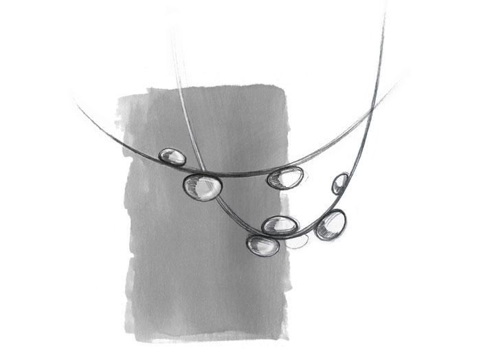
Designed by Boris Klimek, Dew Drops is a unique collection of pendants from Bomma. Featuring an internal light source, each glass object presents a hint of iridescence, adhered tightly to hand-sewn bands of either vegan material or high-quality natural leather.
Having first worked with Bomma on the Pebbles collection in 2019, Klimek says of his second collection for the lighting brand: “The Dew Drops collection was created to capture the fleeting beauty of morning dew, clinging to blades of grass. We managed to transpose that magic to materialise the seemingly immaterial with lightness and grace. The delicate drops on the surface of its carrying straps hang in space like pearls in a necklace. The carrying strap is as essential a part of the lighting as its glass drops. They connect harmoniously and equally contribute to the overall appearance of the lighting.”
In three words, he describes the pendants as “poetic, emotive, and magical”.
He continues about the design’s conception: “Working with light, especially in combination with glass, is magical and endlessly inspirational. I had been thinking about the concept of Dew Drops for a long time. Bomma then approached me to design a new lighting collection for them, so I tried to transform my idea into sketches.
At this moment several people from Bomma joined the prototyping stage; every step of which was challenging as everything was new and different. A big thanks goes to the Creative Director of the brand Václav Mlynář and head of R&D Ota Svoboda, who played a crucial role in the development of Dew Drops collection.”
Klimek likens the design process of Dew Drops to many of his other products’ journeys. “From the first ideas and sketches, I went quickly to verifying the proportions and modelling in 3D,” he explains. “Afterwards, I created visualisations that I showed to Bomma and they liked it. The prototyping process took into consideration Bomma's glassworks, where we tested the combination and proportions of used materials – leather, crystal glass, metal etc. The light source was the most challenging part. The Bomma team always develops the light sources themselves and it differs for every collection. It took us almost one year to develop the Dew Drops lighting, which is a success considering the technical difficulty of this collection.”
Dew Drops use a combination of metal-coated crystal glass, leather hand-sewn straps and an LED light source. The collection is also available in vegan leather.
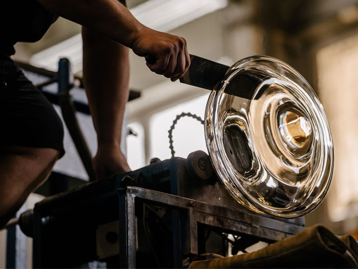
When asked more specifically about why these materials were chosen, Klimek elaborates: “It emerged from the essence of Bomma itself. They are not afraid to experiment, and they accept every challenge. They move the boundaries of the glass making craft; therefore, they weren’t afraid, even though the realisation of this collection was challenging.”
Klimek continues to describe the new collection and its application suitabilities: “It is almost like a sparkling pearl necklace levitating in a space, it is a crystal object that brightens up every interior. You can use Dew Drops as a single pendant or you can create immense installations by multiplying it. There is no limit except the space itself. It is perfectly suitable for both private residence and public spaces such as lobby, hotel receptions, cafes and others.
“I think that every lighting in Bomma’s portfolio is unique in a certain way. All the collections differ not only by the concept itself but also by the individual approach of the designer and their work with glass, it’s colour and the form. The light source and the way the lighting is attached to the ceiling is, for many products, different. The Dew Drops collection is not an exception.”
Václav Mlynář, Creative Director of Bomma adds: “From the beginning, it’s characteristic for Bomma glassworks to create lighting that balances functional fixtures with art objects that lend interiors both atmosphere and distinction. The Dew Drops collection follows this principle with perfection. Various options to combine individual lights through crossing and bending add custom possibilities to its artistic intent.”
Watt Plaza, USA
Canadian-based lighting studio Archilume were brought in by Studios Architecture to create a stunning lighting installation for the Watt Plaza. With sustainability and efficiency in mind, Archilume's piece uses low consumption LED pendants to create the dramatic effect.
First designed in the 1980s by architect Gin Wong, the lobby of the Watt Plaza building located in Century City, California called for a major renovation and the new design was completed in 2020. At 17,000sqft, Studios Architecture has revealed a stunning, flexible light-filled space nearly six times the original size. Watt Plaza was the first LEED Platinum-certified office high-rise building in Century City.
Central to this space is the lobby’s lighting feature. The original design by Studios Architecture called for a large decorative light display made up of a multitude of small pendants. Lighting design specialists Banks Landl Lighting Design (previously Hiram Banks Lighting Design) were brought on board the project. A variety of fixture types, sizes, and shapes were explored, with the design team finally landing on the desired solution. The result is a striking constellation of 350 luminaires in a single fixture from the Canadian lighting studio, Archilume.
Archilume’s P1 pendant blends minimalism and contemporary styling into an elegantly simple luminaire. Its simple form hides a visionary development in the use of energy-saving LEDs. It utilises total internal reflection optics, where the light source is not visible and emits a pleasant, flattering light that instantly enhances the space.
“Given this element is the focal point of the project, the feature needed to maintain a certain mass for it to carry the stature it would need in the space. If the design only used say 50 fixtures due to budget or another factor, the impact would have been far less. The density and scale of the installation make this feature a success,” says Matthew Landl, Banks Landl Lighting Design.
A project of this magnitude certainly had its challenges. Once the number of luminaires had been decided and a design solution had been created, labour and installation became the primary focus so the design was constructible. BLLD designed a template system for the overall 15x19ft ceiling cove area with which the contractor could simply layout the mounting points and required wiring. This was a critical component to the overall design success of the installation as the pattern needed to be exact and simple enough for the installation to be efficient, but random enough for the overall mass to look unified.
“We’re thrilled to have worked with BLLD and Studios Architecture. Not only did this design project truly tap into our core design philosophy, it showcases the breadth of our product capabilities,” says Saleem Khattak, Archilume.
The design includes new energy-efficient glass, sustainably sourced materials, low-flow fixtures, new energy saving cool roofing over the rotunda, and LED lighting. By using Archilume’s P1 LED, low wattage, low output fixture, but doing so in a large, focalised quantity, it allowed for the surrounding connective spaces to have reduced power consumption, effectively allowing for the space to remain energy efficient and preserve resources.
RG Naxos Hotel, Sicily
THDP's Nicholas J Hickson sits down with Editor Sarah Cullen to discuss the design influences for the RG Naxos Hotel at Giardini Naxos in Sicily. The scheme takes strong aesthetic cues from the towering Mount Etna located above the resort.
RG Naxos Hotel at Giardini Naxos, Sicily, has recently opened and is set to become a new Delta Hotel by Marriott. Designers THDP were brought on board at the end of 2019 to complete the new scheme for the hotel that was previously built in the late 1970s. Huddled against the Mediterranean coast and cradled by the imposing Mount Etna, the hotel's position is idyllic and unique. The hotel features 296 guest rooms, suites, two penthouses, two restaurants, lobby, gardens and beach, all of which were designed by THDP.
darc caught up with lead designer Nicholas J Hickson to find out more about the chosen aesthetics and their inspiration.
“The hotel was first built back in the late 70s as a Holiday Inn, so the rooms and hotel are therefore atypically large for the area; the hotel was then a Hilton Hotel – but has now rebranded as a Delta Hotel by Marriott. The client is an Italian family, which owns many other hotels in Rome, Milan and other areas of Sicily,” explains Hickson.
Mount Etna and its volcanic landscapes played a key role in the team’s design concept and choices for materials and objects throughout the space. Its natural beauty and supernatural presence, along with the nautical, seaside features of the island of Sicily, were brought together into a central point of design in the lobby. By adding local decoration, artworks and colours, the goal was to add character, a deep sense of authenticity and a refined and resort-based palette of natural tones with touches of colours of the sea.
What made this a stand-out project for the team, was its location. “Being in the shadow of Mount Etna, gave us a real opportunity to tell stories - La Sciara restaurant in particular features dark grey rough lava stone walls, and enameled lava stone bar and tables - the theme is dark, brooding just like the volcano above it,” says Hickson.
The hotel is also categorised as a MICE hotel for meetings, incentives, conferences and exhibitions. It provides an elite space for professionals in a tailor-made hospitality setting.
From the outset, THDP considered adding a new lobby bar to the centre of the space, defined as being both a visual anchor but also dividing the space and making it feel more intimate. This new layout allows workers and leisure guests to cohabit in an intimate space. The style is elegant, Mediterranean with sea colours and Taormina’s stone colours blending the indoors and outdoor colour palettes.
In terms of lighting this space, Hickson says: “The lobby area for the hotel is very large, and previously didn’t have an anchor feature, to encourage guests to use it. A very early idea from THDP, supported by the client, was to activate this space as a new lobby bar, Quintessenza. Therefore, the lighting needed to be completely manageable to transition the space from a fresh place to have a coffee, to a cool cocktail bar in the evening. We built lighting into and over the bar and added lighting to the back of some new banquet seating, which had a room divider effect with a rattan screening and new Laos wall lights were added by Aromas del Campo. These are a wonderful collection of dried grass wheels, which are back lit - perfect for a seaside resort. Overhead fans were also added to give a cooling and peaceful atmosphere.
“For us, lighting not only provides a functional but aesthetic enhancement to any space, so as this was a MICE hotel used by both business and leisure guests it was important to light the spaces well, but also to enhance each area,” explains Hickson. “Generally, the meeting rooms have recessed ceiling lighting, with inset LEDs so the lighting is invisible but completely manageable. For the restaurant here too, the lighting was generally lowered, and new pieces of furniture, such as buffets etc. had built-in lighting at touch points to help guests navigate.
“The decorative lighting brands we chose included: Aromas del Campo, Faro Barcelona, Utu Lighting, Marset, Aldo Bernadi, Contardi, Servomuto.”
Speaking of how the lighting was integrated into the entire interior design and what it brings to the spaces, Hickson says: “Without good lighting there is no interior, ensuring that there is not only light but there is dark is the key for us, allowing spaces to transition from daytime use to evening is so important to our front of house spaces. So lighting placement and control is key. Too much lighting, or lighting in the wrong space simply ruins a good design.”
As is the case with so many projects these days, the THDP inevitably encountered some issues with completing this design during international lockdowns, which caused numerous delays throughout the process.
“The client initially wanted the interiors of the main front of house areas built during the spring of 2020, THDP were appointed in December 2019. With Covid rather interfering with this plan the works were finally carried out in the autumn of 2020 and spring 2021. Clearly the intent of the interior design being in such a wonderful location as Sicily was to keep the design, selection of suppliers and finishes local. This way we could rely on the natural heritage of these materials within our design.
“Like everyone else THDP soon became fluent in meeting online, of course this affected the review meetings, luckily we have a team placed in Italy so we could always attend meetings personally and review samples and materials with the client directly. Of course we prefer to meet the client face to face, and we now recognise that by doing so, you really avoid misunderstandings, and you can not just show your work to your client but get immediate feedback from them. Moving forward we will revert back to meeting clients face to face.”
Luckily for the design teams, the brief for the concept did not change over the course of the project. However, as is typical, the budget did “mature over time”, and due to the age of the building, necessary additional costs came into play to cover civil works that had not originally been accounted for. “Some value engineering took place, but in the end it was through direct procurement opportunities that savings were made – and therefore in the end many of the items specified by THDP were included,” says Hickson.
Overall, the final outcome of the design is something Hickson and the team are “immensely proud of” despite working with the challenges brought on by Covid-19. “I think if we had the opportunity to visit the property more we would have had a better result, as the project was more or less completely designed in lockdown, it suffered due to obvious misunderstandings, which caused some delays - that said, we are immensely proud of the final result.
“I think the balance of using a local design vernacular mixed with a modern take on interior design works really well, not making it kitsch, but rethinking local tradition and making it feel more contemporary - perhaps given more time it would have been possible to add more artwork, and accessories to amplify this,” he concludes.
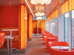
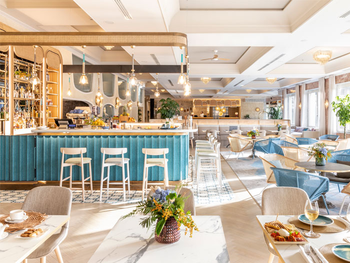
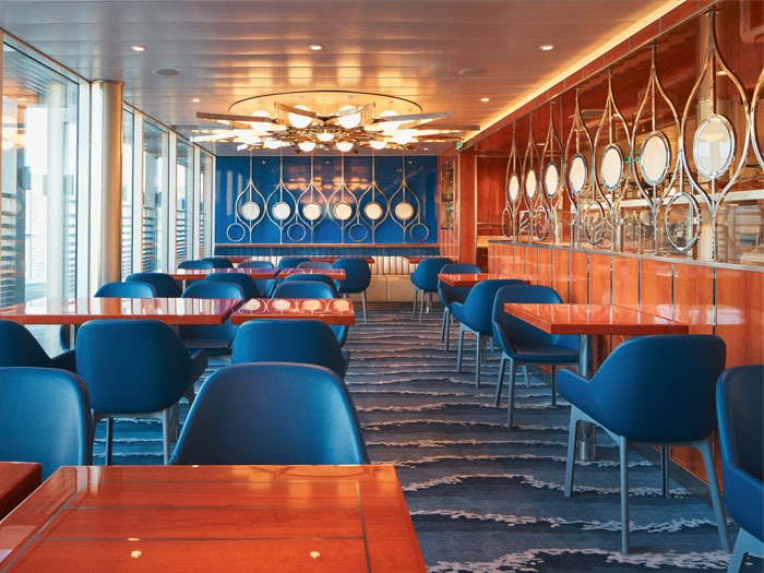
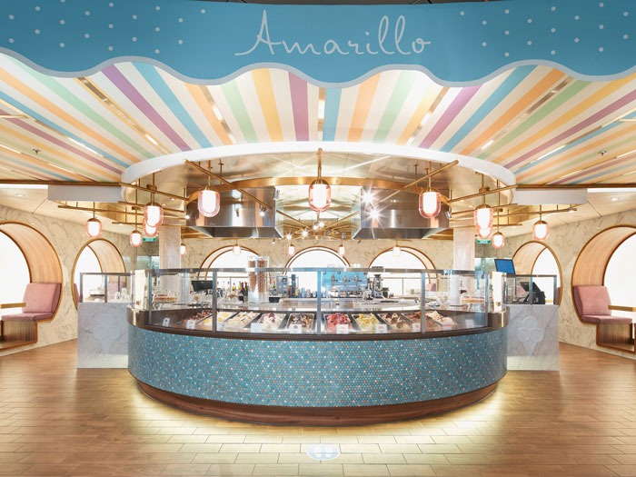
Costa Smeralda, International
Lichtvision has completed the lighting design for the new Costa Smeralda cruise ship, with an interiors masterplan by Tihany Design. Maintaining a constant lighting theme throughout the ship whilst giving each space its own identity was a key design choice.
Designed by four different interior designers (Partner Ship Design, Rockwell Group, Jeffrey Beers International and Dordoni Achitetti), under the guidance of Tihany Design’s masterplan, the Costa Smeralda cruise ship presents a large variety of design aesthetics between each of its spaces. The floating mini-city offers an incredible variety of areas between restaurants, shops and entertainment.
Lichtvision Design was brought on board to complete the lighting design schemes for numerous areas on the ship. darc spoke with Karen Ihlau, one of the lead designers on the project to find out more about the architectural and decorative lighting scheme throughout.
“We were approached for Costa Smeralda’s lighting design as Lichtvision was already involved in the lighting design of other vessels belonging to Carnival Maritime Group (Aida Cruises),” explains Ihlau. “Lichtvision has been involved with Aida since 2007 and has designed the lighting for 10 of its vessels and will be completing the second Costa vessel by end of 2021.
“The project took around two years from start to completion and was related mainly to lighting design of front of house and public areas, both interior and exterior (all restaurants, bars, gathering areas, theatre, museum, beach club and pools, spa, casino, show lounge, sport venues, indoor and outdoor decks etc. and also typical cabins and suites).
“The general client brief, for this Italian-themed cruise ship, was to support the masterplan by Tihany Design and ensure very different atmospheres between day and night (sun filled look at daytime and moodier and cosier at night). General lighting was used as the main connecting element throughout the ship. Dim to warm modules were widely used in order to allow for atmospheric changes, always in respect of the architectural characteristics of each area. Also, light levels were designed to be (as much as possible) equal along the ship unless this was going against the venue design and feel that was intended to provide,” she continues.
“Finally, all the main architectural features specific to each area were highlighted to bring additional value and interest. Entertainment plays a big part on the cruises and lighting design that supports this was crucial.”
As Ihlau explains, general lighting was used to bind the various venues together, creating pleasing transitions from one area to the next. Custom decorative fittings and highlights to architectural features have been introduced to bring out the essence of each area for a greater customer experience. However, ensuring a cohesive lighting atmosphere was achieved across the entire ship was one of the major challenges Ihlau and her team had to deal with. She explains further: “The design challenge was to create individual special atmospheres for each themed venue and at the same time maintain a cohesive lighting ‘masterplan’ for the entire ship.
“Very typical for a cruise ship, ceiling heights are low and daylight is not always available. The lighting has the task of transforming the spaces to light and airy rooms and give the illusion of tall spaces.
“Additionally, we identified four further challenges within this project; the integration of fittings due to very reduced ceiling cavities, cost control for both luminaire quantities and for control channels, the wide use of highly reflective surfaces that made implementation of lighting in architectural details difficult, without making fixtures visible (cove lights, furniture integrated lighting etc.), and control of overall quantity of different light fixtures specified.
“As mentioned, we did have some structural constraints due to very reduced ceiling voids behind ceiling panels. In a ship, every centimetre counts and cavities were reduced to the minimum acceptance. This had a particular impact on the definition of cove details and for recessed fittings with more than 90mm recess depth,” she says.
Decorative lighting played a key role in all of the spaces designed by Lichtvision, particularly as each public area was working with a unique design aesthetic. “We had 33 decorative lighting situations, varying according to the interior design of each public area, within five different interior design practices,” says Ihlau. “As the intention was to enhance the spirit of each of them, we didn’t insist in a common language for decorative lighting. Nevertheless, we made sure, through mock-ups and samples, that all custom and non-standard decorative fittings were visually checked and approved by us and/or interior designers.
“Rutec was used as our main manufacturer for linear LED strips and fully encapsulated linears, different CCTs, tunable white, RGB and RGBW. Other manufacturers commonly used throughout were: DGA, iGuzzini, Hunza, Philips, Osram and Segula for retrofit lamps in decorative fixtures.
“With regards to the decorative lighting, we used pieces from Chelsom, TVV Marine and Light Contract (Flos) as the main manufacturers for custom decorative fixtures. Vibia, Flos, Venini, Chelsom and Fontana Arte were the main manufacturers for standard decorative fixtures.
“Decorative lighting provided that final touch to make each space outstanding and clearly recognisable.
“Lighting allows for variation and supports the theming of the project. It provides different daytime and nighttime atmospheres and offers different visual choices, for example entertainment spaces but also quiet and relaxing spaces.
“The decorative lighting layer was part of the interior architecture, theme, look and feel of the space, (as opposed to the general lighting layer being the glue and transitions between spaces). Sometimes, visitors may have the feeling that the entire space has been designed around decorative lighting (especially for oversized chandeliers). Sometimes decorative lighting completes the design, and you may think that without that specific decorative element something would be missing.”
Despite having a full portfolio of cruise ship projects under its belt, this was a first for Lichtvision’s London office to design with the support of the Berlin team, as well as a first to work on a vessel along with five interior design practices, including a masterplan by Tihany Design. Luckily, the brief didn’t change much for the team along the design process. However, Ihlau admits that they had to “run revisions of lighting layouts to reduce costs, especially for decorative lighting that followed the architects’ design brief. The interior design was simplified together with the decorative fixtures to bring the overall design into a specific price point”.
She continues: “It was exciting to be involved and experience some very differently designed spaces come together at the end, and at the same time find a visual common language that ties in all the designs. The spaces are designed to appear very different, yet they require a solid visual and detailed design strategy as well as considerations for costs, procurement and future maintenance, which of course is not visible but goes on in the background.”
Adam Tihany, Creative Director for Costa Cruises, adds: “I was in charge of selecting and directing the team of designers who created the interiors of Costa Smeralda, soon to be joined by her sister ship, Costa Toscana.
“Lighting has always been a key component to the project’s success. Lichtvision worked very closely with the four commissioned design firms, creating not only dramatically lit individual venues but, most importantly, a seamless transition between very diverse spaces resulting in a harmonious and balanced project.
“My studio designed only one venue on the ship - CoDe: Costa Design Museum, the first ever design museum at sea. The museum occupies approximately 500sqm and has a dramatic ‘tunnel’ made out of highly polished steel rings requiring a clever and bespoke lighting solution. Again, Lichtvision rose to the occasion and helped create a memorable experience.”
In conclusion and upon reflection of the project, Ihlau says: “We would re-consider the colour temperature selection of the dim to warm range (specified was 2000K-3000K), and perhaps also consider a change to tunable white LED chip, which have that extra flexibility for different light scenes and atmospheres. Overall, the flexibility of changing colour temperatures between day and night was widely liked.”
imm cologne 2022 goes ahead
(Germany) - The international Interior Business Event, imm cologne, will open its doors in 10 weeks’ time.
Some 600 companies from 51 countries are expected in Cologne for next year’s edition of imm cologne. A considerable 75 per cent of exhibitors will be travelling from outside Germany to attend.
“The upcoming imm cologne is all about positioning – for us as a trade fair organiser, for the German furniture industry and for the entire sector. But it is not just about how dynamically we start 2022,” said Matthias Pollmann, Vice President Trade Fair Management at Koelnmesse. “We are facing major challenges that also present enormous opportunities. With this in mind, I see the number of exhibitors at imm cologne 2022 as a good starting position for a successful relaunch. I’m firmly convinced that imm cologne is the ideal platform for the industry to design tomorrow’s living spaces together,” added Pollmann.
Addressing the much-discussed question of visitor numbers, Pollmann called for a realistic estimate. “We’re expecting visitor numbers to be below pre-pandemic levels. They will probably rise in line with exhibitor numbers. Visitors are more likely to come from other European countries than from overseas, but we keep seeing the odd surprise at recent European trade fairs.”
In total, imm cologne 2022 will occupy nine halls. Pure, the format for design quality, will be staged in Halls 11.1, 11.2, 2.2 and 3.2, supplemented by Hall 4.2, where Pure Architects will be hosted with Connect. The Connect interior world presents the new solutions for home living in a digital future in a wide-ranging, high-profile showcase. The Home interior world is the new address for furnishing solutions that suit any lifestyle. It will occupy Halls 10.1, 10.2, 5.2 plus Halls 6 and 7 as well as Hall 9. The hall planning accommodates all the necessary measures and official requirements for the protection of exhibitors and visitors. Koelnmesse has taken the requirements of the Coronavirus Protection Ordinance for the State of North Rhine-Westphalia into careful consideration. In close consultation with the authorities, it has developed numerous measures to ensure the highest standards of professional safety at imm cologne. The CH3CK principle applies to all those wishing to enter the trade fair grounds. This means that exhibitors and visitors have three options for gaining access to the event: They must either be vaccinated, have recovered from Covid-19 or have been tested. All the measures combined create an environment where business can grow again.
The Interior Business Event’s 365-day strategy aims to offer knowledge, content and business opportunities not just during the limited time frame of the in-person event, as has been the case previously. imm cologne 365 now gives the industry a suitable and attractive forum all year round – completely independent of the fixed dates of the trade fair. Companies can showcase their product highlights to an interested audience 365 days a year.
At the trade fair grounds in Cologne/Germany, the leading international trade fairs imm cologne, LivingKitchen, spoga+gafa and Orgatec showcase the latest trends, products and innovations, serving as international, central gatherings for the global industry. In addition to the events at its Cologne headquarters, Koelnmesse is strategically expanding its portfolio internationally: The inaugural Orgatec Tokyo will be hosted in 2022. It will be the first trade fair in Japan to focus on professional and hybrid work environments. As the satellite event for imm cologne and Orgatec, idd shanghai provides European companies in the premium and luxury segment of the interior design industry with a unique platform for showcasing exclusive, design-driven products.
The in-person events are complemented by ambista, the online business network for the international interiors industry, which provides direct anywhere, anytime access to relevant products, contacts, expertise and events.
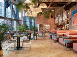
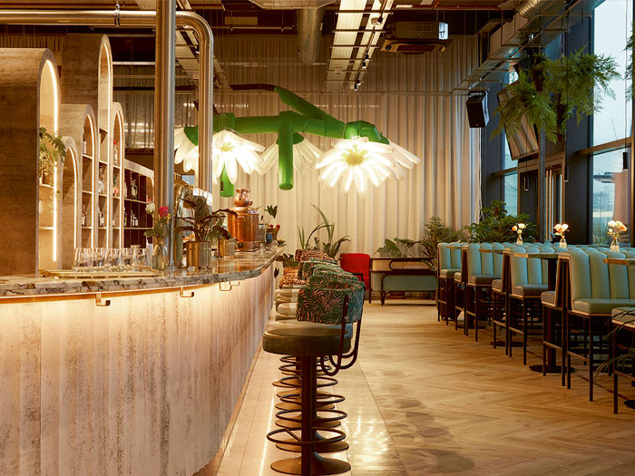
Bondi Green, UK
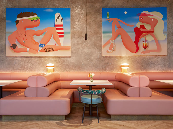
Bondi Green is the second hospitality venue designed by Run For The Hills for the Daisy Green Collection. With lighting design completed by Elektra Lighting, the modern Deco-beach inspired aesthetic is one of the newest dining and drinking spots in West London.
One of West London’s newest and most expansive al fresco drinks and dining spots, Bondi Green is an all-day bar, restaurant and café that immediately stands out from anything else in the area.
Set within a huge, light-filled space at the base of the landmark Brunel Building, directly beside the peaceful waters of the Grand Union canal in Paddington Basin, the client - the Daisy Green Collection - called on interior designers Run For The Hills to create a space that was “luxe mixed with a bit of industrial - pops of metallics, refined concrete and textured plaster, creating a luxurious palette with an urban edge”.
The interior designers were involved in the project from a very early stage, working with the clients during site negotiations to put together a vision for the space and discuss concepts with the Brunel Building landlords.
Anna Burles, Founder of Run For The Hills, explains the initial brief for the space: “The venue has super high ceilings and a raw, refined concrete backdrop, dreamed up by Brunel Building architects Fletcher Priest - the perfect urban oasis blank canvas for us to build upon.
“Our operational brief was to segment the space into a bustling, casual dining, all-day venue incorporating a glamorous cocktail bar, casual dining restaurant, and a pizzeria with a semi-open theatre kitchen. We also needed to work in a specialty coffee café zone and a live, working bakery.
“In terms of a look and feel, our brief was to run riot with a Miami-inspired palette, to inject bold colour into the space, while still keeping things pared back, and with an industrial-luxe feel. So we designed a wonderful, colour pop space, playing with pattern clash and experimenting with wow factor specialist surface finishes - an unadulterated celebration of tone and texture.”
The many elements within the vast space, coupled with the floor-to-ceiling glazed windows that fill the venue with natural light during the day, meant that zoning was a particular challenge, as the interior designers sought to “create a special ‘nook’ for every kind of guest”. Meanwhile, the design of the venue’s huge “hero bar” was a challenge of scale for the interior design team, as it needed to incorporate two cocktail stations, a dedicated tank beer zone, wine testing section, a working bakery and dedicated pizza oven.
Burles continues: “Our solution was to create a huge, centralised bar to house all of these different zones, with a perfectly positioned ‘opening’ in the back bar that offers a direct view down the barrel of the pizza oven.
“We also used lighting to play a big part in helping zone the space, using tightly focused pools of light to create cozy nooks throughout what can only be described as a huge, airy space.”
To achieve this, Run For The Hills worked with lighting designers at Elektra Lighting, blending decorative and architectural elements to create a beautiful lit environment. The decision to work with Elektra Lighting was a natural one for Burles.
She explains: “Amazing lighting is a must have, not just a nice to have. It can make or break design and transform a gorgeous scheme into an utterly jaw-dropping design. Spaces are zoned as much by the shadows and darkness as they are by the lights picking beautiful design details out.
“We designed the look and feel of the decorative lighting within the space, but we encouraged the commissioning of an architectural lighting consultant, to calculate lux levels, quantity of ambient lights needed and specify all technical fittings, including ceiling tracks, LEDs to the back and front bar and around the banquettes, to create the lighting mood we wanted.
“We’re delighted with the results of the collaboration with Elektra Lighting. The arches behind the bar are beautifully picked out with soft lighting, highlighting the curves and casting a glow onto our antique mirrored shelves, glassware and bottles. The fluted bar front is also softly washed with warm light, which picks out the lovely raw concrete finish we specified, which we then contrasted with an ultra-glamorous, deep and swirling seaweed-toned marble counter top, with a luxurious double bullnose edge.”
Neil Knowles, Director at Elektra Lighting, explains how the architectural lighting sits in harmony with decorative elements specified by the interior designers: “We’ve worked with Run For The Hills before on a couple of projects, and they had worked with the client before on a couple of smaller kiosks and small coffee shops, but this was the first large-scale, full-service restaurant and everyone wanted to make sure the lighting was right.
“Decorative lighting has been used to define areas and spaces - the cluster of pendants over the central dining area for example, or the individual small pendants over the high seating booths. Each identifies and delineates these as a zone. However in some areas, it would be cluttered or intrusive to have decorative lighting, for example over the bar top. The back bar is a stunning decorative feature so the lighting here should be invisible, softly lighting the bar counter and leaving the back bar as a spectacle.
“In other areas, we have architectural and decorative lighting together. The large group of pendants in the main space look great but we wanted a dedicated spotlight to each table, which these don’t provide.”
Burles elaborates on the decisions behind the decorative lighting specified for Bondi Green: “We wanted to find textural, interesting fixtures that would be features in their own right, but that also cast a lovely glow onto tables and seating. The lights at the pink half-moon banquettes have a retro space-aged 70s feel, the lights at the single-man booths in the bakery are a little more School House electric to create a really eclectic feel. Lights above the high booths opposite the bar are more invisible and discreet, there to cast a really tight glow of light onto the tables. Extra large textured dome pendants above the main dining area are clustered for effect, to zone the dining space.
“Beautiful decorative lights are also stunning objects in their own right, quite aside from the lovely light and highlight they provide.”
Bondi Green’s huge space is also zoned through botanical-style planting, which has also been picked out with lighting. Here, specialist wall finishes were used to zone areas of the bar, so Elektra Lighting also paid special attention to make the metallic specialist wall finish in the Tank Beer zone sparkle day and night. In this space, lower light and visual interest is provided by bar-top decorative lamps, while architectural lighting draws the eye up to the high ceilings and wall feature designs.
Although Run For The Hills’ design approach is very varied from project to project, Burles believes that this particular location stands out as it puts “colourful glamour” centre stage.
“We went quite out there with furnishings for the Bondi Green client - they pop in extrovert shades and clashing botanical and animal print fabrics. We chose swivel seats for a golden age style, pared down with 70s style cantilever dining chairs in a mix of raw cane and upholstered in tactile fabrics,” she continues.
“For fabrics, we opted for a mix of boldly patterned and plain velvets, softly textured wools and leathers. Dining tables were sourced in a mix of rounds and squares, topped with a range of finishes for an eclectic feel - including cocktail-cool smoke-tinted glass, deep emerald green, Carrara white and dusky brown marble - edge-banded with antique brass for a touch of glamour.
“The semi-open kitchen is also a standout. It features a three-metre charcoal robata grill, creating flame-filled drama throughout the dining room.”
Looking back on the completed project, Burles is very pleased with the end result. She concludes: “We love how Bondi Green has turned out - it reflects the vision and personality of the clients and the Daisy Green Collection, but it also encapsulates our Run For The Hills design signatures - artfully juxtaposing eclectic, personality-driven furnishings, lighting and fabrics, creating the perfect backdrop for the client’s colourful, characterful art collection.
“Bondi is also a standout project for us because of its scale, at a huge 1200sqm of double height space. Since the opening up this summer, the venue has been buzzing, with the kitchen, bakery and Tank beer teams working hard to keep up with demand. Extra covers are being added on the canal-side terrace to service customers still wanting an al fresco experience.
“We feel the design really has delivered on creating an F&B destination in its own right in West London - a new style of venue not seen anywhere else in the area.”

Maria Porro
darc's Editor Sarah Cullen sits down with President of Salone del Mobile.Milano Maria Porro to discuss the impact of the global pandemic on the international design event, the Italian design community and how both have responded to its challenges.
The events’ industry has had a turbulent 18-months due to the impact of international lockdowns and restrictions, as a result of the global Covid-19 pandemic.
However, 2021 saw the beginning of the events world re-opening, and with that came the latest instalment of Salone del Mobile.Milano in the form of Supersalone at Milan Design Week.
darc sat down with Maria Porro, President of Salone del Mobile, to find out more about how Italy’s design community weathered the pandemic and how the exhibition bounced back to accommodate the “new normal”.
“Supersalone was a real success, well beyond our expectations,” says Porro. “After 18 months away, together with colleagues, entrepreneurs, architects, designers, manufacturers, the city of Milan and the entire international design community, we created this unprecedented event that we wanted to call "Supersalone": we set out to organise it, believing that it was essential to get together again, but above all, to rediscover, retouch and try the products that our companies have continued to create in these long months of the pandemic.
“As you might know, the decision to do the event was taken at the end of June, so we had very little time to organise it. It was a completely new format and we had a lot to do in a strict time. So, we are deeply satisfied by its incredible results.
“Figures speak for themselves: over 60,000 visitors from 113 countries - of these more than half were trade operators and buyers (47% from outside Italy); nearly 1,800 journalists from all over the world.
“I believe it sent a message of beauty and hope not only to Italy, but to the entire world.”
Unable to compare the previous years of Salone del Mobile.Milano to Supersalone due to its unique circumstances in which it was held, Porro is still delighted with the turnout at this year’s event.
“We cannot do any comparison with the last edition of Salone del Mobile.Milano because this year was an emergency year due to the general Covid situation. For example, Chinese visitors – who in the past are number one in terms of quantity - could not leave China. “Supersalone” is not comparable to the 2019 edition, but by no means is it inferior: I can say we appreciated even more those who decided to visit despite the difficulties, confirming the strong relationship and affection with our design community,” she explains.
In order to ensure the event was as safe and secure as possible for its international visitors, Porro and her team worked hard to implement as many Covid-prevention measures to limit the spread of the virus. “Salone del Mobile.Milano had laid down the bases, carefully and respectfully, to ensure that the first great trade fair in person was open, in terms of security, to as many people as possible,” she tells darc. “We had to devote considerable effort and attention to the organisational aspects involved with preventing the spread of the Covid-19 pandemic and, in particular, to the organisation of the spaces at the fair, the guidelines for correct visitor behaviour (the use of masks and social distancing throughout was mandatory) and to regulate access and flows. Body temperature screening and Green Passes or the EU Digital Covid Certificate was compulsory for all visitors. We also created four rapid testing stations for those who wished to take a rapid antigen test.”
With an increased demand for large events and organisations to be more environmentally aware of their footprints, Supersalone reflected this in its approach to creating a more sustainable show. Porro explains how they achieved this further: “The show reflects the general attention to the environment and embraces the concept of sustainability and the issue of reuse, recycling and circularity. This approach interprets striving for better and more responsible development of the industry. In building the event, we gave importance to hire and reuse, in order to cut material waste as much as possible. All the materials and components of the installation have been achieved using a reduced quantity of chipboard panels made from 100% recycled wood, which will then be channelled back into the production cycle with a view to circularity, saving 553,500kg of CO2 from being emitted into the atmosphere.”
Shifting to look at Italy’s design market as a whole, darc asked Porro about how the local industries had weathered the last couple of years?
“These particular years have forced us to rediscover the importance of the domestic space and, for this reason, to reconsider the value of the quality of the places of living, encouraging renovation,” she says.
“The situation resulted in a positive growth in France, the US, Germany, the UK and Switzerland, the top five commercial outlets for us, as well as in the top 25 destination markets, testifying the healthy state of Italian exports.”
She continues: “The pandemic has increased the need for quality design: which does not mean only quality of materials and surfaces but also quality in the organisation of spaces, able to influence the way in which we live in the spaces.
“The experience of the home is something universal that unites all people in all the countries of the world, but every home is different because it is created by the people who live in it: every home is unique.
“Design made in Italy always gives a different and personalised quality solutions, making our furnishings enter the most diverse and distant homes, resulting in a harmonious encounter between different cultures and ways of life.”
When looking at design trends occurring in Italy at the moment, Porro adds that design has been directed back inwards to the home. “During this long pandemic period there has been a lot of attention to the house and a rediscovery of the domestic space. Home has become more and more “home” and less and less “house”. A cosy place to take refuge from the outside, being comfortable and surrounded by beauty with your objects and pieces of furniture. Being forbidden to go out for some long periods, even the smallest balcony or terrace or garden became a sort of “escape room”. The boundary between indoor and outdoor is blending and home is now also a place where you can reconnect with nature. So, outdoor furniture has received a lot of attention.
“It’s essential to support companies in the process of innovation and change towards greater environmental sustainability, but first of all we need to enhance and communicate the strength already inherent in our products, which are the expression of a virtuous manufacturing system and a model that focuses on quality and durability.
“I believe we have realised that we need the essential and the functional. The superfluous is not necessary in difficult times but we probably extend this concept to normal times. The experience of the home has been something universal that united everyone.
“At the same time, our perception of public spaces has dramatically changed, and now we appreciate more and more large, un-crowded spaces, where it is possible to control the flows of people and meet safely thanks to the presence of outdoor areas.”
Looking ahead to the next edition of Salone del Mobile.Milano, Porro is enthusiastic that the 2022 show will continue to bring designers and industry heavyweights together in the heart of Italy to spark new design and creativity. “Supersalone has reiterated once again how Salone del Mobile.Milano, and its relationship with the city of Milan, is at the centre of the design scene with an irreplaceable role in catalysing all the energies of the sector, and attracting visitors, offering new enthusiasm and a creative boost to all our partners.
“All agreed that it had been a positive experience, and for everyone a signal of the restart of an entire industry and of the city of Milan, trade operators and exhibitors are all hard at work on the 2022 edition in the hope that we will be able to meet the whole design community again at Salone,” she says.
“Supersalone was a special event, a one-off piece. Salone del Mobile.Milano 2022 will go back to the original formula and we’ll once again be a fair rather than an exhibition. However, it will certainly keep some “supersalone” important turning points, such as sustainability and the fact that for the first time we had a real digital presence through website, socials, QR codes and streaming. And last but not least, the visitor’s experience at the centre for us.”
The next edition of Salone del Mobile.Milano will take place 5-10 April 2022.