

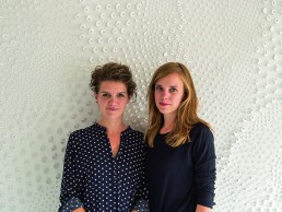
Alissa van Asseldonk & Nienke Bongers
Founded by Alissa van Asseldonk and Nienke Bongers, Alissa + Nienke is a material research and design studio with a unique interpretation of surface design. Here, in her own words Alissa van Asseldonk talks materials, innovation and design.
The basis of our studio is a joint urge to experiment, we met at Design Academy Eindhoven when we were both doing our internships, and we really felt the need to create for ourselves. That is when we started a ‘material get-together’ resulting in our successful product line Pigments & Porcelain. The experimentalism and research was always there, but it wasn’t until a few years later that we deliberately transformed our studio into a much wider approach to materials and applications focussing on the manipulation of flat materials to make them pop-up, move or elevate and to apply them to our daily living environment - this is strongly influenced by our aim to trigger curiosity and interaction.
You could say that the experiments we do in our studio often surprise or trigger us to such an extent that we really want to translate them into bigger, durable and applicable materials or products that can be experienced by a broader public. For us, material research is really about bringing this experience to people. This means researching human perception, creating new materials to improve daily life and exploring what our future environments will look like. Over the last few years we developed our own human-centric approach to material research and design, specialising in surface design.
Our team consists of the two of us, often supported by freelancers, trainees or interns. As Nienke and I are quite different, we know where both of our strengths lie and aim to empower those by dividing tasks. This happens in a practical sense, but also within projects. Where I am the structured and analytical one, Nienke has the free, crazy mind. So my strengths lie in the research part looking into material properties and functioning, Nienke’s strength is the crazy patterns and detailing. My focus is more graphical and leans towards colour use and combinations, Nienke leans towards tactility and touch. It’s a constant synergy in diverging and converging a design from our own angle, to later bring it together in a brainstorm like meeting. This can sometimes result in intense discussions but always generates a stronger end result.
We often collaborate with specialised companies to push the technical boundaries of our designs, this keeps us fresh, we feel like we’re constantly learning new things. The challenge is to apply this knowledge to your own design perspective, which is also really fun.
Material means so much to our brand: tactility, movement, softness, stimulation, discovery, and optical illusions. We really do believe that in a world that’s getting more digital it’s important to think about our daily surroundings, our work and living environment. Our studio’s aim is to adjust the environment we spend most of our time in, in order to enrich our lives, and we do so by creating materials that speak to all the senses. We see materials as the bridge between your body and the space surrounding you.
We often use readily available materials and techniques but tweak and manipulate them to get something new. This process is often very interesting; when we actually make an end result that can be applied it can make people perceive a space or an activity differently. We want to think beyond the ordinary, could a wall be more than a wall? Our process is full of what ifs.
The first project in which we’re working with light is a good example of this, it’s called Woven Light and first began with us winning a Renault Design Award for a lifestyle product concept: layered window blinds that create new patterns due to cut outs and transparency. We didn’t develop this concept into a real product because it felt quite flat and we had a feeling that we could take it a step further, we let the project rest to pick it up again at a later date (this often works quite well for our company). We were already very interested in traditional weaving techniques and at the time we had an intern working with us who specialised in textiles who was working on ton-sur-tun weavings in black and white for the studio, we decided to work with a semi-transparent material, which enabled us to discover the inner structure.
Analysing what made the weavings interesting triggered us to work with porcelain, a material we were already familiar with and had access to. We had the material Keraflex lying around the studio so tried some tests in common weaving that we fired in our kiln. Keraflex is a kind of porcelain foil, a sheet material that isn’t known for its most innovative applications so it was a challenge to use it in a not so obvious way.
Our studio is part of a creative co-working hub in Eindhoven (which we set up ourselves) all kinds of facilities are available to us, which means we can do rapid prototyping in-house in metal, wood, ceramics, printing etc.
When the first tests came back from the kiln we decided to combine our research into transparent patterns for the Renault Design Award, a decision that was the basis of the development of Woven Light.
We started creating digital patterns that we later cut using paper as the initial material so we could physically weave it, later with a local laser cutting company we tested the Keraflex and after much experimentation discovered how to laser cut it in a detailed way.
As the material has a certain thickness, we had to create patterns that were actually weavable without the material breaking. Porcelain has very nice qualities and transparent characteristics, but also shrinks almost 20% when firing in a kiln. It was a big challenge to create a woven structure that wouldn’t pull or tear itself apart while firing and shrinking.
It became a quest, almost a puzzle, to create interesting patterns that changed with the light while not breaking it in the process. Therefore, and this happens in many of our projects, design choices are actually a direct result of the technical process. With every piece of knowledge we gain, ‘design rules’ within a project pop-up. Our projects are always creating their own framework, as if we’re battling with the material itself.
When we succeeded in creating the porcelain, woven sheets, we realised the material was very fragile and proceeded to try round shapes, which are generally stronger. Again, an adaptation had to be made in the weaving patterns to create round shapes. Because of the strength issue one of the ‘design rules’ became: in every weaving, horizontal, vertical and diagonal directions had to be combined. This resulted in a collection of possibilities that you can now see in our prototype collection.
We chose not to glaze the porcelain, this could have made it stronger as it adds another layer but we felt that the porcelain is so beautiful already, almost skin-like. Unglazed it also created more of a surprise effect.
We are always eager to discover and show all sides of a product or material, literally and metaphorically. We don’t just think about the flat front, what happens on the side? What happens when the material moves? What happens when you move? Every tiny detail interacts differently with light. For example, in our three-dimensional wall coverings, we actually print all sides, even the interior sides. We create very subtle gradients that can be enhanced by the interaction with light.
Every material has a different effect while interacting with light, for us it’s very interesting to think about the application: where is our product or material going to live, who is interacting with it and when? While testing and prototyping we work with different light sources to see how our materials react to it.
We are currently working on a new concept for LED lighting, though it’s all still very premature, we hope to give a sneak-peak during the next Salone del Mobile.
As well as that, we are in the process of testing and further developing to integrate lighting in the design of some of our existing projects, such as the Dangling Mirror.
The biggest challenge as a small studio with the aim to innovate is that prototyping can sometimes be very expensive. How do you afford a long process of research and development? Our way is to constantly improve and build on what we have. We’re not afraid to show ideas or concepts to the world. For us making others around you enthusiastic actually results in great partners to work with.
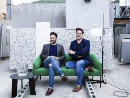
Jordan Cluroe & Russell Whitehead
Jordan Cluroe and Russell Whitehead of 2LG Studio share their top tips for creating drama and an individual style through the use of decorative lighting in the home.
Founded in 2014 by Jordan Cluroe and Russell Whitehead, 2LG Studio is a design practice based in South East London. Working in residential interiors, creative consultancy and product design, the duo’s adaptable and personal approach to design allows them to respond uniquely to the specific human needs of each project. Combining form, function and decorative joy in equal measure - with a background in theatre - collaboration has always been central to their work and has naturally progressed into their design ethic.
Not ones for sticking to set ‘design rules’, the duo adopt an individual approach to each project they’re involved with and find joy in the different challenges and inspirations each new client brings to the table, as they explained to darc...
It keeps the work fresh and we’re excited about getting into each person’s mind-set to find out how best to help make the experience of living in their space the best it can be.
Key factors for us though, are staying true to the architecture and true to yourself. We like to build stories into each room with vintage pieces or new work and unique commissions; it’s important that the client comes on the journey with us and develops connections to the pieces we choose and makers we work with.
In recent times, there has been a definite shift in client’s attitudes towards interior design, particularly in the UK. For so long, people have been mainly concerned with the value of bricks and mortar, not necessarily with the experience of living in their home for right now. This is now shifting and we couldn’t be happier about it!
It’s so important to live in your space for you, rather than what might happen later on down the line when you sell - you should be showing your home off to friends. This change in attitude has led to braver choices in interiors and a move back to decorative spaces.
Thanks to an explosion of design ideas and information now available on the internet – specifically via social media, clients are prepared to go further than they might have dared before. This has pros and cons - sometimes too much information and inspiration overload can lead to paralysis of homeowners afraid to make the wrong choice; that’s where we come in to give confidence and help navigate the bombardment of inspiration, to find a focused interior that our clients feel represents them and helps them to recharge. Homes are important retreats and it’s our job to deliver atmosphere as well as function and impact.
In terms of lighting within the home, the shift in the contract market towards the use of decorative lighting within interior design is now trickling down into the residential sector. Lighting is key to creating living, breathing spaces that make you feel. It can shape space, create moments of wonder, ambience and function. With open plan living spaces becoming more and more common, it is all the more important to use lighting as a way to define different spaces.
While spotlights are still a strong reference point for most residential clients, we try to use them sparingly for bathrooms and kitchens and then gently lead clients towards more decorative pieces for the rest of the home. We much prefer the ambience of lamp light for lounges or TV snugs and love to create wow moments with statement lights over dining tables or in entrance halls, as it’s good to have a moment of theatre if you love to entertain guests. All it takes is one key light and it will set the tone for the entire house in one stunning moment.
Lighting can be the jewellery of the home - the Rolex watch, the diamond ring, the gold cufflinks, or even the designer fashion jewellery with a playful impact - whatever suits you on a personal level. Some clients are much braver now when it comes to decorative statement lighting and we tend to combine this with architectural lighting in specific areas to shape the spaces throughout a home.
We are lucky to have worked on several large-scale renovations where we have been involved from the beginning and were able to have an input on the bones of the lighting schemes. For example, we recently installed an architectural seamless strip lighting in the ceiling of an entrance tunnel at a Victorian townhouse, which was only possible because we were involved from the beginning. It creates a moment of subtle drama that makes a great impact as soon as you enter the space.
In terms of products suited to residential projects, we’re big fans of using wall lights to create ambience in a living room and decorative pendants above a dining table. Pendants also work beautifully as bedside lights, leaving the side table clear for your water glass and book. Our Brockley project really benefitted from some star lighting pieces such as the Major Light by Roll & Hill. It’s a huge sculptural piece that sits above the dining table in an open kitchen / diner / living room and took a big chunk of the interior budget, but the impact is huge and connects the three spaces beautifully.
“The master suite at the top of the Brockley house project features a double height ceiling and the statement lighting continues in the ensuite with a stunning Giopato & Coombes Bolle light. It’s so rare to find such decorative lighting for a bathroom with IP rating, so this was a real winner! We love the passion of Giopato & Coombes, they are as curious about technology advances as they are about ornamentation and that leads to pieces of real quality.
When it comes to lighting advice for a project, we have worked with Atrium before now on specifying architectural lighting, as their knowledge is huge and they’re a great help in finding the right light for the job and telling us about new technologies available. We also work with Astro Lighting who have proven to be a very useful supplier for functional lighting and Nest.co.uk who are a great resource for statement pendants or lamps with a design edge.
“CTO Lighting also has some incredibly architectural statement lights that we showcased in our Design House project and more recently we have been working with Decode and designer Dan Schofield. We love their new Clam and Bulk lights – so simple yet brutalist. Areti is also a go-to for us, we used their lights in our first ever project, one that has gone on to be shared many times; and Rothschild and Bickers is a firm favourite for more classic interior projects.”
The lighting influences don’t stop there for the designers, with the duo telling darc of their love for Normann Copenhagen, Hay and Petite Friture and admitting they’re “completely obsessed” with the conceptual and organic glasswork of Bocci.
“Having spent some time in New York earlier this year, we also found the design scene there incredibly inspiring. It felt more like an art gallery scene… So many brands out there such as Apparatus Studio, Roll & Hill and Lindsey Adelman are pushing the boundaries in lighting and keeping us very excited!
Lighting literally illuminates your life, shaping spaces, defining functions, creating atmosphere or drama,” the duo conclude. “Homes are important retreats now and its our job to deliver atmosphere as well as function and impact. Lighting is a layer in every interior that deserves plenty of time, care and attention.
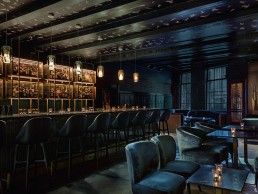
Barca, Italy
Fabio Fantolino transforms a Turin building into a 70’s eatery reminiscent of Italy’s west coast.
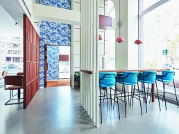
Formally a family pub, Barca is Located in a Turin building overlooking Corso Vittorio Emanuele II, in the Borgo Nuovo district of Turin, Italy.
The three-storey Italian restaurant’s interior is designed by architect, interior and product designer Fabio Fantolino.
Characterised by a consistent design that connects the first two floors, the furnishings contribute to the creation of a warm and relaxed atmosphere. Custom designed lighting consisting of diagonally cut cylindrical chrome profiles; custom-made tables of different colour laminates and Breuer sidechairs in Alcantra, recall the design of Italy’s West Coast in the 1970’s.
With a special focus on sofas and chairs, sea blue velvet, green dry cotton twill and hazel Alcantara alternate, covering the seats throughout the three floors and bringing a splash of colour to each space.
The counter is the protagonist of the ground floor space; the white circles on the wooden background are reminiscent of the typical geometries of 70’s interior design. The underground level houses an intimate and reserved area, where the dark shades of the walls are softened by the red melange tones of the seats, the space is punctuated by blue velvet screens and wooden panels.
“The clients wanted to turn this old family pub into a pizzeria restaurant with an international design,” Fantolino tells darc. “They expected a more industrial venue, but from the start we had a vision of the west coast in the 70’s with a touch of elegance. We showed them some examples and went through a strong and deep analysis of materials, lights and design trends. In a year, Barca’s was born.”
This was the first time the designer and his team had developed a concept for a three-storey restaurant. “This was fascinating to us, because it was an opportunity to work with height and give each of the spaces a unique mood and atmosphere.” says Fantolino.
The decorative lighting strengthens the space's dual atmosphere; the first floor has a light and airy ambiance while the basement houses a darker more reserved area. Iconic &Tradition Flowerpot VP1 pendants illuminate the bench table on the ground floor. Designed in 1968 and used predominantly in restaurant spaces, this classic light lends itself perfectly to the decor's vintage theme. The Paw floor light, designed by Fabio Fantonino himself for lighting brand Phanto spreads soft warm light and creates a sophisticated focal point near the first floor window's.
Minimalistic and angled LED Hexo ceiling lights by Wever & Ducre can be found on the first floor.
“We don't usually work with a lighting designer, we prefer to research the decorative and technical lighting elements ourselves in order to have a common thread in every detail of the project. The lights really highlight the 70’s references, the shapes and colours.”
The result is a lighting scheme that gives the space hierarchy, enhances the interior details and offers the diners a chance to bask in the laid back atmosphere of the west coast in the centre of Turin.
A Taste of Italy, France
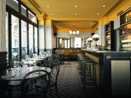
Emilie Bonaventure designs a Parisian bistro with a Milanese twist in a classic Art Nouveau property in the heart of Paris.
At 17 Rue Oudinot, hidden away amongst the Parisian bustle of the 7th arrondissement, there is an exceptional Art Nouveau building that is now home to Calabrian chef Denny Imbroisi’s latest restaurant. EPOCA was formed through a partnership with Micael Memmi and Denny Imbroisi who collaborated with interior designer Emilie Bonaventure, the talent behind ‛Frenchie’ in London’s Covent Garden.
Imbroisi crafted his culinary skills in the famous Northern Italian San Domenico and Corrado Fasolato restaurants. The turning point in his career came after he took part in the French TV show Top Chef; he gained insight into the culinary world whilst working alongside renowned Chef William Ledeuil before joining Alain Ducasse’s team at the renowned Jules Verne as sous chef.
Memmi is a serious foodie who left his job as a grain trader to become a restaurateur in 1997. He has since opened many eateries including Le Zo in 1998, a concept restaurant that fused Japanese and French cuisine with an Italian touch. In 2003 he launched II Caffe in Paris, which has since grown into a famous Italian restaurant chain, serving dishes that are made in the kitchen and delivered to five retail outlets in the French capital.
In October 2016 Memmi met Imbroisi at the Joel Thiebault stand at the President Wilson market. As Micael had dinner at his beloved restaurant Ida on several occasions, and Denny often lunched at Le Zo, their friendship blossomed and the idea of opening EPOCA was born.
“Micael appeared one day in my agency,” Bonaventure says. “He was a huge fan of Frenchie Covent Garden, the restaurant that I had designed in 2016 for Greg Marchand and asked me if I wanted to design the next Italian Bistro of calabrian Chef, Denny Imbroisi. I, of course said yes and the project was born.”
As this was Bonaventure’s first Italian-inspired project, she sought to design an interior with a unique personality whilst also drawing inspiration from both the features typical to a Parisian bistro and a Milanese design emphasis on warmth and function in a colourful, graphic style.
Equally passionate about ancient and contemporary objects, Bonaventure sets a scene for the vintage features in the space, such as the suspension lamps and wall sconces. Lights in chrome metal, stainless steel or aluminium interact dramatically with the brass features.
“We decided to preserve the original 1930’s light fixtures. To complement them I added discrete spotlights to the suspended ceiling, in order to enhance the general lighting level.”
Bonaventure chose not to work with a lighting designer, instead she used the already formed design and built on it, tying it in with the space flawlessly.
“Light is something I love experimenting with,” she explains. “For me light is the most important material and I do consider it to be a material. Conceptually I work with light as I would any other material. Its design is fully formed and integrated into the project from the very beginning.”
Bonaventure’s focus on the precision of design comes to the fore in this project through the presence of geometric shapes in black and yellow, accompanied by modernist influences. Unusual yet effective, the focal point in this design is the floor mosaic. In EPOCA, saturated tones in ochre, mustard and bronze add colour to the otherwise monochromatic scheme. The striped wallpaper lends a cinemascope depth to the room, which is enlarged through the tactical use of mirrors.
In keeping with the historical resonance of the building, Bonaventure chose a marble bar, however, she exerted a distinctive individuality over the space with veins running throughout the stone and up to the base of the vintage lights. Another reference to Art Deco is in the seating designs, which revitalise the traditional Thornet style with velvet booths.
For the tableware, Bonaventure herself designed the black lacquered wooden table tops and chose earthenware plates with black edges that perfectly echo the spirit of the restaurant. As a quirk against too much formality cutlery and accessories in aluminium were added.
The result is a vibrant and welcoming space in which lunch, dinner, or even just an apperitivo becomes an authentic escape to Italy in the heart of Paris.
“Denny and Micael were wonderfully enthusiastic about the original briefs and goals,” she says. “Interior design is all about that delicate balance between fulfilling a client’s aesthetic and technical expectations with the harsh reality of economic and architectural constraints, and at the end of the project we were all so delighted and proud with the finished project,” she says. “I think this project definitely has the strongest décor of all my previous designs - the smaller projects can result in a much stronger design.
EPOCA is Bonaventure’s second address in the Left Bank, a mere few hundred metres from her first, The Rose Bakery tearoom at the Bon Marche.
“It has been a real opportunity to carry on exploring my roots and the legacy that has made me who I am today; the spirit of the Left Bank lends itself perfectly to my values. I keep coming back to the dream of a literary and fashion Intelligentsia so the desire to welcome lost icons is a definite part of the atmosphere.”
Instagram:@emiliebonaventure
Kimpton de Witt, The Netherlands
Design firm Michaelis Boyd looked to a crisp architecturally-driven interior for Kimpton De Witt's first hotel outside the US, while taking influence from the building's Dutch roots.
The Kimpton De Witt in Amsterdam is Kimpton Hotels’ first destination outside of the Americas. Located in the heart of Amsterdam’s vibrant centre and within walking distance of Centraal Station, interior architects Michaelis Boyd has created a newly refurbished hotel boasting 274 guest rooms, including 15 signature rooms.
Working with Ave Bradley, Global Senior VP / Design & Creative Director of Kimpton Hotels, Michaelis Boyd designed a crisp architecturally-driven interior, featuring contemporary timber wall panelling, pale oak timber floors, steel glazed screens and bespoke terrazzo walls. The hotel design was inspired by the playful nature of Kimpton, with a contemporary architectural approach and a nod to traditional Amsterdam.
The ground floor has been reconfigured to provide a new entrance with a visual connection to the street and an improved guest journey through a series of lobby and lounge spaces. On arrival, guests ascend a white terrazzo staircase under a slim curved mirrored canopy, which punctures the glazed facade and runs seamlessly through to the internal entrance area. A bold custom green terrazzo wall defines the entrance and is complemented by the softness of a living wall, which runs the length of the entrance facade. Inset within the foliage are the words ‘and breathe’ in playful pink neon letters.
For the hotel reception area, Michaelis Boyd designed a range of graphic blue and white encaustic floor tiles inspired by the traditional Dutch delft tile. Behind the reception desk a ceramic tiled fireplace is surrounded by a ring of banquette seating, with cushions and blankets for reading and relaxing. Walls are animated with a bold selection of contemporary artwork and feature lighting in the form of a bespoke made Atelier Areti Alouette pendant, which is accompanied by the Porada floor lamp; Lambert et Fils Clark table lamp, and the Bolle chandelier from Giopato & Coombes.
The lounge areas use a combination of decorative lighting elements including Flos IC floor lights designed by Michael Anastassiades; Pin wall lamps from Vibia; the Dreistelz floor lamp from Kalmar; and the Tripode G5 floor lamp from Santa & Cole in the grand lobby area. “The concept was to use domestic light fixtures like those used around the home and arrange them around furniture clusters. These lights are integral in promoting a feeling of familiarity and a sense of home.
“The brief, set by the client, was to rework the internal arrangement of the space to improve the overall circulation and guest experience,” says Alex Michaelis, of Michaelis Boyd. “The decorative lighting is playful and thematic, which works in contrast to the architectural finishes and lighting. The lighting reinforces the concept of birds, botanicals and flowers – a language that runs throughout the hotel. We also wanted to make the spaces feel very residential, so the small decorative lighting elements such as desk lamps, table lamps, and floor lamps help to make it feel more like a home than a hotel.”
Mathijs Sommeijer and Ilse Dijkstra-Nugteren of Deerns Netherlands lighting design practice worked on the architectural lighting at Kimpton De Witt, which took on a supportive role to the rest of the interiors as Sommeijer explains: “Deerns was selected as MEP consultant for the project. During the process it became clear that there was a need to design the architectural lighting in close cooperation with the decorative lighting elements. The interior design – including the lighting fixtures – had to be the ‘eye-catcher’ in the space. With our architectural lighting design we made sure we created the proper ambient light to meet the regulations by using high quality fixtures from Xicato and let the interiors speak for themselves.”
Concealed within the centre of the hotel, a former lounge area has been reimagined as a new garden room, bringing in daylight and fresh air to the centre of the building, while acting as the terrace to the adjacent House Bar. “This fresh and ethereal space is now washed in an abundance of natural light during the day,” says Michaelis. “However, festoon lighting and lanterns provide subtle twinkles of light, bringing magic to the space in the evening and throughout the night.” The external courtyard is draped in cascading plants and swing chairs, enclosed within full height steel framed glazing, while internally, the floor is made up of a sequence of diagonally-laid oak planks inset with smooth square concrete tiles. This pattern continues through to the external courtyard and is formed using concrete pavers and black gravel. In the summer, the courtyard can be opened allowing the light and fresh air to permeate through.
The House Bar is located within the historical Queen of Holland building. Featuring original beams and timber wall paneling, the interior is painted a dark glossy teal. Michaelis Boyd designed a bird motif wallpaper to run between the ceiling beams - this pays homage to the traditional painted murals that date back to the Dutch Renaissance. “The lighting in the House Bar was to be dramatic and moody within the context of a dark and sumptuous room,” says Michaelis. “The back bar itself acts as a feature lighting installation, washing bottles with warm light.”
“The architectural lighting is in perfect harmony with the decorative lighting elements and interior,” adds Sommeijer. “One of the main challenges we had on this project was the existing structure of the building as it sometimes provided very little space to recess the lighting and we really needed that space to minimize the possible glare of the architectural ambient light, but we worked around these challenges – as well as the tight deadline – to get the job completed in time.”
As the concept of flora and botanical runs through the hotel, the interior furnishings reference the natural world in a playful Kimpton way - deer, elk and bee doorknockers adorn guest rooms, bird pendant lights have been used, and beautiful dragonfly motifs have been incorporated into Kit Miles velvet upholstered Gubi chairs.
Moving upstairs, there are two interior palettes installed over the 274 bedrooms, providing guests with a unique experience with each visit. Smooth oak floors and colour blocked walls run throughout the guest rooms, which are furnished with a honed marble bedside tables, bold velvet fabrics and custom designed brass hanging rails.
The lighting in the bedrooms had to be playful yet functional and made clever references to the public areas, for example a smaller version of the Areti bird chandelier over the reception desk has been used to make the bedside lamps, accompanied by BL1 table lamps from Gubi. The guest bathrooms are defined by bright geometric floor and wall tiles and feature the Disc and Sphere wall light from Areti.
Reflecting on the project, Michaelis tells darc: “The outcome remained very much in line with the schematic designs presented at the start of the process. The materiality of some of the larger architectural elements have exceeded my expectations and add a real warmth and tactility to the spaces. It’s hard to communicate these elements through visuals, models or drawing presented during the early stages. The decorative lighting was integral in communicating the design concept. These pieces are prominently displayed within the spaces and often attract a lot of attention from visitors.
“We do a lot of restoration projects which favour a raw and industrial design aesthetic – a trend that is currently very fashionable. However, in comparison, this hotel is a little more refined and well considered while remaining playful and fresh. The materials are crisp and new and the furniture is eclectic yet comfortable.
“If I could have changed anything I would have loved to have more ceiling lights in the lobby and conference spaces. The new courtyard works so well to bring daylight into the heart of the building – it would have been great to do this in other places but we were restricted by the existing building and heritage restraints.”
20 Old Bailey, UK
Lighting studio By Luum created two opposing installations for workspace 20 Old Bailey in London, that work together to create a visually stunning atrium space.
20 Old Bailey in London is an immaculate workspace set around a pioneering ‘arterial street’, creating its own bustling community and consisting of 235,000sqft of exceptionally designed office space.
At the heart of the building’s atrium are two statement light installations from British lighting design studio BY LUUM. Each housed within a glass tree pit that extend from the ground floor to lower ground level, the installations – entitled ‛Order and Chaos’ - reference the inherent historical context of the area and are juxtaposed in style.
Commissioned by international design practice BDP, on behalf of architects Buckley Gray Yeoman and developers ISG, Tom Niven at BDP commented: “As concept designers, we approached BY LUUM to work collaboratively on the two installations for 20 Old Bailey. Responding to a tight timeframe, we quickly developed a proposal using ‛Bangle’ from BY LUUM that met the brief of ‘Order and Chaos’. The two sculptures reflect the context of the surrounding area; the South atrium forming a giant ordered cube from 100 elements and the North atrium directly juxtaposed with Bangles exploding across the space.
“Light was punched up from the lower levels to illuminate the sculptures but also create a play of light and shadow on the soffits above. The finishes were chosen carefully to ensure some elements appeared bright, whilst others reflected light at all angles, adding a sparkle as viewers moved between the two final sculptures. Luum’s technical expertise was invaluable in the process and the final installations delivered precisely.”
Developing the project in partnership with the client, which in turn aided the smooth delivery of the project, BY LUUM’s Creative Director Chris Fox talks darc through the installation: “The main challenge for us was delivering such a large project within the lead time, while keeping to our usual high standards; a very meticulous approach was required behind the scenes. ‘Order’ for example made use of 100 ‛Bangles’, which means there are 300 ceiling points, each with specific cable lengths that had to be carefully coordinated when installed. One wrong cable and the installation would have been out of position.
“The scale of each installation evolved over time,” says Fox. “Order became more compact as we progressed, while the looser formation of Chaos, which was mocked-up in several arrangements, allowed our interpretation greater flexibility due to its more random nature.”
As mentioned, the desired effect of ‛Bangles’ is to reflect the light off the many facets, creating tones and casting complex shadows in the space. While the installation can be offered with integrated LEDs, for this installation BY LUUM used plain lengths and so it was vital to illuminate it as a whole in order to enhance the striking interaction with light. The properties of the matt finish also allow it to hold the light while intermittent polished ‛Bangles’ were used for their reflecting and refracting qualities.
BDP was responsible for specifying the lighting and ensuring the light output, colour temperature and beam angle was suitable for both installations, while the layout of the lighting in the floor was customised to suit each layout – ‘Chaos’ spans almost four metres compared to ‘Order’s’ two.
Created from extruded aluminium, which is then machined to create the detailing and fittings, each ‛Bangle’ is then hand polished and finished by a local craftsman to any finish the client specifies - in this instance polished aluminium, matt aluminium and matt brass, as mentioned.
“With the exception of our glasswork, BY LUUM prides itself on the use of UK manufacturing for all elements of our installations to ensure our work is of the highest standard,” says Fox. “Utilising a combination of technology and craftsmanship, our network of manufacturers enables us to create imaginative designs and undertake complex custom projects in a wide variety of materials. The locality is crucial for regular production meetings, which allows BY LUUM to maintain our adaptable approach when creating bespoke designs.
“Watching an installation take place is a special feeling as a render can never match up to the reality of transforming a blank space in front of your eyes. With ‘Order’ the cube shape becomes more evident with every ‛Bangle’ you suspend, therefore there is always great satisfaction in turning your designs into life and taking that step back for the first time.
“We were extremely happy with the outcome at 20 Old Bailey, it has a real presence within the space and enhances the atrium’s role as a vibrant hub of the building, which itself is extremely impressive with large glass panels and black detailing rising up from the atrium – so naturally, the ‛Bangle’ installations stand out as the centrepiece.”
While BY LUUM has done many ‛Bangle’ installations in the past, the cube shape of ‘Order’ at Old Bailey was a new challenge for the team as it is usually specified to fill a space in a more random manner. This, according to Fox, created the complexity of designing a cube from triangular pyramids, creating 90º angles from acute shapes, all of which couldn’t touch or contain overlapping fixing points to allow the steel cable to hang true – essentially pushing the design team to work out an effective pattern through extensive mock ups.
Comparing this latest installation to previous works, Fox tells darc: “Having two opposing installations was new for us due to the fact they were purposefully unsymmetrical and designed to contrast with one another. The density and quantities involved also made it the largest ‛Bangle’ installation BY LUUM have done to date while the combination of different finishes in each installation gave it an added dimension.”
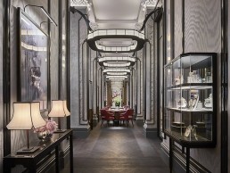
Mei Ume, UK
Designers AB Concept, collaborated with dpa lighting consultants to create a classic, sophisticated fusion restaurant in London’s Four Seasons Hotel.
Following the successful launch of Four Seasons Hotel London at Ten Trinity Square earlier this year, the hotel has now opened its doors to Mei Ume, a Japanese and Chinese restaurant.
Demonstrating the part that both cuisines play in the concept of the restaurant, the name Mei Ume is inspired by the Chinese and Japanese terms for plum blossom.
Overseen by Hong Kong-based designers AB Concept, the interiors of Mei Ume work harmoniously with the stunning architectural features of Ten Trinity Square. “We were approached by the owners, Reignwood Group, who we have known for quite some time,” Ed Ng, Principal at AB Concept and lead designer on the project, tells darc.“The project scope was for an Asian restaurant, so Reignwood felt we would be the right candidates based on our work in Hong Kong and that's how we began the discussions. It took us around two years to complete. As soon as we started working, we realised that we shared a lot of similarities and commonalities in terms of design. Hong Kong’s architectural and interior design professions are pretty much based off the British system, so it almost felt like we were working on a project at home, we were honoured to be working on such an iconic heritage building, to bring in very Asian inspired elements and merge it within a western architectural context.”
The Mei Ume Bar is a focal point for the restaurant, with a pavilion-style design featuring sleek custom lighting and glassware. Ornate pillars run through the centre of the room creating a subtle division between the ten-seat bar and lounge area and the 48-cover dining room. Suspended between the first two pillars as guests enter the restaurant, is a panel featuring enamel paintwork on glass, inspired by Chinese and Japanese plum flowers – fusing the two worlds into one as a common language. At either end of the main dining room, unique three-layer gilded artworks depict a traditional Chinese banquet scene while a palette of bold reds and pinks enhance the vibrant restaurant and bar - separated by a large embroidered silk lace panel. A private dining room seating up to fourteen guests provides a more intimate space for private dinners and events.
dpa lighting consultants provided a flawless scheme, which complements the restaurant’s beautiful finishes perfectly.
“The designers produced a strong interior concept within this magnificent heritage interior,” explains Ian Clarke, Associate at dpa. “Due to the considerations related to the historic architecture, the fabric of the building was to remain untouched with all lighting integration to be reversible, the ceiling was also off limits so decorative lighting was the key to the success of the scheme.”
Bespoke lighting elements were designed with ambient light sources concealed inside, while discreet, functional downlighting provides ambience to the tables and subtly highlights the interior’s details.
Only the most considered and delicate of interventions were achievable in terms of lighting. Metal structures were designed to adorn the interior in a way where lighting could be incorporated without the building needing to provide locations to house equipment. The two rows of columns in the centre of the space proved an issue, but still wanting to add drama; a halo inspired by celestial clouds was added and attached to each column, helping to lower the ceiling height to a more intimate level.
The outcome provides an elegant Asian aesthetic to the detailing with the integration of localised lighting in a creative and unique way.
“On this particular project, I think decorative lighting plays an extremely important role because it’s a heritage building,” Ng says. “When we went to the site for the first time and learned more about heritage architecture from the professionals, one thing that was brought to our attention was that architectural lighting such as downlights don't belong to this era of architecture. We felt that we should follow and respect such norms when designing the lighting scheme, so we tried to minimise the use of architectural downlighting unless it was completely necessary, which is why decorative lighting became the major light source for the entire interior.”
“The decorative lighting elements were developed as bespoke solutions with specialist manufacturers,” adds Clarke. “Lighting equipment was integrated within decorative interior detailing to provide high quality lighting without the use of standard architectural lighting equipment.”
The space relies heavily on the lighting to create a sophisticated, nostalgic atmosphere in the day and a relaxed, seductive feel in the evening.
“It is crucial for us to collaborate with a high calibre and competent designer on every project,” explains Ng. “Restaurants and bars are no longer places to just eat and drink, they’re experiences where lighting has a strong influence on the entire mood.
If you can imagine that the chef has spent so much time and creativity on making a dish tasteful and beautiful, it’s important for lighting designers to showcase their art. If a restaurant is poorly lit, we wouldn't be doing justice to the chef or the diners.”
The final installed scheme achieves the goals of the initial concept completely. “This project is a real credit to the owner and project team for their commitment throughout the project,” continues Clarke. With Ng concluding: “I sometime still mix-up the final photos and computer renderings that we presented to the client because they look so identical.”
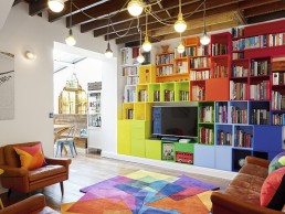
Residential Project, UK
Avocado Sweets took on the re-design of a run-down ex rental property and transformed it from a drab and dingy maisonette to a vibrant, playful, family home.
Left languishing on estate agent websites, this former dark and dingy ex-rental property was not for the faint-hearted. The four bed flat spread over the garden level and first floor of a period Victorian property was in extremely poor condition with a layout that was completely unfit for family life. With a young family ready to move in, the design team set about transforming the space into a warm and welcoming home that meets the needs of adults and children in every room.
With a host of clever design tricks and hidden solutions including skirting board heating and a vertical Lego play wall – Avocado Sweets increased the sense of space without extending an inch of the property. Drawing on their knowledge of cutting-edge and vintage products the design is a feast for the eyes and a highly functional family living space for adults and children alike.
With two primary-age children, the family agreed their design priorities, which included: an enjoyable kitchen with space for the children to join in the cooking; enough space to host large meals for family and friends; a comfortable living space to incorporate a piano and play area, two bathrooms, children’s bedroom with room for homework; a comfortable hall space for storing coats and shoes and a garden that could be enjoyed by adults and children alike year-round.
The first challenge for the team was re-working the compact space. Going back to the drawing board, Avocado Sweets re-worked the internal layout to suit family life and bring in as much natural light as possible, removing walls to create an open-plan kitchen-diner and building in a new family bathroom and en-suite to the master bedroom. Plaster was stripped from the hallway wall to expose the brick below and widen the narrow space.
“The property was a run-down ex rental with dark rooms and corridors,” Avocado Sweets Co-founder Susie Agathou explains. “We set about taking down the internal walls and moving rooms around to create a better family space.”
Agathou and her team looked at ways to not only create more space but to create the illusion of space, this was achieved by raising the kitchen and living room ceiling height by exposing the wooden beams.
“We found hidden tricks,” Agathou says. “Running the heating through the skirting boards to leave a flexible space for furniture.”
With no extra room for a playroom, play was built into the design with a vertical Lego wall in the living room and a piano neatly tucked under the stairs.
A custom made, poured concrete kitchen island that doubles as an area for food preparation, a breakfast bar and even an ironing board, was commissioned. The island's textured surface adds an earthy, welcoming feel to the kitchen design whilst banquette seating, clad in reclaimed wood, allows adequate space for a dinner party with hidden storage below.
“Sourcing the right pieces for each space was fun but a real challenge to get the right look to combine with the right measurements,” says Agathou. “Our designs are all tailor-made for the space and we like to mix and match vintage with modern – championing new designers alongside little known salvaged pieces.”
The wall lights throughout the house are salvaged from a post-war Hungarian factory, as well as the industrial kitchen pendants.The combination of the chalky white ceramic base with the elongated glass test tube-like lamp are at the same time a wonderful design statement and an unobtrusive layer of mood lighting.
"The dining area’s glass lean-to roof posed a particular lighting challenge, so we opted to create a hidden false wall in the painted exposed beam to allow the wall lights to continue as the main lighting in this area," Agathou says.
Functional spotlights continue the ‘hidden theme’ as they peep out from amongst the exposed kitchen ceiling beams. Meanwhile the industrial pendants over the island (also salvaged from Hungary) add a gravitas to the space - with the warm orange cord adding a little Avocado Sweet’s twist and a sense of warmth and fun to the industrial metal chain fixing, which add a sense gravitas to the space, contrasting with the more playful aspects of the design.
“Light was always at the heart of the project,” Agathou explains. “As well as enabling natural light through careful space planning, the light fittings help shape the personality of each space.”
Hanging Muuto coloured lamps are a fun, colourful addition to the hallway and set the tone for the rest of the house whilst the softer hanging Luna Lana knitted pendants in the living room create a homely vibe set in combination with the bold colour-block shelving, rug and exposed wooden beams.
Peak up the stairs and the Ingo Maurer Lucellino Wall Lamp with its iconic exposed lamp sporting delicate angel wings creates a wonderful sense of anticipation and intrigue to the upper level.
For the children’s room, the designers played around with colour and texture bringing a sense of fun and whimsy to the space. The playful Seletti Egg of Columbus is an ideal pendant in the low-ceilinged bedroom, the combination of the moulded recycled cardboard ‘skirt’ with the bold red cord create a strikingly industrial feminine effect without being too ‘girly’. "We’ve long been admirers of Seletti’s ground breaking designs so we were delighted to include one," she says. For the boys bedroom, the Bau by Normann Copenhagen has all those great elements of colour, shape and fun - literally fitting together like a jigsaw puzzle.
The overall look is heavily influenced by the team’s experience of hospitality design, love of innovation and experimentation.
For hospitality design its important to think about affecting customer behaviour through your design and you need specialist knowledge of the health and safety aspects of the job are needed, but the design mind-set is very similar. "Our work is all about making spaces enjoyable and hunting out the ingredients that will unlock that feeling of enjoyment in each concept or home.
For us the starting point for every project is always the same – and that's to understand the needs of the people using the space and how the space should make them feel. We never sacrifice function for form. The trick to a great design is to weave the aesthetic into the flow of the space.”
Maison&Objet turns the spotlight on rising talent
(France) - Maison&Objet is turning the spotlight on rising talent from Italy, each edition young designers from a different country are invited to present their work to an international community of industry professionals.
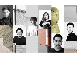
Six influential figures from the design industry were called upon to name one rising talent each. Andrea Branzi, Piero Lissoni, Luca Nichetto, Art Director Giulio Cappellini, gallerist and contemporary design icon Rossana Orlandi and acclaimed fashion designer Rosita Missoni. Though personal kinships and past collaborations certainly were a factor in their decision, the Jury was truly determined to celebrate the work of anonymous young designers. Federica Biasi, Antonio Facco, Marco Lavit Nicora, Kensaku Oshiro, Federico Peri and Guglielmo Poletti are the six Italian designers who were chosen to show the entire design community their immense potential and the direction Italian design is headed.
Oblure collaborator and product designer Antonio Facco was nominated by Giulio Cappellini after catching his attention, in 2013, during his final presentation of his graduation project at Milan’s Istituto Europeo di Design. The encounter marked the beginning of a productive collaboration (exhibitions, shops, communication campaigns), which culminated in the release of a whole collection in 2017.
Maison&Objet takes place from January 19th – 23th, 2018.
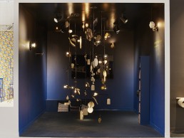
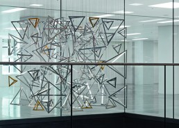
Lindsey Adelman debuts an immersive installation
(USA) - Selected to participate in Design Miami’s Curio program, a showcase of today's design landscape, Lindsey Adelman has envisioned an immersive installation that hangs like a kinetic cabinet of curiosities—mysterious, alluring and unexpected. Entirely handmade by Adelman, the presentation features seven suspended pieces, gathered in a cluster hanging nine feet high and nine feet wide, with five sconces and two ceiling surface mounts.
The work takes inspiration from the writings of Italian philosopher and physicist Carlo Rovelli and questions our understanding of the reality of the universe. Adelman considers: Are our five senses a hindrance to gaining a full understanding of the truth? Combined with our ego, have they developed to protect us and stand in opposition of truth-finding? Is it instead science, coupled with our intuitive imagination that can point to the truth? Citing Rovelli's consideration of a stone as a momentary getting-together of sand, she challenges preconceived notions of matter, suggesting it is not solid as we know it to be, rather an interaction that continues through time.
Ancient materials are manipulated to allow light to pass through: bronze perforated, alabaster thinly sliced, slippery porcelain barely there until it hardens; a metaphor for seeing through what is wise and established.
The transformation of the materials–from liquid to solid, for example—alludes to Rovelli's statement that "the difference between past and future only exists when there is heat." This distinction reframes our assumption of what time is and what matter is.
Nothing is static—just existing at different speeds of frequency of molecules," elaborates Adelman. "The work here evokes bits of matter suspended amongst bits of light on a mobile that can change with any movement in the air; a form that can be modified with interaction. It is adaptable. It is a material representation of collaborative thought.”
Fittingly, The Edge of What We Know marks the beginning of a new series of collaborative installations by Adelman, called Immersive Commissions. Serving not as a replacement to her modular lighting systems, but a complementary element of her practice, she will take on just a few each year. “As my company has evolved and grown, with the original Bubble collection morphing into various lines and tangents coming into their own, the team growing to a group of 40, the process becoming more inclusive and robust, the interactive spontaneity I used to share with the client has become a rarity," explains Adelman. "Immersive Commissions will become my platform for collaborative exchange and experimentation, where I will gain a deeper understanding of the function and fantasy others are looking for, alongside the freedom to explore possibilities simply not feasible with product lines."
As interaction serves as the impetus for the Miami presentation, it will remain the driver behind each commission. The original mobiles become a collaborative portrait of the designer and the collector, physical evidence of a personal, creative moment in time.
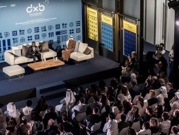
Dubai Design Week sets a new benchmark
(UAE) - The third edition of Dubai Design Week (DXBDW), the Middle East’s most important design event established a new benchmark for the city’s reputation as a vibrant and diverse platform.
DXBDW 2017 saw over 200 activities staged in locations across the city. The free-to-attend six day event attracted designers, architects, thought-leaders and creatives drawn to Dubai Design Week through its high-calibre design programme.
The programme, now live at www.dubaidesignweek.ae/2017-events-programme/, was a vivid expression of the varied and talented design community established in and drawn to the region’s design capital. Dubai Design Week invites the public to explore the full roster of events taking place, opening up opportunities for thousands to learn, be inspired, network, do business and celebrate the positive impact and potential of design.
Dubai Design Week’s Head of Design, William Knight, says, “The programme is testament to the talent and commitment that exists within Dubai and interest that has been generated globally through previous editions of Dubai Design Week. The team has been thrilled to work with an incredible range of designers, companies and sponsors to stage an event that is bursting with possibilities for visitors from near and far.”
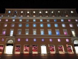
Rinascente, Slamp and Studio Waldemeyer light up Christmas
(Italy) - To celebrate the flagship store Rinascente's first christmas in Rome, Slamp and Studio Waldemeyer joined forces to add a bit of extraordinary to the iconic city's charm.
In every window of the store a shining star sparkles in light effects rippling across the entire façade, creating concentric wave patterns.
The light waves signify the impact the opening of the new store has on the city and beyond, a beacon of light that has risen right in the centre of Rome.
London based Studio Waldemeyer is known for artful, inventive projects with light and has a history of collaboration with Rinascente. Slamp with its HQ in Rome is the leading Italian lighting brand that combines handmade aesthetics and patented materials offering cool illuminations worldwide.